The 6 Most Common Mistakes of Distributing Home Spaces

One of the most complicated issues when it comes to interior design is accurately distributing the spaces in your home. This practice tends to generate repetitive mistakes that can dwarf or waste many areas of your home. As knowledge is power, we’re going to explain what these mistakes are and how to avoid them.
We invite you to configure the best possible space for each of your rooms. To achieve this, keep reading to avoid six of the most common mistakes. Are you ready to learn more?
The art of distributing home spaces
There are six common mistakes that people often make when it comes to home decor. The distribution of spaces isn’t an easy task and, sometimes, it leads to the loss of harmony. Or furniture and accessories may not look as good as they could.
Discover everything to consider when choosing furniture and elements for your home. Beware! There are certain aspects that could overload your room or create the visual sensation that it’s a small room.
1. Do not differentiate zones
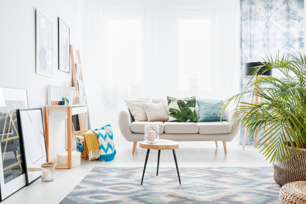
We recently mentioned the various ways in which you can use different spaces without the need for partitions. It’s important that, in large or open areas, each zone is clearly differentiated. You can do this with shelves, plants, or rugs to give more visual clarity.
2. Don’t distribute spaces according to proportions
One of the most common layout mistakes is choosing furniture without rhyme or reason. There are two problems with this: on the one hand, not taking into account the size of the space in which the furniture will go. And, on the other, not considering the proportions between them.
Remember that if you choose large furniture for a small room, your space will look full and cluttered. While if your furniture is too small, it’ll look lost and won’t look quite right.
3. Distributing home spaces: blocking natural light
Lighting is important when creating pleasing environments, but even more valuable is natural light. Distribute the furniture taking into account where the light enters the room.
A word of advice: avoid curtains that are too heavy, instead opt for opaque curtains or blinds. If your house is dark, mirrors are a good way to multiply the luminosity.

4. Too many walls can hinder distributing home spaces
The more partitions in your house, the smaller it’ll look. It’s not that you need to turn it into an open-plan, loft-type space, but you need to observe areas that are too compartmentalized.
A good idea, if you’re thinking of reform, is to open up the kitchen to the dining room. In addition to being a trend, it completely changes the perception of space. You can also eliminate some divisions or change partitions for glass.
5. Don’t forget to consider the passageways
As a general rule, avoid filling any space with too much furniture, especially if you have limited floor space. In this sense, furniture would be very close together, which would make movement and passage difficult.
Keep in mind that ideally, there should be a minimum of 40 or 50 centimeters between each piece of furniture. In this way, passageways will be clear and you’ll ensure a feeling of space.
6. Don’t connect spaces
If you have a terrace, a patio, a garden or a balcony, don’t hesitate to make them part of your home. Make the indoor space connect with the outdoors.
How? With light curtains, sliding doors, glass, and everything else you can think of to make it a part of the rest of the house. Complete this space with plants, armchairs, cushions, and any elements to your liking and that allow you to enjoy it. Otherwise, it’ll become a lost zone.
When it comes to distributing spaces, it’s a mistake to restrict yourself to the build of the house. While it’s true that the build of your home is relevant, it’s not everything. As we’ve learned, your furniture, the way you place it, the proportions and the light can all be used to dictate how you distribute spaces.
Now that you know the mistakes when it comes to distributing spaces within your home. you can avoid them and enjoy more harmony and practicality.
One of the most complicated issues when it comes to interior design is accurately distributing the spaces in your home. This practice tends to generate repetitive mistakes that can dwarf or waste many areas of your home. As knowledge is power, we’re going to explain what these mistakes are and how to avoid them.
We invite you to configure the best possible space for each of your rooms. To achieve this, keep reading to avoid six of the most common mistakes. Are you ready to learn more?
The art of distributing home spaces
There are six common mistakes that people often make when it comes to home decor. The distribution of spaces isn’t an easy task and, sometimes, it leads to the loss of harmony. Or furniture and accessories may not look as good as they could.
Discover everything to consider when choosing furniture and elements for your home. Beware! There are certain aspects that could overload your room or create the visual sensation that it’s a small room.
1. Do not differentiate zones
We recently mentioned the various ways in which you can use different spaces without the need for partitions. It’s important that, in large or open areas, each zone is clearly differentiated. You can do this with shelves, plants, or rugs to give more visual clarity.
2. Don’t distribute spaces according to proportions
One of the most common layout mistakes is choosing furniture without rhyme or reason. There are two problems with this: on the one hand, not taking into account the size of the space in which the furniture will go. And, on the other, not considering the proportions between them.
Remember that if you choose large furniture for a small room, your space will look full and cluttered. While if your furniture is too small, it’ll look lost and won’t look quite right.
3. Distributing home spaces: blocking natural light
Lighting is important when creating pleasing environments, but even more valuable is natural light. Distribute the furniture taking into account where the light enters the room.
A word of advice: avoid curtains that are too heavy, instead opt for opaque curtains or blinds. If your house is dark, mirrors are a good way to multiply the luminosity.

4. Too many walls can hinder distributing home spaces
The more partitions in your house, the smaller it’ll look. It’s not that you need to turn it into an open-plan, loft-type space, but you need to observe areas that are too compartmentalized.
A good idea, if you’re thinking of reform, is to open up the kitchen to the dining room. In addition to being a trend, it completely changes the perception of space. You can also eliminate some divisions or change partitions for glass.
5. Don’t forget to consider the passageways
As a general rule, avoid filling any space with too much furniture, especially if you have limited floor space. In this sense, furniture would be very close together, which would make movement and passage difficult.
Keep in mind that ideally, there should be a minimum of 40 or 50 centimeters between each piece of furniture. In this way, passageways will be clear and you’ll ensure a feeling of space.
6. Don’t connect spaces
If you have a terrace, a patio, a garden or a balcony, don’t hesitate to make them part of your home. Make the indoor space connect with the outdoors.
How? With light curtains, sliding doors, glass, and everything else you can think of to make it a part of the rest of the house. Complete this space with plants, armchairs, cushions, and any elements to your liking and that allow you to enjoy it. Otherwise, it’ll become a lost zone.
When it comes to distributing spaces, it’s a mistake to restrict yourself to the build of the house. While it’s true that the build of your home is relevant, it’s not everything. As we’ve learned, your furniture, the way you place it, the proportions and the light can all be used to dictate how you distribute spaces.
Now that you know the mistakes when it comes to distributing spaces within your home. you can avoid them and enjoy more harmony and practicality.


