How to Combine Classic Blue

Classic Blue was chosen as the color of the year by Pantone in 2020, and that has made things easy for us, as it’s one of the most versatile shades when it comes to combining and it adapts to any type of decoration.
At the Pantone Institute, they define it as an elegant color that instills calm and confidence. Without a doubt, it offers us much more play than the 2019 color of the year, Living Coral, as beautiful as it is controversial.
This intense blue, classified as reflective and ideal for promoting resilience, is perfect for use in interior design. We’re going to give you a few tips to implement it in your décor.
Brushstrokes of Classic Blue in the home

This blue color perfectly combines calm with sophistication. It’s not surprising that it’s one of the favorite colors for the bedroom area. Blue stands out for its freshness and for the ability it has to bring us to calm and, among the wonders it offers us, it can give optical amplitude if you have small spaces. Let’s see how to get the most out of its magnetism.
What colors can I combine Classic Blue with?
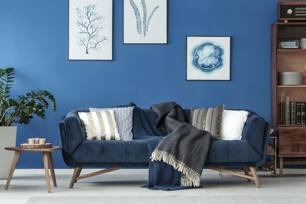
Classic Blue is a cold color, so we recommend you combine it with other tones that provide warmth.
For example, if we’re talking about a bedroom, you can use off-white bedding or use orange, ocher, and yellow. Even Living Coral goes wonderfully with Classic Blue and will bring a fresh vibe to your bedroom.
You can also add details of warm colors through the accessories, with a wooden bedside table, vases and flowers, or candles.
Other ideal but much riskier combinations are with red and gold. We recommend that you apply them in more social areas of the house such as the living room, dining room, or even the kitchen.
Play with tableware in this shade of blue and add golden touches with cutlery if you’re looking to distinguish yourself with your guests.
If you want to be more subtle, we’ve seen glasses, napkins, trays, etc. in Classic Blue. There are a lot of decoration stores, so take a look and check out this trend on your lunch break.
Another combination that you’re sure to love, especially if you’re more conservative when it comes to decorating, is with other shades of blue, especially the lighter ones. You can look for gradients through textiles or ceramics.
The calm of 2020’s color of the year

Classic Blue brings a sense of peace and tranquility; for this reason, it’s considered an introspective color. It invites us to concentrate, hence it’s one of the favorites to balance our mood.
As we stated, it’s ideal for bedrooms and living rooms but, without a doubt, one of its most innovative applications is as an important part of decorating work environments. Try subtle pink brushstrokes and wooden elements, and you’ll see how wonderful it is to work with a peaceful mind.
Let’s give it the prominence it deserves

Let’s be honest, Classic Blue and all its benefits deserve to be absolute protagonists of any room in your home. Are you convinced?
One of our suggestions would be the sofa, creating a living room that’s both elegant and modern. You can choose to leave the walls in neutral tones, like the curtains. and add a touch of color with a blue or green rug to look for a bit of contrast.
Don’t hesitate, Classic Blue will make your life calmer, more beautiful, and more harmonious.
Classic Blue was chosen as the color of the year by Pantone in 2020, and that has made things easy for us, as it’s one of the most versatile shades when it comes to combining and it adapts to any type of decoration.
At the Pantone Institute, they define it as an elegant color that instills calm and confidence. Without a doubt, it offers us much more play than the 2019 color of the year, Living Coral, as beautiful as it is controversial.
This intense blue, classified as reflective and ideal for promoting resilience, is perfect for use in interior design. We’re going to give you a few tips to implement it in your décor.
Brushstrokes of Classic Blue in the home

This blue color perfectly combines calm with sophistication. It’s not surprising that it’s one of the favorite colors for the bedroom area. Blue stands out for its freshness and for the ability it has to bring us to calm and, among the wonders it offers us, it can give optical amplitude if you have small spaces. Let’s see how to get the most out of its magnetism.
What colors can I combine Classic Blue with?

Classic Blue is a cold color, so we recommend you combine it with other tones that provide warmth.
For example, if we’re talking about a bedroom, you can use off-white bedding or use orange, ocher, and yellow. Even Living Coral goes wonderfully with Classic Blue and will bring a fresh vibe to your bedroom.
You can also add details of warm colors through the accessories, with a wooden bedside table, vases and flowers, or candles.
Other ideal but much riskier combinations are with red and gold. We recommend that you apply them in more social areas of the house such as the living room, dining room, or even the kitchen.
Play with tableware in this shade of blue and add golden touches with cutlery if you’re looking to distinguish yourself with your guests.
If you want to be more subtle, we’ve seen glasses, napkins, trays, etc. in Classic Blue. There are a lot of decoration stores, so take a look and check out this trend on your lunch break.
Another combination that you’re sure to love, especially if you’re more conservative when it comes to decorating, is with other shades of blue, especially the lighter ones. You can look for gradients through textiles or ceramics.
The calm of 2020’s color of the year

Classic Blue brings a sense of peace and tranquility; for this reason, it’s considered an introspective color. It invites us to concentrate, hence it’s one of the favorites to balance our mood.
As we stated, it’s ideal for bedrooms and living rooms but, without a doubt, one of its most innovative applications is as an important part of decorating work environments. Try subtle pink brushstrokes and wooden elements, and you’ll see how wonderful it is to work with a peaceful mind.
Let’s give it the prominence it deserves

Let’s be honest, Classic Blue and all its benefits deserve to be absolute protagonists of any room in your home. Are you convinced?
One of our suggestions would be the sofa, creating a living room that’s both elegant and modern. You can choose to leave the walls in neutral tones, like the curtains. and add a touch of color with a blue or green rug to look for a bit of contrast.
Don’t hesitate, Classic Blue will make your life calmer, more beautiful, and more harmonious.

