5 Color Rules Every Interior Decorating Fan Should Know
One of the most complicated things about decorating any room is choosing the color scheme. It’s at this point that most people start to worry about what will work best with what, and how to go about using them in a room. To make this task easier, we want to give you simple 5 color rules that every interior decorating fan should know.
As you’ll soon discover, choosing the right colors and getting the look you’re after is no easy task. However, all you need are these 5 basic color rules to make your project a success.
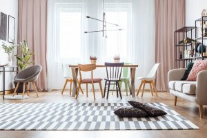
1. Color rules: the 60-30-10 rule

Let’s start with the 60-30-10 rule. This method is as simple as it is effective. In fact, it is the most popular method for designing any interior. Never heard of it? We’ll tell you everything you need to know.
- 60% of the room should be painted in the same color. This will be the predominant color.
- 30% of the room should be decorated in a second, complementary color.
- The final 10% of the room should be decorated in a third tone. This color should create contrast with the first two, helping to break the monotony.
The primary color (the one that will cover 60% of the room) should be neutral. Remember, it’s going to be the focus of your room. Too bright a color will create a space that is garish and overwhelming. Unless that’s the look you’re going for, it’s best to avoid bright colors as the main color.
As for the second color, it’s normally used for things such as furniture and upholstery. The curtains, cushions, and rugs will bring a touch of color, and break with neutral primary color. These two colors should work in harmony with one another, with neither one standing out more than the other.
The third tone, however, needs to stand out. Its job is to bring a touch of color and energy to the room. It’s perfect for decorative objects such as paintings, lamps, flowers, and ornaments.
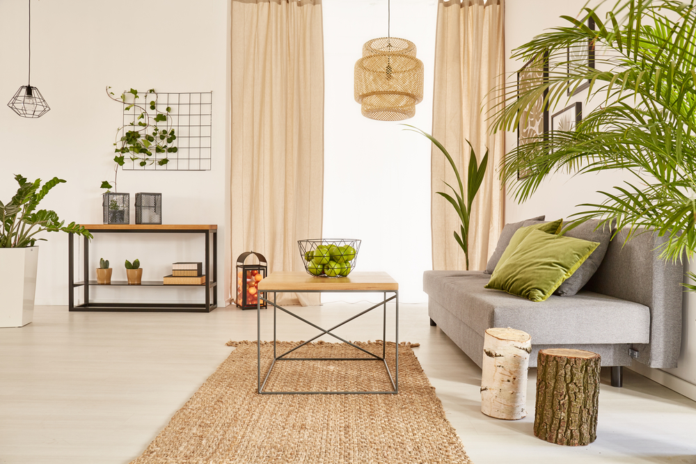
2. Color rules: Opposites attract
When it comes to decorating our homes, we often find ourselves choosing very similar tones. By doing this, we hope that the colors will work well together, and create a perfect sense of harmony.
However, this tactic usually has the opposite effect: boring, monotonous and completely unremarkable rooms, that aren’t worth a second glance.
Don’t be afraid to mix different colors, even if you’re not sure they go together. Opposite colors attract, and the results can be truly spectacular. Some of the best color combinations are:
- Black and white
- Blue and orange
- Yellow and purple
3. Color psychology

Interior designers also have to think about the feelings and emotions they want to evoke. It’s important to remember that colors can tell us a lot about a home and its inhabitants. This is why it’s so important to choose the right ones.
- White: purity, light, cleanliness, spaciousness
- Black: luxury, prestige, distinction
- Yellow: positivity, joy, happiness
- Pink: warmth, love, romance
- Green: relaxation, freshness, nature
- Blue: tranquillity, harmony, stability
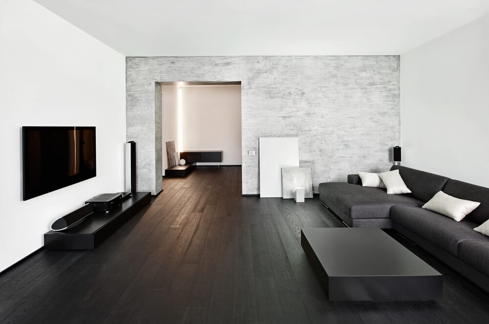
4. Don’t get too hung up on making sure everything matches
Every interior design fan channels all their efforts into trying to create a room that is beautiful and stylish. Sometimes, they are so intent on creating the perfect look, that finding matching elements almost becomes an obsession.
Trust us on this one: it doesn’t work. Using contrasting colors and elements is an essential part of good interior decor. So, we encourage you to use anything, from antiques to recycled furniture, or any other style that takes your fancy. The result will be much more pleasant and authentic. Otherwise, you’ll always have the vague sensation that you’re living in a very beautiful, but strangely unwelcoming home.
5. Patterns and textures
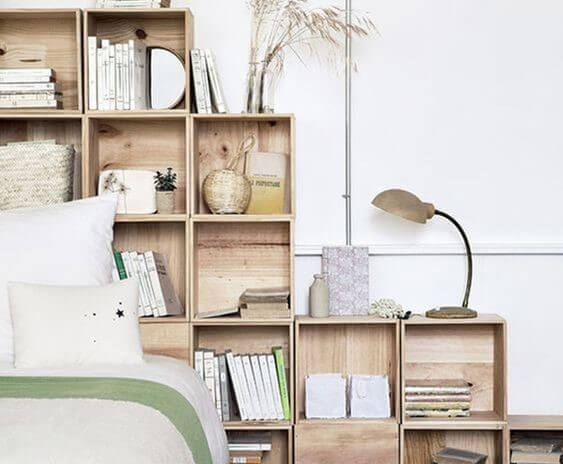
Up until now, we’ve mainly talked about colors, but interior design is much more than that. Materials, patterns, and textures are a key part of decorating any room, allowing you to use the same color in a variety of different ways. This helps create a much more dynamic and less monotone environment.
For example, brown can be incorporated in a number of different ways: wooden furniture, ochre walls, and decorative wicker objects. If you apply this method to all the colors in your room, the results will be simply fantastic.
One of the most complicated things about decorating any room is choosing the color scheme. It’s at this point that most people start to worry about what will work best with what, and how to go about using them in a room. To make this task easier, we want to give you simple 5 color rules that every interior decorating fan should know.
As you’ll soon discover, choosing the right colors and getting the look you’re after is no easy task. However, all you need are these 5 basic color rules to make your project a success.
1. Color rules: the 60-30-10 rule
Let’s start with the 60-30-10 rule. This method is as simple as it is effective. In fact, it is the most popular method for designing any interior. Never heard of it? We’ll tell you everything you need to know.
- 60% of the room should be painted in the same color. This will be the predominant color.
- 30% of the room should be decorated in a second, complementary color.
- The final 10% of the room should be decorated in a third tone. This color should create contrast with the first two, helping to break the monotony.
The primary color (the one that will cover 60% of the room) should be neutral. Remember, it’s going to be the focus of your room. Too bright a color will create a space that is garish and overwhelming. Unless that’s the look you’re going for, it’s best to avoid bright colors as the main color.
As for the second color, it’s normally used for things such as furniture and upholstery. The curtains, cushions, and rugs will bring a touch of color, and break with neutral primary color. These two colors should work in harmony with one another, with neither one standing out more than the other.
The third tone, however, needs to stand out. Its job is to bring a touch of color and energy to the room. It’s perfect for decorative objects such as paintings, lamps, flowers, and ornaments.
2. Color rules: Opposites attract
When it comes to decorating our homes, we often find ourselves choosing very similar tones. By doing this, we hope that the colors will work well together, and create a perfect sense of harmony.
However, this tactic usually has the opposite effect: boring, monotonous and completely unremarkable rooms, that aren’t worth a second glance.
Don’t be afraid to mix different colors, even if you’re not sure they go together. Opposite colors attract, and the results can be truly spectacular. Some of the best color combinations are:
- Black and white
- Blue and orange
- Yellow and purple
3. Color psychology
Interior designers also have to think about the feelings and emotions they want to evoke. It’s important to remember that colors can tell us a lot about a home and its inhabitants. This is why it’s so important to choose the right ones.
- White: purity, light, cleanliness, spaciousness
- Black: luxury, prestige, distinction
- Yellow: positivity, joy, happiness
- Pink: warmth, love, romance
- Green: relaxation, freshness, nature
- Blue: tranquillity, harmony, stability
4. Don’t get too hung up on making sure everything matches
Every interior design fan channels all their efforts into trying to create a room that is beautiful and stylish. Sometimes, they are so intent on creating the perfect look, that finding matching elements almost becomes an obsession.
Trust us on this one: it doesn’t work. Using contrasting colors and elements is an essential part of good interior decor. So, we encourage you to use anything, from antiques to recycled furniture, or any other style that takes your fancy. The result will be much more pleasant and authentic. Otherwise, you’ll always have the vague sensation that you’re living in a very beautiful, but strangely unwelcoming home.
5. Patterns and textures
Up until now, we’ve mainly talked about colors, but interior design is much more than that. Materials, patterns, and textures are a key part of decorating any room, allowing you to use the same color in a variety of different ways. This helps create a much more dynamic and less monotone environment.
For example, brown can be incorporated in a number of different ways: wooden furniture, ochre walls, and decorative wicker objects. If you apply this method to all the colors in your room, the results will be simply fantastic.


