How Do Colors Influence Decor?
We turn to different disciplines to explain the influence that colors have on decor. These disciplines attribute a set of meanings to each color. The meanings are based on the sensations that the colors create in people as well as the impact on their mood.
While the famous German writer, poet, and scientist, Johann W. von Goethe’s masterpiece The Theory of Colours has been one of the biggest voices in this field, Feng Shui also touches upon color psychology as well.
Color has an incredibly important role in decor because it helps condition a space, empowering one or more sensations. Taking that into consideration, the first glance of color is powerful.
Colors in decor
While color psychology is an established concept, the world of decor treats every possible meaning of color differently. In other words, design considers color psychology in the process but isn’t entirely based on it.
Below, we’re going to explain how colors influence decor according to their meaning:
- Red. Passion, heat, stimulation, dynamism. In decor, people usually use red for kitchens and transit areas.
- Orange. Joy, vitality, fun. Orange is used in social areas or those that hold a higher level of energy. In some cases, people also use orange for baby rooms.
- Yellow. Energy, positive thinking, enthusiasm. Yellow goes in social areas such as kitchens, hallways, home entrances and other areas of high social interaction.
- Green. Freshness, calmness, balance, stability. In decor, people use green for any room as it delivers lovely results.
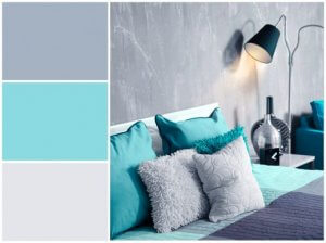
- Blue. Peace, serenity, freshness, relaxation, depth. Blue is another favorite in the decor world; so much so that it’s used in any room.
- Purple. Creativity, inspiration, wealth, luxury, mysticism. Purple works great in all kinds of spaces whether they’re bedrooms or home entrances.
Color temperature
In addition to meanings, we can also characterize colors into two main temperature categories:
- Cool tones bring in freshness and relaxation because they don’t create a setting of high movement. These colors are also for creating more visual space.
- Warm tones offer vitality and dynamism to a setting. They’ve become the top choices for creating more intimacy, closeness, and warmth. Unlike cool colors, warm tones make spaces look smaller, creating a sensation or more energy and movement.
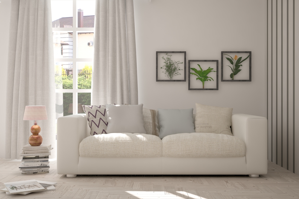
Some people refer to a third category as well: neutral colors (white, black, gray). You can use these colors as a base and create a setting that’s either warmer or cooler depending on the other colors that you use with them.
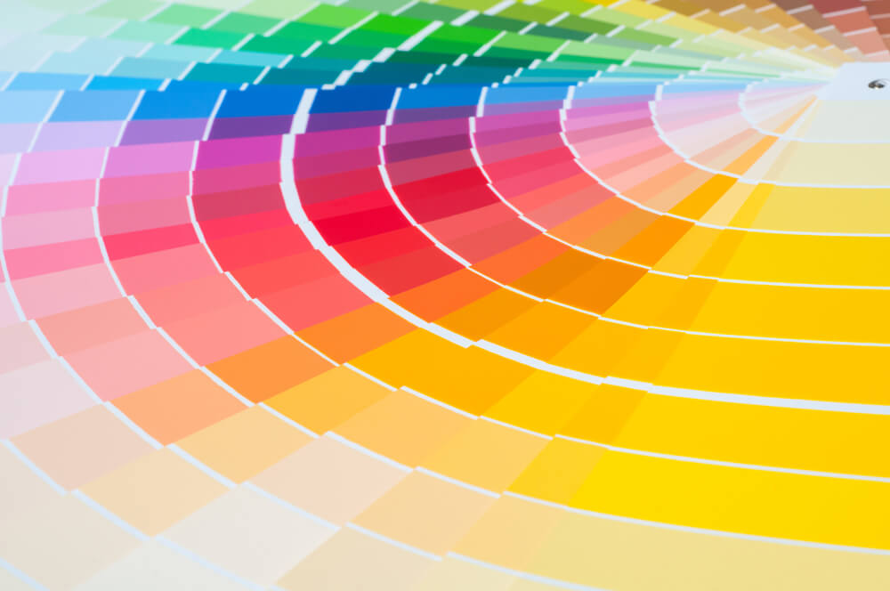
The most popular colors
Besides their meanings, there are other factors that influence people to choose one color or another. People also make their choices based on if a color is relevant all-year-round or capable of adding sophistication to their homes.
- White
- Creams
- Blue
- Green
- Beige
- Brown
- Gray
In interior decoration, brown and gray offer temperance, stability and security while white brings in light, amplitude, freshness, and cleanliness.
You’ll often see these colors paired with creams, beige or other neutrals to create simple yet sophisticated ambiances.
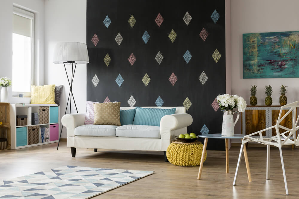
Green and blue are everywhere in nature. As a result, people connect them to concepts like balance, tranquility, and life. The darker a shade the deeper the meaning becomes.
Creative ideas, amazing results
The magic of color and creativity has no limits, making the possibilities plentiful. But keep in mind that a harmonious result needs balance.
On top of that, contrasts and similarities that come from your palette should respect the size and natural lighting of your rooms.
You can carefully choose a color scheme after reading out tips, but you’ll have to test them out to find a truly unique style that fills onlookers with positive sensations at first glance.
We turn to different disciplines to explain the influence that colors have on decor. These disciplines attribute a set of meanings to each color. The meanings are based on the sensations that the colors create in people as well as the impact on their mood.
While the famous German writer, poet, and scientist, Johann W. von Goethe’s masterpiece The Theory of Colours has been one of the biggest voices in this field, Feng Shui also touches upon color psychology as well.
Color has an incredibly important role in decor because it helps condition a space, empowering one or more sensations. Taking that into consideration, the first glance of color is powerful.
Colors in decor
While color psychology is an established concept, the world of decor treats every possible meaning of color differently. In other words, design considers color psychology in the process but isn’t entirely based on it.
Below, we’re going to explain how colors influence decor according to their meaning:
- Red. Passion, heat, stimulation, dynamism. In decor, people usually use red for kitchens and transit areas.
- Orange. Joy, vitality, fun. Orange is used in social areas or those that hold a higher level of energy. In some cases, people also use orange for baby rooms.
- Yellow. Energy, positive thinking, enthusiasm. Yellow goes in social areas such as kitchens, hallways, home entrances and other areas of high social interaction.
- Green. Freshness, calmness, balance, stability. In decor, people use green for any room as it delivers lovely results.
- Blue. Peace, serenity, freshness, relaxation, depth. Blue is another favorite in the decor world; so much so that it’s used in any room.
- Purple. Creativity, inspiration, wealth, luxury, mysticism. Purple works great in all kinds of spaces whether they’re bedrooms or home entrances.
Color temperature
In addition to meanings, we can also characterize colors into two main temperature categories:
- Cool tones bring in freshness and relaxation because they don’t create a setting of high movement. These colors are also for creating more visual space.
- Warm tones offer vitality and dynamism to a setting. They’ve become the top choices for creating more intimacy, closeness, and warmth. Unlike cool colors, warm tones make spaces look smaller, creating a sensation or more energy and movement.
Some people refer to a third category as well: neutral colors (white, black, gray). You can use these colors as a base and create a setting that’s either warmer or cooler depending on the other colors that you use with them.
The most popular colors
Besides their meanings, there are other factors that influence people to choose one color or another. People also make their choices based on if a color is relevant all-year-round or capable of adding sophistication to their homes.
- White
- Creams
- Blue
- Green
- Beige
- Brown
- Gray
In interior decoration, brown and gray offer temperance, stability and security while white brings in light, amplitude, freshness, and cleanliness.
You’ll often see these colors paired with creams, beige or other neutrals to create simple yet sophisticated ambiances.
Green and blue are everywhere in nature. As a result, people connect them to concepts like balance, tranquility, and life. The darker a shade the deeper the meaning becomes.
Creative ideas, amazing results
The magic of color and creativity has no limits, making the possibilities plentiful. But keep in mind that a harmonious result needs balance.
On top of that, contrasts and similarities that come from your palette should respect the size and natural lighting of your rooms.
You can carefully choose a color scheme after reading out tips, but you’ll have to test them out to find a truly unique style that fills onlookers with positive sensations at first glance.


