Why Does Blue Look so Good in the Bathroom?
The shades of color in the home usually offer a personalized image. Normally, we opt for basic and functional principles when working on the interior. For this reason, we are going to learn why blue looks so good in the bathroom.
Some rooms in the house call for certain types of aesthetic treatments, so we introduce formulas that don’t fit well on some occasions. We must assess what the possibilities are and what looks good in each place.
The new decorative trends try to offer an original and distinctive image. For this reason, new aesthetic approaches have been opened that try to innovate in the application of colors. However, it is the traditional processes that continue to predominate.
The color blue – a relationship with hygiene
Within the blue family, there is a wide variety from the lightest to the darkest shades. Some convey more serenity, while others can be a bit louder and more intense. It’s all a matter of assessing the appearance of each one.
What we are clear about is that they offer a hygienic and natural feel. They are usually used in rooms such as the kitchen or the bathroom. This is basically due to the chromatic conception that we have of water and the relationship this color has with it.
The perception we get within the home helps us better work on cleanliness and purity. Whether it is placed on the walls or the floors, blue is interesting to apply in the bathroom. An ideal treatment is achieved to obtain an appropriate environment for personal hygiene.
Colors are linked to sensations.
Why does blue look so good in the bathroom?
The blue in the bathroom is a conventional resource. It can be common in homes and public places, but this is basically because it works well on an aesthetic level. Why does blue work so well?
- On the one hand, you have to take into account the purity and vitality factor of this color. We often resort to warm colors to work on this idea, however, some of the cold family can also be linked.
- Freshness is essential in rooms like the bathroom. It is the light blues that have an influence since the perception of naturalness is very important as this is a place where contact with water is made and the environment conducive to it is created.
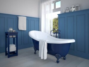
- Another case will be the dark shades. They provide more seriousness, a much more forceful feeling, and boldness. They are a good option for contemporary and classic styles. I
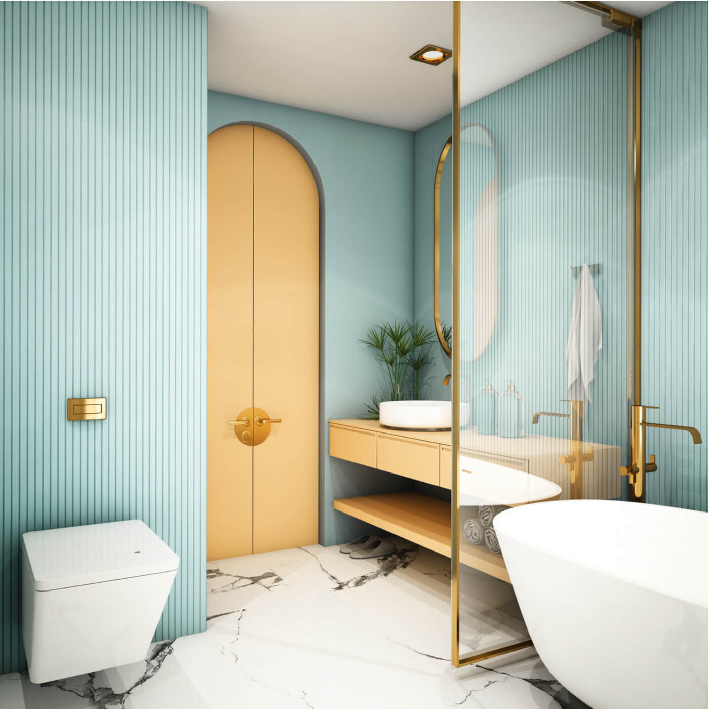
- The range that is close to turquoise, such as blue-green, shows a more youthful appearance. These colors are much more dynamic, gentle, and showy, being very appropriate for tiles on both walls and floors.
Relationship between colors

In the bathroom, white is usually present – the toilets, the floor, the walls, the furniture, etc. It has multiple ways of presenting itself. For this reason, you must have around you tonalities with which you can establish a good dialogue.
In this case, the relationship is quite close. At the aesthetic level, they contrast clearly and there is an evident differentiation process that, in reality, is pleasant. In other words, blue and white create a subtle, pure and intoxicating atmosphere.
Blue – a suitable color for interiors
So far we have been able to confirm that blue in the bathroom is a success. From the point of view of cleaning and sensations, it has a set of attractive benefits.
In this way, we can confirm that these tones are appropriate if you want to create combinations in the bathroom. It’s all a matter of knowing what you want to achieve and setting a series of objectives to enhance the decoration.
The shades of color in the home usually offer a personalized image. Normally, we opt for basic and functional principles when working on the interior. For this reason, we are going to learn why blue looks so good in the bathroom.
Some rooms in the house call for certain types of aesthetic treatments, so we introduce formulas that don’t fit well on some occasions. We must assess what the possibilities are and what looks good in each place.
The new decorative trends try to offer an original and distinctive image. For this reason, new aesthetic approaches have been opened that try to innovate in the application of colors. However, it is the traditional processes that continue to predominate.
The color blue – a relationship with hygiene
Within the blue family, there is a wide variety from the lightest to the darkest shades. Some convey more serenity, while others can be a bit louder and more intense. It’s all a matter of assessing the appearance of each one.
What we are clear about is that they offer a hygienic and natural feel. They are usually used in rooms such as the kitchen or the bathroom. This is basically due to the chromatic conception that we have of water and the relationship this color has with it.
The perception we get within the home helps us better work on cleanliness and purity. Whether it is placed on the walls or the floors, blue is interesting to apply in the bathroom. An ideal treatment is achieved to obtain an appropriate environment for personal hygiene.
Colors are linked to sensations.
Why does blue look so good in the bathroom?
The blue in the bathroom is a conventional resource. It can be common in homes and public places, but this is basically because it works well on an aesthetic level. Why does blue work so well?
- On the one hand, you have to take into account the purity and vitality factor of this color. We often resort to warm colors to work on this idea, however, some of the cold family can also be linked.
- Freshness is essential in rooms like the bathroom. It is the light blues that have an influence since the perception of naturalness is very important as this is a place where contact with water is made and the environment conducive to it is created.
- Another case will be the dark shades. They provide more seriousness, a much more forceful feeling, and boldness. They are a good option for contemporary and classic styles. I
- The range that is close to turquoise, such as blue-green, shows a more youthful appearance. These colors are much more dynamic, gentle, and showy, being very appropriate for tiles on both walls and floors.
Relationship between colors
In the bathroom, white is usually present – the toilets, the floor, the walls, the furniture, etc. It has multiple ways of presenting itself. For this reason, you must have around you tonalities with which you can establish a good dialogue.
In this case, the relationship is quite close. At the aesthetic level, they contrast clearly and there is an evident differentiation process that, in reality, is pleasant. In other words, blue and white create a subtle, pure and intoxicating atmosphere.
Blue – a suitable color for interiors
So far we have been able to confirm that blue in the bathroom is a success. From the point of view of cleaning and sensations, it has a set of attractive benefits.
In this way, we can confirm that these tones are appropriate if you want to create combinations in the bathroom. It’s all a matter of knowing what you want to achieve and setting a series of objectives to enhance the decoration.
All cited sources were thoroughly reviewed by our team to ensure their quality, reliability, currency, and validity. The bibliography of this article was considered reliable and of academic or scientific accuracy.
- Lluch, Francisco Javier: Arte de armonizar los colores, Barcelona, Imprenta de El Provenir, 1858.


