The Color Sky Blue - Subtle and Delicate
Decorative resources that produce different sensations nourish your home. The ambiance will impact the sensations you create in your home. In this article, we’re going to tell you all about the color sky blue.
Although we all like to feel comfortable at home, this isn’t easy to achieve. Each choice you make to decorate your rooms allows you to customize and consistently organize the arrangement of objects, materials, and furniture.
In this sense, when you choose a certain color for a room, in the end, you’re working the aesthetic line you want the decoration to be directed at. However, you must evaluate what suits each room to ensure you’re satisfied with the result.
The color sky blue and its aesthetic conception
When it comes to describing the aesthetics of the color sky blue, everyone could explain what it evokes in them and how it feels to contemplate it. However, some aspects are intrinsic to it.
Its appearance is linked to concepts such as hope, calm, and optimism. It reflects trust, subtlety, and delicacy, as it’s a pastel color.
Also, it reminds us of the sky on sunny days, that enriches your spirit with good vibes and allows joy and well-being to flourish. Therefore, these are some of the aesthetic considerations you must bear in mind.
If you want to create joyful and enthusiastic spaces, this is the best color you can go for
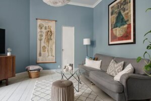
The color sky blue in the living room
In what way can you add this color to your living room? It goes perfectly well with other colors and, of course, with furniture. It doesn’t generate tension nor cause other decorative complications. Below, discover four ways to apply it:
- You can paint all the walls in this color. However, another solution is to only paint one wall. Of course, the important thing is to ensure contrast. Therefore, you should leave the ceiling white. In fact, it goes well with wooden floors.
- It’s possible to add it to your sofa or an armchair to create a direct contrast with the wall, as long as it’s white or grayish. We don’t recommend mixing it with other blues or with intense or strident warm colors.
- If you want to add it subtly, you can do so with a blanket, a sofa cushion, a vase, or a tablecloth, among other ideas. In fact, you can mix these elements with other resources to establish a color contrast.
- The connection you make between this color and others may seem somewhat complicated. It’s interesting to relate it to complementary colors, such as orange, salmon, gray, or neutral colors.
The color sky blue in the bedroom
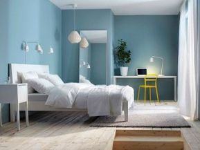
Bedrooms are very personal spaces. As in the living room, the walls are the main place you can add color to. However, you can also do so through a blanket, the bedspread, or the curtains.
This color creates light and transmits a serenity that helps calm your spirit and, in turn, make you feel happy every morning.
On the other hand, we must highlight how you can use it in children’s rooms. There’s no doubt that it enhances the decoration and gives children a placid and calm room from an early age.
The color sky blue in the bathroom
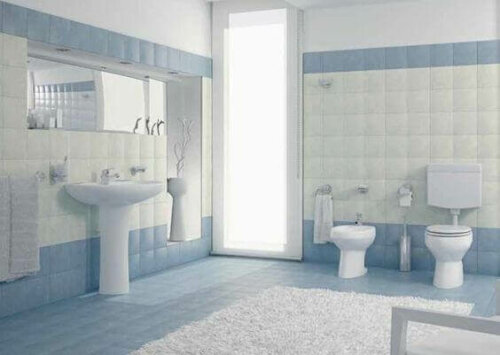
You can really go all out with this color in the bathroom, mainly because it’s related to water and blends perfectly well with the white of toilets and sinks. Also, you can add other blues to it in bathrooms, even if they’re darker.
On the other hand, it also transmits a hygienic feel. Therefore, it enhances the goal of this space, which is to create a peaceful and healthy environment. Therefore, it creates perfect harmony with the rest of the resources that make up any bathroom.
All cited sources were thoroughly reviewed by our team to ensure their quality, reliability, currency, and validity. The bibliography of this article was considered reliable and of academic or scientific accuracy.
- Lluch, Francisco Javier: Arte de armonizar colores, Barcelona, Imprensa El Porvenir, 1858.