How a Professional Decorator Matches Colors
You shouldn’t take your home’s decoration lightly. We’d all like to be trained in the mastery of interior design like the specialists. In this regard, you may have asked yourself on more than one occasion how a professional decorator matches colors.
The color relationship you establish in a room must pursue a single goal – harmony. When there’s an aesthetic confrontation between the different resources, it’s largely due to poor color matching.
The difficulty lies in cool and warm colors: when to apply one or the other, in what way, how one, in particular, should predominate, etc. In this article, we address all these doubts so that your home decoration looks professional.
How a professional decorator matches colors
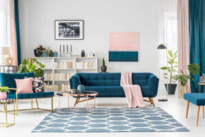
We all know what the color wheel is it’s where all colors are featured. The colors that are considered complementary are those that are located on the opposite side of each other.
A professional decorator usually looks closely at this color wheel and, depending on the goal and the rooms where they’re going to work, they’ll choose the colors that suit them best. They usually always resort to a primary color and its complementary color, which will be the secondary one.
This type of work is well reflected in styles such as pop-art, minimalist, psychedelic, or any other that projects greater aesthetic intensity in spaces. This also works on the relationship with emotions.
“All colors are the friends of their neighbors and the lovers of their opposites.”
-Marc Chagall-
5 criteria for combining warm and cool colors
Warm and cool colors contrast with each other. However, you can find common ground and try to establish a mutual harmony that allows them to create distinguished and attractive spaces. Let’s look at five fundamental criteria:
- Remember that the walls are the reference point to make a color predominate. To establish a harmonious contrast you need to use opposite colors in smaller decorative accessories.
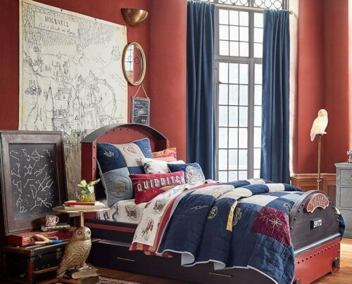
- If you opt for a warm color for the walls, such as earthy colors, maroons, or oranges, it’s best for them to not be too intense but, to a certain extent, dull. This way, they won’t clash.
- If you choose blue to enhance a space, you should relate it to earth colors. For this, it’s best to use wooden furniture, creating a pleasant contrast. But under no circumstances should you link it with red.
- Green offers several possibilities for use with warm colors. You can use it on certain elements, such as sofa cushions or on the floors themselves.
- Cream colors have always been a great bet for interior designers, as they don’t stand out but create a warm atmosphere. This is when you can use furniture that has cool tones, such as blue or green.
The use of white by a professional decorator
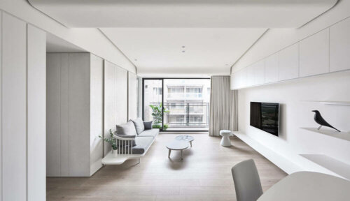
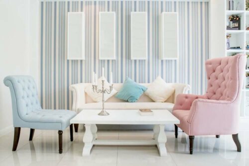
The color white is an indispensable component in any home. You can apply it in different spaces and it goes well with both warm and cold colors. Therefore, it doesn’t create color imbalances.
If you don’t want a color to predominate on the walls, it’s a good idea to use white to complement and counteract. This way, you can regulate the harmony of the interiors. A good idea is to put color on one of the walls and paint the other walls white.
In the same way, it helps you to highlight the decorative resources in the room: seats, furniture, paintings, plants, etc.
The chromatic environment according to a professional decorator
When you enter a room, you feel that there’s a certain atmosphere. This is due to the dominance of a color, and its presence in different resources as it generates an emotional sensation.
As a general rule, professionals tend to use all warm colors since they tend to be more pleasant and transmit more serenity. However, cool colors are also very popular. However, they offer greater limitations when it comes to matching.
Whenever you create a comfortable environment, it’s best to opt for colors that make you feel good and that don’t establish discord with others.
We hope you enjoyed learning about how a professional decorator matches colors!
You shouldn’t take your home’s decoration lightly. We’d all like to be trained in the mastery of interior design like the specialists. In this regard, you may have asked yourself on more than one occasion how a professional decorator matches colors.
The color relationship you establish in a room must pursue a single goal – harmony. When there’s an aesthetic confrontation between the different resources, it’s largely due to poor color matching.
The difficulty lies in cool and warm colors: when to apply one or the other, in what way, how one, in particular, should predominate, etc. In this article, we address all these doubts so that your home decoration looks professional.
How a professional decorator matches colors
We all know what the color wheel is it’s where all colors are featured. The colors that are considered complementary are those that are located on the opposite side of each other.
A professional decorator usually looks closely at this color wheel and, depending on the goal and the rooms where they’re going to work, they’ll choose the colors that suit them best. They usually always resort to a primary color and its complementary color, which will be the secondary one.
This type of work is well reflected in styles such as pop-art, minimalist, psychedelic, or any other that projects greater aesthetic intensity in spaces. This also works on the relationship with emotions.
“All colors are the friends of their neighbors and the lovers of their opposites.”
-Marc Chagall-
5 criteria for combining warm and cool colors
Warm and cool colors contrast with each other. However, you can find common ground and try to establish a mutual harmony that allows them to create distinguished and attractive spaces. Let’s look at five fundamental criteria:
- Remember that the walls are the reference point to make a color predominate. To establish a harmonious contrast you need to use opposite colors in smaller decorative accessories.
- If you opt for a warm color for the walls, such as earthy colors, maroons, or oranges, it’s best for them to not be too intense but, to a certain extent, dull. This way, they won’t clash.
- If you choose blue to enhance a space, you should relate it to earth colors. For this, it’s best to use wooden furniture, creating a pleasant contrast. But under no circumstances should you link it with red.
- Green offers several possibilities for use with warm colors. You can use it on certain elements, such as sofa cushions or on the floors themselves.
- Cream colors have always been a great bet for interior designers, as they don’t stand out but create a warm atmosphere. This is when you can use furniture that has cool tones, such as blue or green.
The use of white by a professional decorator
The color white is an indispensable component in any home. You can apply it in different spaces and it goes well with both warm and cold colors. Therefore, it doesn’t create color imbalances.
If you don’t want a color to predominate on the walls, it’s a good idea to use white to complement and counteract. This way, you can regulate the harmony of the interiors. A good idea is to put color on one of the walls and paint the other walls white.
In the same way, it helps you to highlight the decorative resources in the room: seats, furniture, paintings, plants, etc.
The chromatic environment according to a professional decorator
When you enter a room, you feel that there’s a certain atmosphere. This is due to the dominance of a color, and its presence in different resources as it generates an emotional sensation.
As a general rule, professionals tend to use all warm colors since they tend to be more pleasant and transmit more serenity. However, cool colors are also very popular. However, they offer greater limitations when it comes to matching.
Whenever you create a comfortable environment, it’s best to opt for colors that make you feel good and that don’t establish discord with others.
We hope you enjoyed learning about how a professional decorator matches colors!
All cited sources were thoroughly reviewed by our team to ensure their quality, reliability, currency, and validity. The bibliography of this article was considered reliable and of academic or scientific accuracy.
- Egon Schuler, Josef: Color y decoración en el hogar, Gustavo Gili, 1968.


