The Influence of Color - Chromatic Emotions
The influence of color and its sensations can greatly affect people. There are general guidelines, but not everyone reacts to different colors in the same way.
The colors that we use in our daily lives are a reflection of our personality. Before choosing them, be clear about what visual and emotional effect you seek and the function they will serve.
Color psychology – the influence of color on people

Each color transmits sensations that can affect a person’s mood. We’re so influenced by colors that chromotherapy uses them for healing purposes.
The effect of these colors isn’t always the same. However, general considerations can be made in almost all cases. Before decorating any room in your home, don’t overlook the importance of emotions and sensations evoked by colors.
Upon contact with a certain color, it is immediately synchronized with the human spirit, producing a decisive and important effect on the mood.
-Goethe-
A language of its own

Colors speak to us often but mostly we’re not aware of it. In addition to the emotion and sensation they provoke, they accumulate a strong semantic charge due to the symbolic use that each culture makes of them.
Through the colors we choose for our clothing style or environment, we express our character, mood, and feelings. Colors also have a cultural and social meaning, and age and gender affect a person’s color preferences.
The colors you choose when decorating your home shouldn’t be based solely on aesthetic factors. They should also adapt to your psychological needs.
Influence of color
What influence do the following colors have on you? Let’s explore some of their features so that you can use them successfully.
Red
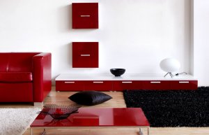
Red carries enormous strength. If it’s deep red, it becomes the most powerful color in the warm color group.
It generates vitality and energy, but also aggressiveness and irritation. It also symbolizes fire, blood, passion, love, and sexuality. For this reason, you should use it in moderation.
If red is intense, it causes an increase in the ambient temperature. If its purity is reduced, this color becomes more delicate and elegant.
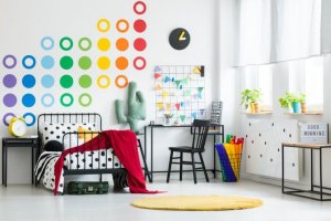
Yellow
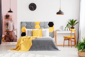
Yellow is the most subtle color of the warm color group. It’s a very stimulating and powerful color. We associate yellow with sunlight, providing great depth and luminosity to any surface.
It stimulates creativity and intelligence and invites fun. If it’s a darker shade, it is elegant and cozy (ocher, mustard, or gold) and produces less eye strain. However, yellow can also mean danger and bad luck.
White
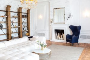
White is the most light-sensitive color. We use white the most in home decoration because of its many virtues. It provides a feeling of spaciousness, diffuses light evenly, and is heat-insulating.
It is a symbol of purity, peace, and immortality and suggests innocence, transparency, modesty, balance, and harmony.
Green
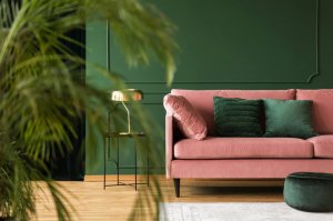
Green is the color of nature and is refreshing and harmonious because of its relationship with vegetation.
This color encourages relaxation and provides calm and stillness. It’s the calmest and most sedating of all colors. In dark tones, green becomes serious and sophisticated. With lighter tones, green is elegant and provides a feeling of spaciousness.
Blue
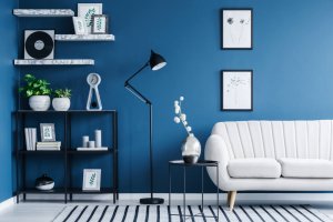
Blue is the color of the sky, the sea, and water. It’s a refreshing or deep color depending on the depth. It also diffuses light.
Blue is harmonious and invites rest and introspection. We associate it with tranquility, patience, sobriety, and serenity. If it’s a darker shade, it transmits seriousness and confidence.
Purple
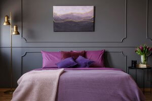
Purple is a mixture of red and blue. It transmits different sensations depending on which of the two primary colors dominates more.
When dark, violet can be a very vibrant color. However, lilacs and light mauve are romantic. On the other hand, purple is more stimulating.
Purple represents faith, chastity, and devotion. In its variant, purple is the color of power and aristocracy, since it was the preferred color of emperors and kings and the color of Catholic cardinals.
Orange

Orange is between red and yellow. It’s a cheerful and youthful color. Orange has an expansive, radiant, and welcoming character.
When used in your home, orange generates optimism and dynamism. We associate it with summer, pleasure, and parties. We also use it as a warning symbol.
Black

Black is the total absence of light. This color lacks vitality and luminosity and has to be used carefully in the home. However, black is an elegant and stylized color.
It is a striking, powerful, and mysterious color that generates a feeling of concealment. It also suggests evil, sadness, pain, and unhappiness. However, not everything black is pessimistic.
We associate black with more positive or neutral values, such as nobility, solemnity, or seriousness. Above all, it’s the symbol of death and mourning in western culture.
Don’t forget that the influence of color is a factor that you must take into consideration when decorating your home.
The influence of color and its sensations can greatly affect people. There are general guidelines, but not everyone reacts to different colors in the same way.
The colors that we use in our daily lives are a reflection of our personality. Before choosing them, be clear about what visual and emotional effect you seek and the function they will serve.
Color psychology – the influence of color on people
Each color transmits sensations that can affect a person’s mood. We’re so influenced by colors that chromotherapy uses them for healing purposes.
The effect of these colors isn’t always the same. However, general considerations can be made in almost all cases. Before decorating any room in your home, don’t overlook the importance of emotions and sensations evoked by colors.
Upon contact with a certain color, it is immediately synchronized with the human spirit, producing a decisive and important effect on the mood.
-Goethe-
A language of its own
Colors speak to us often but mostly we’re not aware of it. In addition to the emotion and sensation they provoke, they accumulate a strong semantic charge due to the symbolic use that each culture makes of them.
Through the colors we choose for our clothing style or environment, we express our character, mood, and feelings. Colors also have a cultural and social meaning, and age and gender affect a person’s color preferences.
The colors you choose when decorating your home shouldn’t be based solely on aesthetic factors. They should also adapt to your psychological needs.
Influence of color
What influence do the following colors have on you? Let’s explore some of their features so that you can use them successfully.
Red
Red carries enormous strength. If it’s deep red, it becomes the most powerful color in the warm color group.
It generates vitality and energy, but also aggressiveness and irritation. It also symbolizes fire, blood, passion, love, and sexuality. For this reason, you should use it in moderation.
If red is intense, it causes an increase in the ambient temperature. If its purity is reduced, this color becomes more delicate and elegant.
Yellow
Yellow is the most subtle color of the warm color group. It’s a very stimulating and powerful color. We associate yellow with sunlight, providing great depth and luminosity to any surface.
It stimulates creativity and intelligence and invites fun. If it’s a darker shade, it is elegant and cozy (ocher, mustard, or gold) and produces less eye strain. However, yellow can also mean danger and bad luck.
White
White is the most light-sensitive color. We use white the most in home decoration because of its many virtues. It provides a feeling of spaciousness, diffuses light evenly, and is heat-insulating.
It is a symbol of purity, peace, and immortality and suggests innocence, transparency, modesty, balance, and harmony.
Green
Green is the color of nature and is refreshing and harmonious because of its relationship with vegetation.
This color encourages relaxation and provides calm and stillness. It’s the calmest and most sedating of all colors. In dark tones, green becomes serious and sophisticated. With lighter tones, green is elegant and provides a feeling of spaciousness.
Blue
Blue is the color of the sky, the sea, and water. It’s a refreshing or deep color depending on the depth. It also diffuses light.
Blue is harmonious and invites rest and introspection. We associate it with tranquility, patience, sobriety, and serenity. If it’s a darker shade, it transmits seriousness and confidence.
Purple
Purple is a mixture of red and blue. It transmits different sensations depending on which of the two primary colors dominates more.
When dark, violet can be a very vibrant color. However, lilacs and light mauve are romantic. On the other hand, purple is more stimulating.
Purple represents faith, chastity, and devotion. In its variant, purple is the color of power and aristocracy, since it was the preferred color of emperors and kings and the color of Catholic cardinals.
Orange
Orange is between red and yellow. It’s a cheerful and youthful color. Orange has an expansive, radiant, and welcoming character.
When used in your home, orange generates optimism and dynamism. We associate it with summer, pleasure, and parties. We also use it as a warning symbol.
Black
Black is the total absence of light. This color lacks vitality and luminosity and has to be used carefully in the home. However, black is an elegant and stylized color.
It is a striking, powerful, and mysterious color that generates a feeling of concealment. It also suggests evil, sadness, pain, and unhappiness. However, not everything black is pessimistic.
We associate black with more positive or neutral values, such as nobility, solemnity, or seriousness. Above all, it’s the symbol of death and mourning in western culture.
Don’t forget that the influence of color is a factor that you must take into consideration when decorating your home.


