The Use of Matte Orange in Decoration
What colors are best for the home? We’ve probably asked ourselves this question on more than one occasion. We not only want a suitable combination, but also originality and distinction. For this reason, we’re going to learn about the use of matte orange in decoration.
Generally, we tend to use neutral tones related to others that may be more striking. It’s a way to achieve a certain balance without producing too strict a contrast. The idea is that there’s a process of dialogue and agreement.
In this sense, it’s necessary to know some types of colors that, after all, have something to say in interiors. Instead of falling into conventions, why not look for another alternative that still suits your needs? The time has come to change.
The importance of warm colors
Without a doubt, it’s the warm range that offers an attractive, singular and placid aesthetic appearance. They’re captivating and, at the first glance, provide pleasant sensations. This is essential if we want to achieve chromatic harmony.
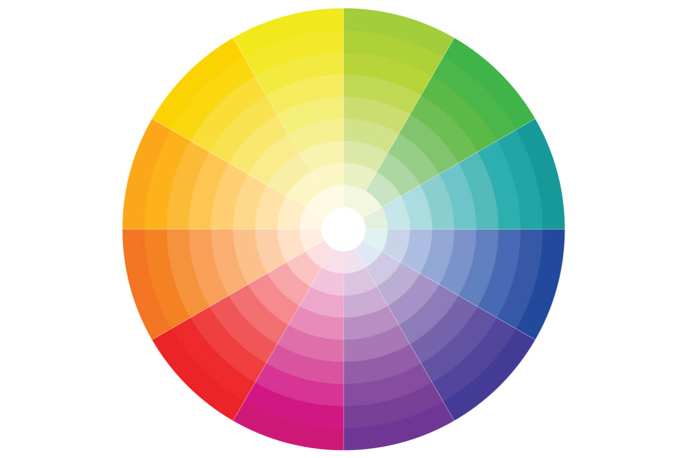
However, it’s necessary to distinguish different typologies within this family. On the one hand, there are the most striking and vibrant ones that, in the background, clearly stand out. And, on the other hand, there are the faint ones that lose strength and intensity in favor of a certain discoloration and paleness.
Obviously, we mustn’t think that by using a passion red or a bright yellow we’ll achieve a better result. The important thing is that we achieve a basic objective: a good choice can help us to create the right combination.
Matte orange qualities
The application of matte orange in decor can be done from different aspects. The first thing to keep in mind is that it is a different color from other oranges, but it doesn’t lose its own essence and it still has a certain influence. Let’s see some of its qualities:
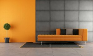
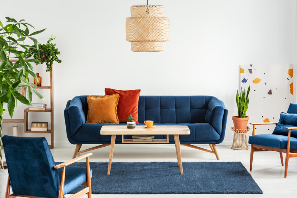
- In a living room it can be arranged as accessories such as sofa cushions, an armchair, or decorative objects to be placed on shelves or other surfaces. The idea is that it appears sporadically and with a certain subtlety.
- The oranges that we usually find in daily life can be a bit strident if we decide to have them on all the walls of a room. On the other hand, matte orange can be applied to a wall and coordinate very well with others colors such as green, white or gray.
- Is there a possibility that it may be present in the furniture? Although it is paradoxical, it can have a presence in this way, but it must be worked with other dark and light colors that allow it to counteract the striking effect that it can have.
- In styles such as rustic, it makes a lot of sense. This is basically due to its warm tone. In fact, you can establish a good relationship with materials such as wood or wrought iron. Thus, a sustainable principle in decor is achieved.
A different kitchen: matte orange
The matte orange has a virtue: to turn the place where you are into an idealized and different space. It has a place in the kitchen and, of course, opens up other aesthetic possibilities by breaking with classic and traditional precepts.
If we carefully analyze its virtues, it offers us many possibilities. For this reason, kitchen furniture is the main support where you can work with this color.
The feeling it generates is one of modernity, innovation and contemporaneity. The space is rejuvenated and a distinguished character is consolidated. In addition, it fits very well with appliances that are probably gray or white.
Using matte orange in the bedroom
If we want to use matte orange in the bedroom, we must bear in mind that it’ll achieve greater vivacity, lucidity and warmth. These principles will be present from the first moment, unlike the neutral and dark ones.
Even so, they can be combined with each other and work elegance with modernity. Undoubtedly, we’re going to create a special and refreshing space. In fact, it may cheer our spirits and activate our emotions. Actually, it’s pleasing to the eye no matter where you look.
What colors are best for the home? We’ve probably asked ourselves this question on more than one occasion. We not only want a suitable combination, but also originality and distinction. For this reason, we’re going to learn about the use of matte orange in decoration.
Generally, we tend to use neutral tones related to others that may be more striking. It’s a way to achieve a certain balance without producing too strict a contrast. The idea is that there’s a process of dialogue and agreement.
In this sense, it’s necessary to know some types of colors that, after all, have something to say in interiors. Instead of falling into conventions, why not look for another alternative that still suits your needs? The time has come to change.
The importance of warm colors
Without a doubt, it’s the warm range that offers an attractive, singular and placid aesthetic appearance. They’re captivating and, at the first glance, provide pleasant sensations. This is essential if we want to achieve chromatic harmony.
However, it’s necessary to distinguish different typologies within this family. On the one hand, there are the most striking and vibrant ones that, in the background, clearly stand out. And, on the other hand, there are the faint ones that lose strength and intensity in favor of a certain discoloration and paleness.
Obviously, we mustn’t think that by using a passion red or a bright yellow we’ll achieve a better result. The important thing is that we achieve a basic objective: a good choice can help us to create the right combination.
Matte orange qualities
The application of matte orange in decor can be done from different aspects. The first thing to keep in mind is that it is a different color from other oranges, but it doesn’t lose its own essence and it still has a certain influence. Let’s see some of its qualities:
- In a living room it can be arranged as accessories such as sofa cushions, an armchair, or decorative objects to be placed on shelves or other surfaces. The idea is that it appears sporadically and with a certain subtlety.
- The oranges that we usually find in daily life can be a bit strident if we decide to have them on all the walls of a room. On the other hand, matte orange can be applied to a wall and coordinate very well with others colors such as green, white or gray.
- Is there a possibility that it may be present in the furniture? Although it is paradoxical, it can have a presence in this way, but it must be worked with other dark and light colors that allow it to counteract the striking effect that it can have.
- In styles such as rustic, it makes a lot of sense. This is basically due to its warm tone. In fact, you can establish a good relationship with materials such as wood or wrought iron. Thus, a sustainable principle in decor is achieved.
A different kitchen: matte orange
The matte orange has a virtue: to turn the place where you are into an idealized and different space. It has a place in the kitchen and, of course, opens up other aesthetic possibilities by breaking with classic and traditional precepts.
If we carefully analyze its virtues, it offers us many possibilities. For this reason, kitchen furniture is the main support where you can work with this color.
The feeling it generates is one of modernity, innovation and contemporaneity. The space is rejuvenated and a distinguished character is consolidated. In addition, it fits very well with appliances that are probably gray or white.
Using matte orange in the bedroom
If we want to use matte orange in the bedroom, we must bear in mind that it’ll achieve greater vivacity, lucidity and warmth. These principles will be present from the first moment, unlike the neutral and dark ones.
Even so, they can be combined with each other and work elegance with modernity. Undoubtedly, we’re going to create a special and refreshing space. In fact, it may cheer our spirits and activate our emotions. Actually, it’s pleasing to the eye no matter where you look.
All cited sources were thoroughly reviewed by our team to ensure their quality, reliability, currency, and validity. The bibliography of this article was considered reliable and of academic or scientific accuracy.
- Atkins, Caroline:Colorea tu hogar, Londres, Ceac, 2003.
- Lluch, Francisco Javier: Arte de armonizar los colores, Barcelona, Imprenta de El Provenir, 1858.


