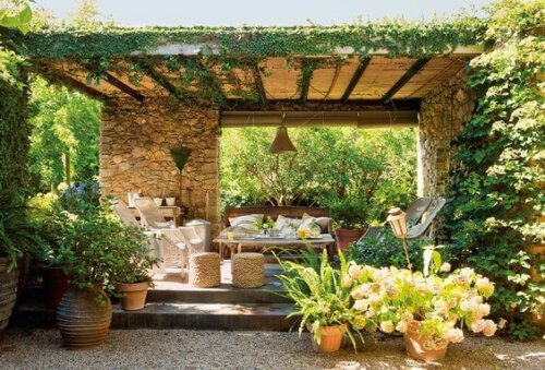
Using a Fresh Color Palette For Summer
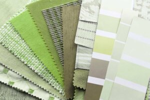
Sunny days and good weather can change your mood for the better. So, it’s time to find inspiration in nature and use a fresh color palette to bring the summer into your home.
You may not think about the importance of interior design. It’s about If you think your home needs a change, it’s time to look for an alternative to freshen it up.
The things you use will help you change the interior design and will offer new ideas. This is a way to freshen up your home and improve your wellbeing.
Seasons can influence decoration styles
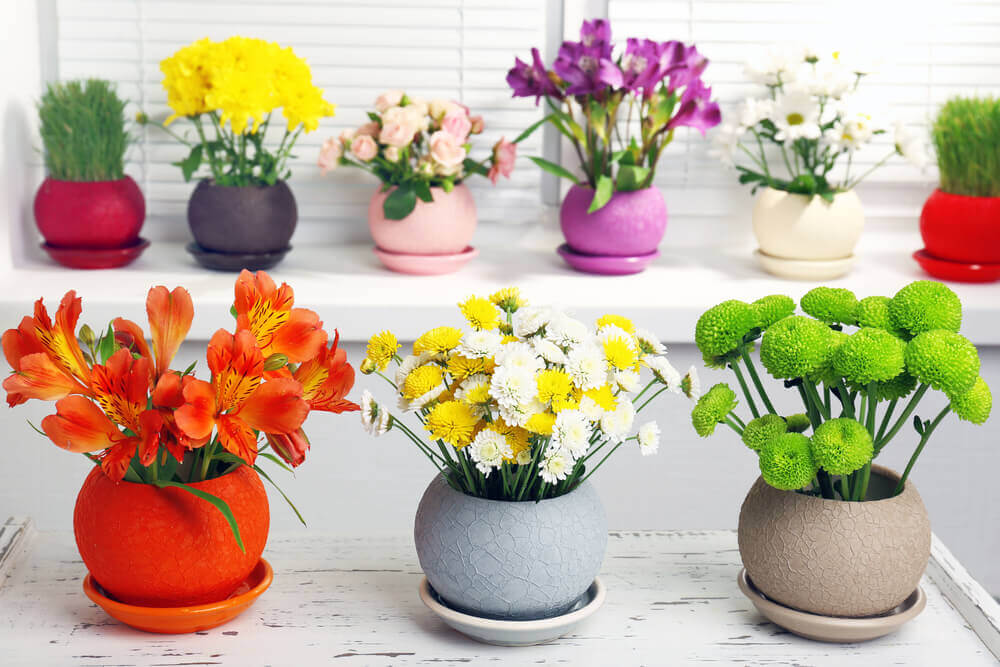
Summer uses spring’s colors and gives you a sense of light and warmth, using yellow and earthy tones. This is a trend you can see and take inspiration from.
Summer can give you all kinds of sensations but, above all, it can make you feel good.
Using a fresh color palette to welcome the summer
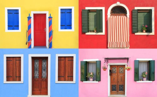
When choosing colors that can transmit that summer feeling, it’s important to know their qualities and what they can offer you. They must give you a feeling of warmth and comfort. Here are three interesting options:
- A caramel shade. This is between ocher and beige, which means it has an earthy and smooth feel to it. It’s perfect for a lounge or a room with furniture and other decorative elements in neutral shades.
- Salmon or coral. These are a must in any home because they’re pale but not harsh. They’re not too strong but they can give you a warmth that looks great. They fit well with dark wooden furniture.
- Mustard. You won’t see this in many homes, but it can bring a lot of light and spark to any area. It matches well with white and, even, some shades of light blue.
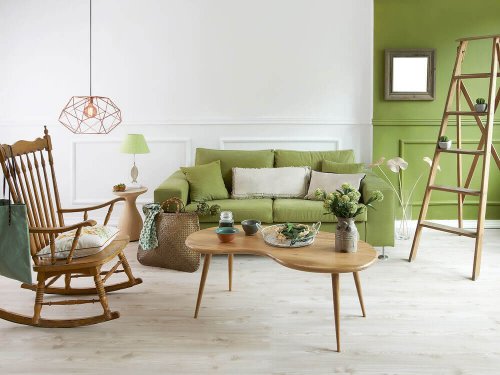
Pistachio green is part of our fresh colors palette
To freshen up your home, use vibrant hues that look great. Pistacchio green is one of these hues. It works great in different areas, although it’s unusual to see it in bathrooms or kitchens.
In the living room, people usually match pistachio green with white walls, but it looks great on cushions or a simple rug.
Avoid using it too much because it can be too stimulating. Besides, being a lively color, it puts you in contact with nature because it offers an organic character.
Pistachio green creates an active, youthful, and lively atmosphere capable of awaking all of your senses.
Matching white and blue
When talking about a palette of fresh colors, it’s worth noting how matching blue and white can create a peaceful environment. This mix creates an effect related to the sea world and transmits a feeling of cleanliness.
Without a doubt, the color white is a purifying shade and helps light move around any space. Don’t forget that natural lighting is important to make any room look and feel more comfortable and peaceful.
It’s worth mentioning that walls and furniture can be of both colors, but how about the floors? Wooden floors can add that warmth and contrast against a harmonious and stable combination.
Sunny days and good weather can change your mood for the better. So, it’s time to find inspiration in nature and use a fresh color palette to bring the summer into your home.
You may not think about the importance of interior design. It’s about If you think your home needs a change, it’s time to look for an alternative to freshen it up.
The things you use will help you change the interior design and will offer new ideas. This is a way to freshen up your home and improve your wellbeing.

Seasons can influence decoration styles
Summer uses spring’s colors and gives you a sense of light and warmth, using yellow and earthy tones. This is a trend you can see and take inspiration from.
Summer can give you all kinds of sensations but, above all, it can make you feel good.

Using a fresh color palette to welcome the summer
When choosing colors that can transmit that summer feeling, it’s important to know their qualities and what they can offer you. They must give you a feeling of warmth and comfort. Here are three interesting options:
- A caramel shade. This is between ocher and beige, which means it has an earthy and smooth feel to it. It’s perfect for a lounge or a room with furniture and other decorative elements in neutral shades.
- Salmon or coral. These are a must in any home because they’re pale but not harsh. They’re not too strong but they can give you a warmth that looks great. They fit well with dark wooden furniture.
- Mustard. You won’t see this in many homes, but it can bring a lot of light and spark to any area. It matches well with white and, even, some shades of light blue.

Pistachio green is part of our fresh colors palette
To freshen up your home, use vibrant hues that look great. Pistacchio green is one of these hues. It works great in different areas, although it’s unusual to see it in bathrooms or kitchens.
In the living room, people usually match pistachio green with white walls, but it looks great on cushions or a simple rug.
Avoid using it too much because it can be too stimulating. Besides, being a lively color, it puts you in contact with nature because it offers an organic character.
Pistachio green creates an active, youthful, and lively atmosphere capable of awaking all of your senses.
Matching white and blue
When talking about a palette of fresh colors, it’s worth noting how matching blue and white can create a peaceful environment. This mix creates an effect related to the sea world and transmits a feeling of cleanliness.
Without a doubt, the color white is a purifying shade and helps light move around any space. Don’t forget that natural lighting is important to make any room look and feel more comfortable and peaceful.
It’s worth mentioning that walls and furniture can be of both colors, but how about the floors? Wooden floors can add that warmth and contrast against a harmonious and stable combination.
All cited sources were thoroughly reviewed by our team to ensure their quality, reliability, currency, and validity. The bibliography of this article was considered reliable and of academic or scientific accuracy.
- Lluch, Francisco Javier: Arte de armonizar los colores, Imprenta de El Porvenir, Barcelona, 1858.
