Take a Peek into the Microsoft Vienna Headquarters Decor
In today’s article, we’re going to tell you all about the decor in the Microsoft Vienna headquarters.
In this day and age, we pay a lot more attention to the decor schemes in our workplaces. That’s true whether you’re dealing with an office building, home office, or a major company’s headquarters, which is what we’re focusing on today. There’s no doubt that a nice decor scheme can make workers feel more relaxed and comfortable.
In the case of the Microsoft Vienna headquarters, the Austrian architectural firm Innocad headed the project. As you’ll see on their web page, their projects always have a clear meaning and purpose. On top of that, they also tend to break from convention. They take inspiration from lots of different sources.
Each one of their projects has a central idea or theme as its backbone. In the case of Microsoft’s new headquarters, as you’ll see below, that idea is nature.
The presence of natural elements
In every single room in this building, you’ll see a reference to some natural element, such as water, plants, or wood. The most interesting thing of all is that only one of those things is present in any given room. There’s never a blend.
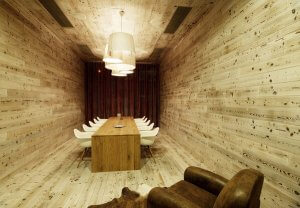
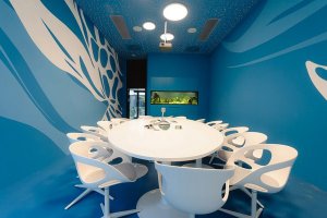
For example, in one of the rooms, all the walls are painted different shades of blue. Meanwhile, in another room, the walls and ceiling are entirely covered in wood. In yet another room, there are lots of plants and green elements.
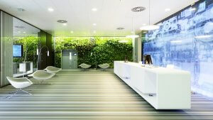
In fact, there are some rooms with ceilings entirely covered by a vertical garden! We’ve written some other articles where we talk about the benefits of having plants indoors, so you know we’re especially big fans of this. But taking that natural world even farther, there’s another room with an aquarium in it!
The best part about each room having a different decor scheme is that people can choose where they want to work every day, depending on their mood or what they feel like at a particular moment. There are no fixed offices, which might sound strange at first. Like we said: people choose where they want to work.
The colors in the Microsoft Vienna headquarters
Knowing the natural elements they’ve used in the decor scheme here, you can probably guess what the colors they’ve used most are. In no particular order, green, blue, brown, and white are probably the most common.
Of course, they’re all present in different ways depending on the room, but you’ll definitely see them around the floor in various bars of color. White is especially common in the furniture.
You also have to note the kind of lighting they’ve used. In some cases, they rely on natural lighting, with big windows in strategic places. In other cases, they use artificial lighting from different kinds of lamps, depending on the space.
Even though each room only has one color (with multiple different shades), the spaces never feel overloaded at all. There’s always a sense of balance and natural energy. Every room in these Vienna offices has different colors, materials, and textures. But in spite of that, there’s a consistent sense of good taste and practicality.
Practical, functional furniture
Lastly, we couldn’t talk about the Microsoft Vienna headquarters without mentioning the furniture. Most of it has simple, organic lines, and is in white. There are some exceptions, though.
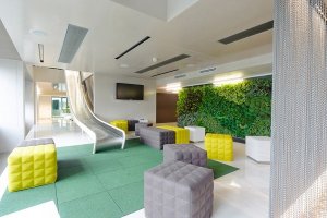
You probably wouldn’t believe us if not for the picture above, but there are even slides in some rooms to go down a floor! You’ll also see square puff chairs in three different colors: white, green, and gray. The nice thing about these kinds of chairs is that they’re easy to move, which makes them a very flexible seating option.
In some of the other rooms, the chairs are entirely round and made of rubber. Once again, they’re very practical and simple.
So, as you can see, these are offices with plenty of references to the natural world. This has been a popular trend in recent years in the interior design world, in both homes and office buildings. It makes you want to work for Microsoft and move to Vienna, doesn’t it?
In today’s article, we’re going to tell you all about the decor in the Microsoft Vienna headquarters.
In this day and age, we pay a lot more attention to the decor schemes in our workplaces. That’s true whether you’re dealing with an office building, home office, or a major company’s headquarters, which is what we’re focusing on today. There’s no doubt that a nice decor scheme can make workers feel more relaxed and comfortable.
In the case of the Microsoft Vienna headquarters, the Austrian architectural firm Innocad headed the project. As you’ll see on their web page, their projects always have a clear meaning and purpose. On top of that, they also tend to break from convention. They take inspiration from lots of different sources.
Each one of their projects has a central idea or theme as its backbone. In the case of Microsoft’s new headquarters, as you’ll see below, that idea is nature.
The presence of natural elements
In every single room in this building, you’ll see a reference to some natural element, such as water, plants, or wood. The most interesting thing of all is that only one of those things is present in any given room. There’s never a blend.

For example, in one of the rooms, all the walls are painted different shades of blue. Meanwhile, in another room, the walls and ceiling are entirely covered in wood. In yet another room, there are lots of plants and green elements.
In fact, there are some rooms with ceilings entirely covered by a vertical garden! We’ve written some other articles where we talk about the benefits of having plants indoors, so you know we’re especially big fans of this. But taking that natural world even farther, there’s another room with an aquarium in it!
The best part about each room having a different decor scheme is that people can choose where they want to work every day, depending on their mood or what they feel like at a particular moment. There are no fixed offices, which might sound strange at first. Like we said: people choose where they want to work.
The colors in the Microsoft Vienna headquarters
Knowing the natural elements they’ve used in the decor scheme here, you can probably guess what the colors they’ve used most are. In no particular order, green, blue, brown, and white are probably the most common.
Of course, they’re all present in different ways depending on the room, but you’ll definitely see them around the floor in various bars of color. White is especially common in the furniture.

You also have to note the kind of lighting they’ve used. In some cases, they rely on natural lighting, with big windows in strategic places. In other cases, they use artificial lighting from different kinds of lamps, depending on the space.
Even though each room only has one color (with multiple different shades), the spaces never feel overloaded at all. There’s always a sense of balance and natural energy. Every room in these Vienna offices has different colors, materials, and textures. But in spite of that, there’s a consistent sense of good taste and practicality.
Practical, functional furniture
Lastly, we couldn’t talk about the Microsoft Vienna headquarters without mentioning the furniture. Most of it has simple, organic lines, and is in white. There are some exceptions, though.

You probably wouldn’t believe us if not for the picture above, but there are even slides in some rooms to go down a floor! You’ll also see square puff chairs in three different colors: white, green, and gray. The nice thing about these kinds of chairs is that they’re easy to move, which makes them a very flexible seating option.
In some of the other rooms, the chairs are entirely round and made of rubber. Once again, they’re very practical and simple.
So, as you can see, these are offices with plenty of references to the natural world. This has been a popular trend in recent years in the interior design world, in both homes and office buildings. It makes you want to work for Microsoft and move to Vienna, doesn’t it?
