Meet Very Peri: The Pantone Color of 2022

It’s official! Very Peri has been baptized as the Pantone color of 2022. This is a beautiful purple tone that seeks to represent modern life where face-to-face and virtual settings converge.
This color is very impressive on a visual level and takes inspiration from the tone of the periwinkle flower. It promises to fill your home with an abundance of brightness and vitality. Ready to know more about this shade? Keep reading!
Very Peri and its origins
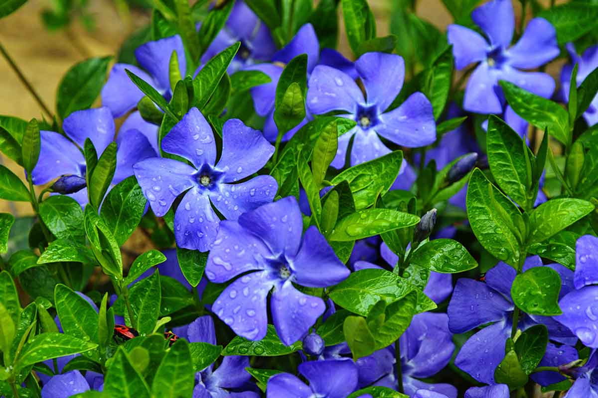
As we mentioned, Very Peri is inspired by the periwinkle or Catharanthus roseus. It’s a perennial herbaceous plant that belongs to the Apocynaceae family. At first glance, it looks like any other plant, but its flowers are particularly striking. These sprout as solitary buds in the axils of the leaves and their color is purple that sometimes appears bluish.
Its flowering occurs in the spring, at the beginning of March. The leaves are also popular as they’re attributed to health properties.
Sensations associated with the Pantone color of 2022
That intense and bright purple tone that’s been named Very Peri, the Pantone color of 2022, produces feelings of calm and tranquility, according to the psychology of color. According to this science, it’s also helpful in managing mental health problems and symptoms of nervousness.
In addition to being the color of creativity, it motivates professionals who need to generate ideas to get results. It makes interior spaces become fun areas in which the inhabitants will feel full, energetic, and at the same time calm. A whole carousel of good and positive sensations!
How to use Very Peri in your interior decor?
The purple color in excess can break those positive feelings we talked about. As such, it’s important to learn how to use it in home decor, how to combine it, and how to enhance it in the best way. If you’ve fallen in love with Very Peri so far, then read on.
Using Very Peri in the living room
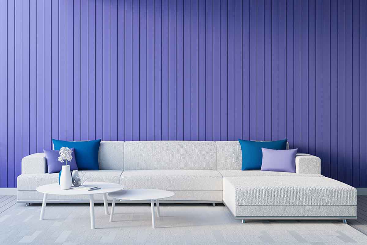
The living room is the perfect place to show off Very Peri. The best way to do it is through the use of textiles in this tone, including cushions, curtains, sofa throws, rugs, and even tablecloths.
Combinations for the Pantone color of 2022
This mystical and enchanting purple pairs perfectly with shades of white. This combination brings light and spaciousness to any space. In addition, it creates contrast and calms the eye, making an almost perfect impact.
On the other hand, it also goes very well with wood in light tones, white furniture, and some decorative accessories in black, gold, or metallic.
It’s perfect on the walls
Using Very Peri on the walls of the living room or other spaces will prove to be a huge success. However, you have to control yourself! This is a very powerful tone and if you apply it to all your walls the harmony you’re looking for will be lost. Ideally, choose a single wall as a focal point and paint the others white.
In the kitchen
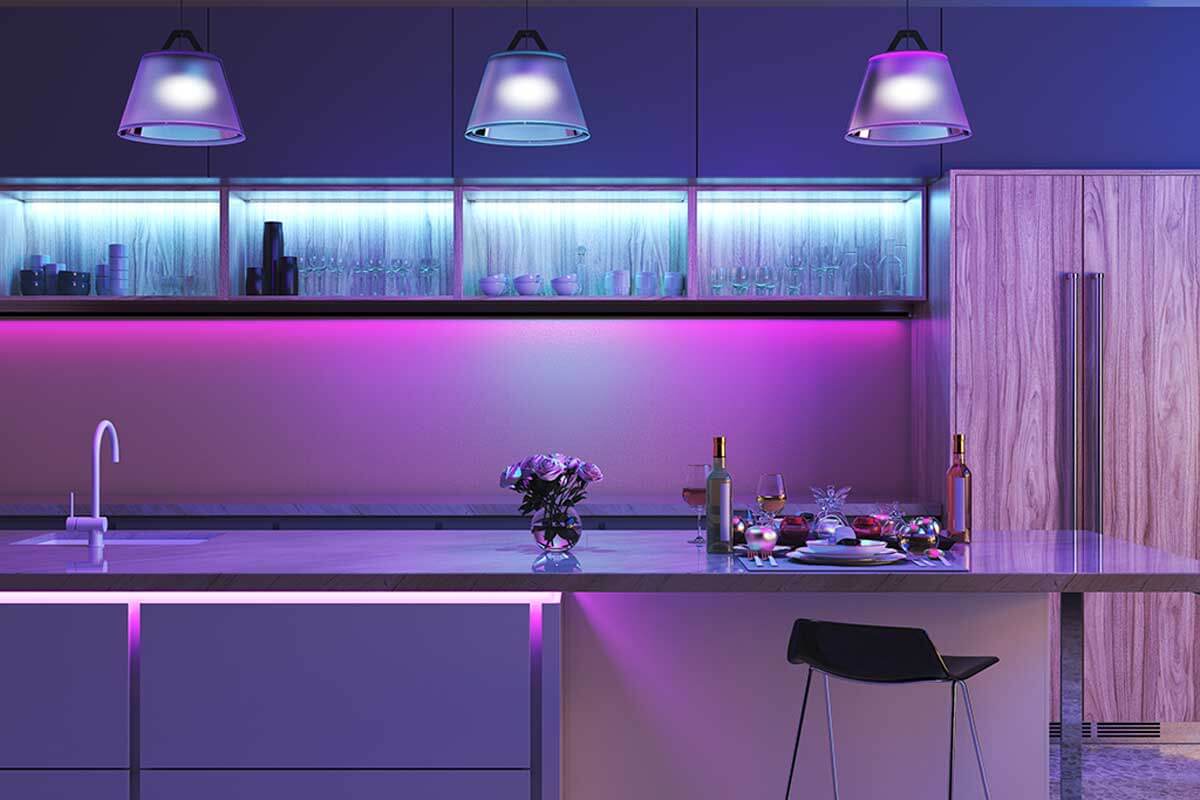
Choosing Very Peri for kitchens is very brave and daring. There are different ways to include it in this area of your home. One of them is through furniture and in that case, your countertop and walls should be white.
Now, if you have a large and spacious kitchen, it’ll be a great idea if you combine Very Peri on your furniture with a lighter shade of it on the walls.
Its use in the bathroom
The bathroom is another of the rooms where you can use Very Peri. You can do this through your furniture or the walls next to the sink or the shower. Without a doubt, this is a tone that shines with its own light for 2022.
Of course, remember not to overdo it because it could go to the extreme! It has the potential to go from a deep calm to uncomfortable chaos.
Where else can I use Very Peri?
This 2022 Pantone color will go very well with the other items in your home, such as your sofas, armchairs, lamps, paintings, and picture frames. Where else will you use it? One thing’s for sure, you’ll fall in love with it!
It’s official! Very Peri has been baptized as the Pantone color of 2022. This is a beautiful purple tone that seeks to represent modern life where face-to-face and virtual settings converge.
This color is very impressive on a visual level and takes inspiration from the tone of the periwinkle flower. It promises to fill your home with an abundance of brightness and vitality. Ready to know more about this shade? Keep reading!
Very Peri and its origins
As we mentioned, Very Peri is inspired by the periwinkle or Catharanthus roseus. It’s a perennial herbaceous plant that belongs to the Apocynaceae family. At first glance, it looks like any other plant, but its flowers are particularly striking. These sprout as solitary buds in the axils of the leaves and their color is purple that sometimes appears bluish.
Its flowering occurs in the spring, at the beginning of March. The leaves are also popular as they’re attributed to health properties.
Sensations associated with the Pantone color of 2022
That intense and bright purple tone that’s been named Very Peri, the Pantone color of 2022, produces feelings of calm and tranquility, according to the psychology of color. According to this science, it’s also helpful in managing mental health problems and symptoms of nervousness.
In addition to being the color of creativity, it motivates professionals who need to generate ideas to get results. It makes interior spaces become fun areas in which the inhabitants will feel full, energetic, and at the same time calm. A whole carousel of good and positive sensations!
How to use Very Peri in your interior decor?
The purple color in excess can break those positive feelings we talked about. As such, it’s important to learn how to use it in home decor, how to combine it, and how to enhance it in the best way. If you’ve fallen in love with Very Peri so far, then read on.
Using Very Peri in the living room
The living room is the perfect place to show off Very Peri. The best way to do it is through the use of textiles in this tone, including cushions, curtains, sofa throws, rugs, and even tablecloths.
Combinations for the Pantone color of 2022
This mystical and enchanting purple pairs perfectly with shades of white. This combination brings light and spaciousness to any space. In addition, it creates contrast and calms the eye, making an almost perfect impact.
On the other hand, it also goes very well with wood in light tones, white furniture, and some decorative accessories in black, gold, or metallic.
It’s perfect on the walls
Using Very Peri on the walls of the living room or other spaces will prove to be a huge success. However, you have to control yourself! This is a very powerful tone and if you apply it to all your walls the harmony you’re looking for will be lost. Ideally, choose a single wall as a focal point and paint the others white.
In the kitchen
Choosing Very Peri for kitchens is very brave and daring. There are different ways to include it in this area of your home. One of them is through furniture and in that case, your countertop and walls should be white.
Now, if you have a large and spacious kitchen, it’ll be a great idea if you combine Very Peri on your furniture with a lighter shade of it on the walls.
Its use in the bathroom
The bathroom is another of the rooms where you can use Very Peri. You can do this through your furniture or the walls next to the sink or the shower. Without a doubt, this is a tone that shines with its own light for 2022.
Of course, remember not to overdo it because it could go to the extreme! It has the potential to go from a deep calm to uncomfortable chaos.
Where else can I use Very Peri?
This 2022 Pantone color will go very well with the other items in your home, such as your sofas, armchairs, lamps, paintings, and picture frames. Where else will you use it? One thing’s for sure, you’ll fall in love with it!
All cited sources were thoroughly reviewed by our team to ensure their quality, reliability, currency, and validity. The bibliography of this article was considered reliable and of academic or scientific accuracy.
- Psicología del color. Escola D’Art I Superiorde Disseny de Vic. Disponible en: https://perio.unlp.edu.ar/catedras/iddi/wp-content/uploads/sites/125/2020/04/Psicologia-del-color.pdf


