Living Coral: 2019's Color of the Year
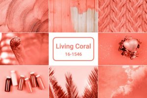
The color of the year is here, and it’s called Living Coral. Like we do every year around this time, we have been waiting anxiously for Pantone to announce the color of the year for 2019.
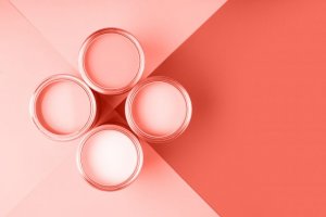
This year, they chose an orange-pink tone that’s both soft and vibrant. It fills you with warmth and energy. It gives off comfort and optimism at a time when the changes around us feel overwhelming.
The goal of Living Coral
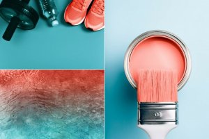
The Pantone Color Institute announced its decision a few days ago. They chose Living Coral. They wanted to push back against the growing influence of technology and social media, which absorb every part of our lives.
As humans, we’re constantly seeking unique experiences that bring us connection and intimacy. That’s why they chose this color in particular: it fills you with energy and makes you want to be social.
“Colour is an equalizing lens through which we experience our natural and digital realities, and this is particularly true for Living Coral,” says Leatrice Eiseman, the executive director of the Pantone Color Institute.
In the same statement, she also says: “With consumers craving human interaction and social connection, the humanizing and heartening qualities displayed by the convivial PANTONE Living Coral hit a responsive chord.”
What is Living Coral like as a color?
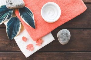
One of the strong points of Pantone 16-1546 (Living Coral) is that it gives off a feeling of optimism and makes you want to express yourself playfully, joyfully, and openly with other people.
The name is also a clear reference to the environment. “Lying at the center of our naturally vivid and chromatic ecosystem, PANTONE Living Coral is evocative of how coral reefs provide shelter to a diverse kaleidoscope of color.”
This is also the basis for an overall trend with marine colors: patterns, decorative motifs, prints, etc…Just watch and see, our homes are going to turn into coral reefs soon enough.
What does Living Coral go well with?
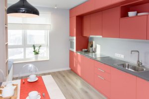
Living Coral is not a subtle color. But it’s still very soft, which makes it easy on the eyes. If you don’t want to take too much of a risk you can add it here and there on cushions, candles, or other accessories.
If you’re willing to take a bigger leap, you can paint your walls or furniture this color. You’ll love the way it looks, and it’ll fill your spaces up with light and lots of energy.
The colors it goes best with are dark grays and blues, which give it a modern feel. Beige and neutral tones are also great if you want more of a soft, warm, and inviting feel.
What’s the Pantone Color Institute?
According to their page, this institute works with color. They predict global color trends and do color consultations for businesses when they’re developing products and brand identity.
The Pantone Color Institute combines those two things with color psychology to help companies take advantage of the way colors make us feel in their market strategies.
It’s time to say goodbye to Ultraviolet, which had a respectable reign during 2018. Last year’s color was about introspection, meditation, and spirituality. It’s time to open ourselves up to the world. To leave social media behind, and focus on the threats to our world.
It won’t be long for the decoration and fashion worlds to pick up on this color. It transports us into a tropical paradise and sprays our houses, restaurants, closets, and graphic design concepts with the salt of the sea. What do you think of it?
The color of the year is here, and it’s called Living Coral. Like we do every year around this time, we have been waiting anxiously for Pantone to announce the color of the year for 2019.
This year, they chose an orange-pink tone that’s both soft and vibrant. It fills you with warmth and energy. It gives off comfort and optimism at a time when the changes around us feel overwhelming.
The goal of Living Coral

The Pantone Color Institute announced its decision a few days ago. They chose Living Coral. They wanted to push back against the growing influence of technology and social media, which absorb every part of our lives.
As humans, we’re constantly seeking unique experiences that bring us connection and intimacy. That’s why they chose this color in particular: it fills you with energy and makes you want to be social.
“Colour is an equalizing lens through which we experience our natural and digital realities, and this is particularly true for Living Coral,” says Leatrice Eiseman, the executive director of the Pantone Color Institute.
In the same statement, she also says: “With consumers craving human interaction and social connection, the humanizing and heartening qualities displayed by the convivial PANTONE Living Coral hit a responsive chord.”
What is Living Coral like as a color?

One of the strong points of Pantone 16-1546 (Living Coral) is that it gives off a feeling of optimism and makes you want to express yourself playfully, joyfully, and openly with other people.
The name is also a clear reference to the environment. “Lying at the center of our naturally vivid and chromatic ecosystem, PANTONE Living Coral is evocative of how coral reefs provide shelter to a diverse kaleidoscope of color.”
This is also the basis for an overall trend with marine colors: patterns, decorative motifs, prints, etc…Just watch and see, our homes are going to turn into coral reefs soon enough.
What does Living Coral go well with?

Living Coral is not a subtle color. But it’s still very soft, which makes it easy on the eyes. If you don’t want to take too much of a risk you can add it here and there on cushions, candles, or other accessories.
If you’re willing to take a bigger leap, you can paint your walls or furniture this color. You’ll love the way it looks, and it’ll fill your spaces up with light and lots of energy.
The colors it goes best with are dark grays and blues, which give it a modern feel. Beige and neutral tones are also great if you want more of a soft, warm, and inviting feel.
What’s the Pantone Color Institute?

According to their page, this institute works with color. They predict global color trends and do color consultations for businesses when they’re developing products and brand identity.
The Pantone Color Institute combines those two things with color psychology to help companies take advantage of the way colors make us feel in their market strategies.
It’s time to say goodbye to Ultraviolet, which had a respectable reign during 2018. Last year’s color was about introspection, meditation, and spirituality. It’s time to open ourselves up to the world. To leave social media behind, and focus on the threats to our world.
It won’t be long for the decoration and fashion worlds to pick up on this color. It transports us into a tropical paradise and sprays our houses, restaurants, closets, and graphic design concepts with the salt of the sea. What do you think of it?

