Copper Colors: Tips on Colors to Use With Copper

Copper colors have become fashionable for decorating. This color pops up in decoration magazines, rustic or industrial environments, and even in modern stores.
If you want to get involved in this trend, we’ll give you tips in this article for working copper into your decoration.
Ideas for combining copper colors with pastels
One of the best combinations that exist is copper and pastels. This pairing is used commonly in Nordic and Scandinavian styles, both very chic design trends.
The mixture with pastel colors is also simple to achieve, but you should consider certain factors.
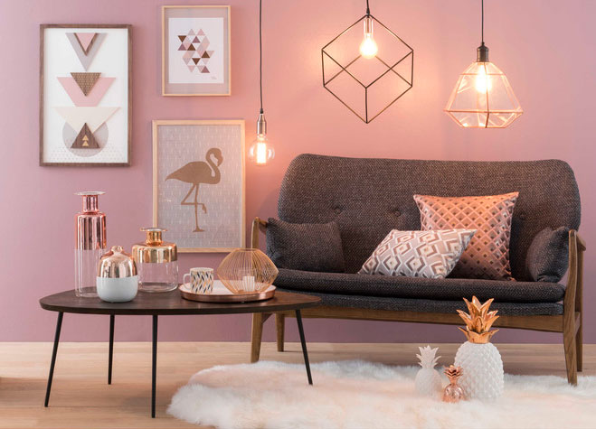
1. Use copper as a highlight
Combining colors is truly an art. If you want to pair copper colors with pastels, we recommend you use the metallic hue for ornaments and decorative objects (lamps, paintings, mirrors, planters, etc.) You can use pastels for walls, textiles, and some furniture, such as the sofa.
2. Add some white
You can also choose to use some ochre tones. You can create a warm atmosphere without being overbearing. Also, if you don’t like the idea of painting a wall in pastel – leave it white! In addition, take advantage of this beautiful tone for those little details that will make all the difference between beautiful decoration and something overbearing.
3. Take advantage of natural light
If you already have copper, pastels, and white, what else do you need to make it perfect? Natural light! Therefore, we recommend that when combining these colors, you choose an environment with large windows or with lots of sun coming in.
This allows you to truly show off your decoration. Keep in mind that the sun’s rays will make the metallic objects sparkle wonderfully.
Ideas to combine copper with bronze
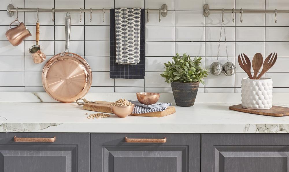
Believe it or not, these metallic tones go great together. More and more designers are using them in their decorations, even over gold and silver. Pairing these tones results in a beautiful, elegant, and original scheme. Here are some ideas to combine copper and bronze:
1. Choose the style
If you use these two tones, you should keep in mind they generally only pair with a handful of decorative styles. They usually go well with industrial, Nordic, and rustic styles (ideal for kitchens). If you’re a fan of these styles, you can use both these colors in your home.
2. Go ahead and put them anywhere
A pipe can become a coat rack, a recycled structure can become a shelf for books or towels, some cans varnished in bronze or copper colors can become planters… There are thousands of options at your disposal.
You can even paint these colors on the edge of the window or door, the shower, frames, the handrail of the staircase, the bed frame of the legs of a table.
3. Choose colors that pair well with both
Since everything can’t be copper or bronze, you should choose other colors that look great with both, such as white, black, gray, or earthy tones. The good thing about copper and bronze is that they pair well with several other options.
More options to combine with copper colors
Maybe you’re not a fan of pastel colors or you don’t like the idea of pairing copper and bronze. Don’t worry! There are many other options that could work well in your home:
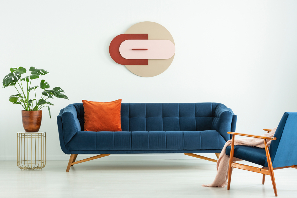
1. Cobalt blue
This is an explosive tone that breaks away from the norm, pairs great with copper, and bring personality into your space. Preferably, use more blue in your scheme than copper.
2. Green
The dark green combined with copper gives a very formal and professional aspect to the environment. Ideal for an office, desk, or conference room.
3. Turquoise
Contrary to copper and green, turquoise and copper are perfect for a youthful, cheerful, and informal room. If you’re looking for an option to decorate your child’s room, this duo could be interesting.
As you can see, combining copper colors with other colors is much easier than you think.
Copper colors have become fashionable for decorating. This color pops up in decoration magazines, rustic or industrial environments, and even in modern stores.
If you want to get involved in this trend, we’ll give you tips in this article for working copper into your decoration.
Ideas for combining copper colors with pastels
One of the best combinations that exist is copper and pastels. This pairing is used commonly in Nordic and Scandinavian styles, both very chic design trends.
The mixture with pastel colors is also simple to achieve, but you should consider certain factors.
1. Use copper as a highlight
Combining colors is truly an art. If you want to pair copper colors with pastels, we recommend you use the metallic hue for ornaments and decorative objects (lamps, paintings, mirrors, planters, etc.) You can use pastels for walls, textiles, and some furniture, such as the sofa.
2. Add some white
You can also choose to use some ochre tones. You can create a warm atmosphere without being overbearing. Also, if you don’t like the idea of painting a wall in pastel – leave it white! In addition, take advantage of this beautiful tone for those little details that will make all the difference between beautiful decoration and something overbearing.
3. Take advantage of natural light
If you already have copper, pastels, and white, what else do you need to make it perfect? Natural light! Therefore, we recommend that when combining these colors, you choose an environment with large windows or with lots of sun coming in.
This allows you to truly show off your decoration. Keep in mind that the sun’s rays will make the metallic objects sparkle wonderfully.
Ideas to combine copper with bronze
Believe it or not, these metallic tones go great together. More and more designers are using them in their decorations, even over gold and silver. Pairing these tones results in a beautiful, elegant, and original scheme. Here are some ideas to combine copper and bronze:
1. Choose the style
If you use these two tones, you should keep in mind they generally only pair with a handful of decorative styles. They usually go well with industrial, Nordic, and rustic styles (ideal for kitchens). If you’re a fan of these styles, you can use both these colors in your home.
2. Go ahead and put them anywhere
A pipe can become a coat rack, a recycled structure can become a shelf for books or towels, some cans varnished in bronze or copper colors can become planters… There are thousands of options at your disposal.
You can even paint these colors on the edge of the window or door, the shower, frames, the handrail of the staircase, the bed frame of the legs of a table.
3. Choose colors that pair well with both
Since everything can’t be copper or bronze, you should choose other colors that look great with both, such as white, black, gray, or earthy tones. The good thing about copper and bronze is that they pair well with several other options.
More options to combine with copper colors
Maybe you’re not a fan of pastel colors or you don’t like the idea of pairing copper and bronze. Don’t worry! There are many other options that could work well in your home:
1. Cobalt blue
This is an explosive tone that breaks away from the norm, pairs great with copper, and bring personality into your space. Preferably, use more blue in your scheme than copper.
2. Green
The dark green combined with copper gives a very formal and professional aspect to the environment. Ideal for an office, desk, or conference room.
3. Turquoise
Contrary to copper and green, turquoise and copper are perfect for a youthful, cheerful, and informal room. If you’re looking for an option to decorate your child’s room, this duo could be interesting.
As you can see, combining copper colors with other colors is much easier than you think.
All cited sources were thoroughly reviewed by our team to ensure their quality, reliability, currency, and validity. The bibliography of this article was considered reliable and of academic or scientific accuracy.
MetAs, G. (2009). Medición del color. La Guía MetAs.


