Learn How to Use Color Theory in Interior Design

There are so many details to consider when decorating a room: decor styles and eras, textiles and different materials. But your color preference will ultimately help you make many decisions. And it’s actually also where you begin to start decorating. That’s precisely why understanding how to use color theory is crucial for good interior design.
Today, we’re going back to the basics. In our post, we want to tackle basic color theory to help our readers use color effortlessly. Understanding the secrets of color and how they relate to each other will help you control the decor of all your rooms.
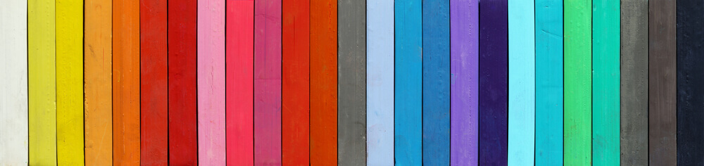
Color doesn’t only fill rooms with beauty. They also add give us character, personality, and emotions. Colors can make us feel happy, inspired, upbeat, calm and even refreshed and renewed. Let’s start by analyzing colors and asking ourselves how they make us feel?
Understanding how to use color – color theory
Who hasn’t studied the color wheel at some point? It’s time to dust off those memories and dig a little deeper into those concepts.
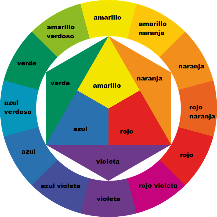
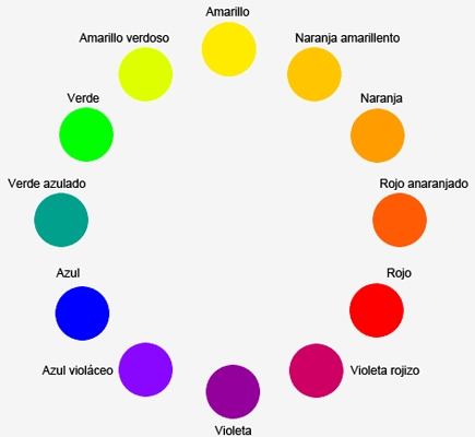
In order to understand how to use color in decor, you have to understand how light affects color. Light and color always go hand in hand. The color wheel actually represents how the twelve colors relate to one another.
While in reality there are actually only seven colors, the color wheel portrays twelve. Let’s find out why. This is basic color theory that can keep on expanding into an infinite number of tones. But let’s first start by reviewing the main colors and what they transmit.
Basic colors
Our first lesson will explain why we play with twelve colors instead of the basic seven. In short, there are three types of colors:
- Primary colors: red, blue and yellow. Primary colors can’t result from mixing other colors.
- Secondary colors: orange, purple and green. Primary colors mix with each other to create secondary colors.
- Tertiary colors: tertiary colors are the six tones that derive from mixing primary and secondary colors.
In order to learn how to use color in interior design, you have to understand that primary and secondary colors brighten up rooms instantly. Start by choosing one of the twelve tones on the color wheel. Use it as your base and choose your favorite tone in the range.
Finding a specific tone – light, shadow, and tone
Once you have your base color, it’s time to play around with the neutral colors to create new, different shades to find one you like. Neutral colors have an important impact on color. In interior design, there are color three techniques that use them:
- Light: brightening colors with white.
- Shadow: opposite of light, darkening a color with black.
- Mid-tone: similar to shadow, but using gray instead of black. Gray only slightly darkens a color.
Color temperature
Understanding color temperature is also key for good interior design. Temperature determines a color’s position on the wheel.
- Warm colors: reds, oranges, yellows. Warm colors are very vibrant and they transmit energy and life to decor.
- Cool colors: blues, purples and greens. Cool colors create serene, tranquil atmospheres.
When you’re deciding between warm and cool colors, take the time to think about not only the sensation you want to create but the size of your room as well. If you use cool colors in large settings, you might risk creating too cold of a setting. On the other hand, using warm colors for small settings can make them seem tighter and unpleasant.
Complementary colors

This is where using color gets easy. In order to find a color’s complement, you just need to jump to the other side of the color wheel. But using your base color as the main color and the complementary color only in accessories is crucial.
The complementary accents should make up 10% or 15% at most of the room’s entire color scheme. When you use complementary colors, they create a big contrast, making neutral colors a good tool to balance out the setting. Failing to balance the colors will result in a mess. Try using neutral colors in decor accessories or in an area that you want to make into a visual focal point.
If your complementary and neutral colors still seem too strong, try using split-complementary colors. Instead of choosing your base color’s exact complementary tone, use one of its split-complementary tones.
Or, you can also try a different complementary color technique that uses four colors in the same setting. Choose two base colors and the complementary color of each one.
Analogous colors
Analogous colors are simple and are almost always a safe bet. They use two primary colors and one tertiary color that derives from the former two. For analogous palettes, use the 60-30-10 technique. In other words, 60% of the main color, 30% of the complementary color and 10% of the accent color.
You can also use a neutral analogous palette. Just use the same ratios with black, white and gray. In interior design, the combination is what’s known as monochrome decor.
Square color scheme
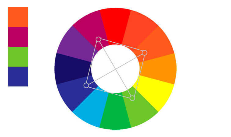
This color scheme also uses four colors, but they aren’t opposites. You need to choose them by drawing out a square on the color wheel and ensuring that one is a primary color, another secondary and the remaining two tertiary tones. With a square color scheme, use 60% of your main color and 10% of the other three in your setting.
There are so many details to consider when decorating a room: decor styles and eras, textiles and different materials. But your color preference will ultimately help you make many decisions. And it’s actually also where you begin to start decorating. That’s precisely why understanding how to use color theory is crucial for good interior design.
Today, we’re going back to the basics. In our post, we want to tackle basic color theory to help our readers use color effortlessly. Understanding the secrets of color and how they relate to each other will help you control the decor of all your rooms.
Color doesn’t only fill rooms with beauty. They also add give us character, personality, and emotions. Colors can make us feel happy, inspired, upbeat, calm and even refreshed and renewed. Let’s start by analyzing colors and asking ourselves how they make us feel?
Understanding how to use color – color theory
Who hasn’t studied the color wheel at some point? It’s time to dust off those memories and dig a little deeper into those concepts.
In order to understand how to use color in decor, you have to understand how light affects color. Light and color always go hand in hand. The color wheel actually represents how the twelve colors relate to one another.
While in reality there are actually only seven colors, the color wheel portrays twelve. Let’s find out why. This is basic color theory that can keep on expanding into an infinite number of tones. But let’s first start by reviewing the main colors and what they transmit.
Basic colors
Our first lesson will explain why we play with twelve colors instead of the basic seven. In short, there are three types of colors:
- Primary colors: red, blue and yellow. Primary colors can’t result from mixing other colors.
- Secondary colors: orange, purple and green. Primary colors mix with each other to create secondary colors.
- Tertiary colors: tertiary colors are the six tones that derive from mixing primary and secondary colors.
In order to learn how to use color in interior design, you have to understand that primary and secondary colors brighten up rooms instantly. Start by choosing one of the twelve tones on the color wheel. Use it as your base and choose your favorite tone in the range.
Finding a specific tone – light, shadow, and tone
Once you have your base color, it’s time to play around with the neutral colors to create new, different shades to find one you like. Neutral colors have an important impact on color. In interior design, there are color three techniques that use them:
- Light: brightening colors with white.
- Shadow: opposite of light, darkening a color with black.
- Mid-tone: similar to shadow, but using gray instead of black. Gray only slightly darkens a color.
Color temperature
Understanding color temperature is also key for good interior design. Temperature determines a color’s position on the wheel.
- Warm colors: reds, oranges, yellows. Warm colors are very vibrant and they transmit energy and life to decor.
- Cool colors: blues, purples and greens. Cool colors create serene, tranquil atmospheres.
When you’re deciding between warm and cool colors, take the time to think about not only the sensation you want to create but the size of your room as well. If you use cool colors in large settings, you might risk creating too cold of a setting. On the other hand, using warm colors for small settings can make them seem tighter and unpleasant.
Complementary colors
This is where using color gets easy. In order to find a color’s complement, you just need to jump to the other side of the color wheel. But using your base color as the main color and the complementary color only in accessories is crucial.
The complementary accents should make up 10% or 15% at most of the room’s entire color scheme. When you use complementary colors, they create a big contrast, making neutral colors a good tool to balance out the setting. Failing to balance the colors will result in a mess. Try using neutral colors in decor accessories or in an area that you want to make into a visual focal point.
If your complementary and neutral colors still seem too strong, try using split-complementary colors. Instead of choosing your base color’s exact complementary tone, use one of its split-complementary tones.
Or, you can also try a different complementary color technique that uses four colors in the same setting. Choose two base colors and the complementary color of each one.
Analogous colors
Analogous colors are simple and are almost always a safe bet. They use two primary colors and one tertiary color that derives from the former two. For analogous palettes, use the 60-30-10 technique. In other words, 60% of the main color, 30% of the complementary color and 10% of the accent color.
You can also use a neutral analogous palette. Just use the same ratios with black, white and gray. In interior design, the combination is what’s known as monochrome decor.
Square color scheme
This color scheme also uses four colors, but they aren’t opposites. You need to choose them by drawing out a square on the color wheel and ensuring that one is a primary color, another secondary and the remaining two tertiary tones. With a square color scheme, use 60% of your main color and 10% of the other three in your setting.


