Anti-Stress Colors for Your Home
Relaxation and disconnection are two concepts that we usually associate with our homes. We all like to walk through the door and let a restful feeling envelop us, but to achieve this, our decor is key. We’re going to explain more about anti-stress colors for your home.
The eyes are recipients of numerous images that, apparently, are nourished by chromaticism. If these are pleasant, then we achieve a state of inner well-being and, therefore, we feel that harmony is present.
It’s essential that there’s a concordance between the resources that make up our home interiors. From this, we conceive the idea of correlation and aesthetic stability that provides us with comfort, calm, and temperance.
Anti-stress colors: dark tones convey calm
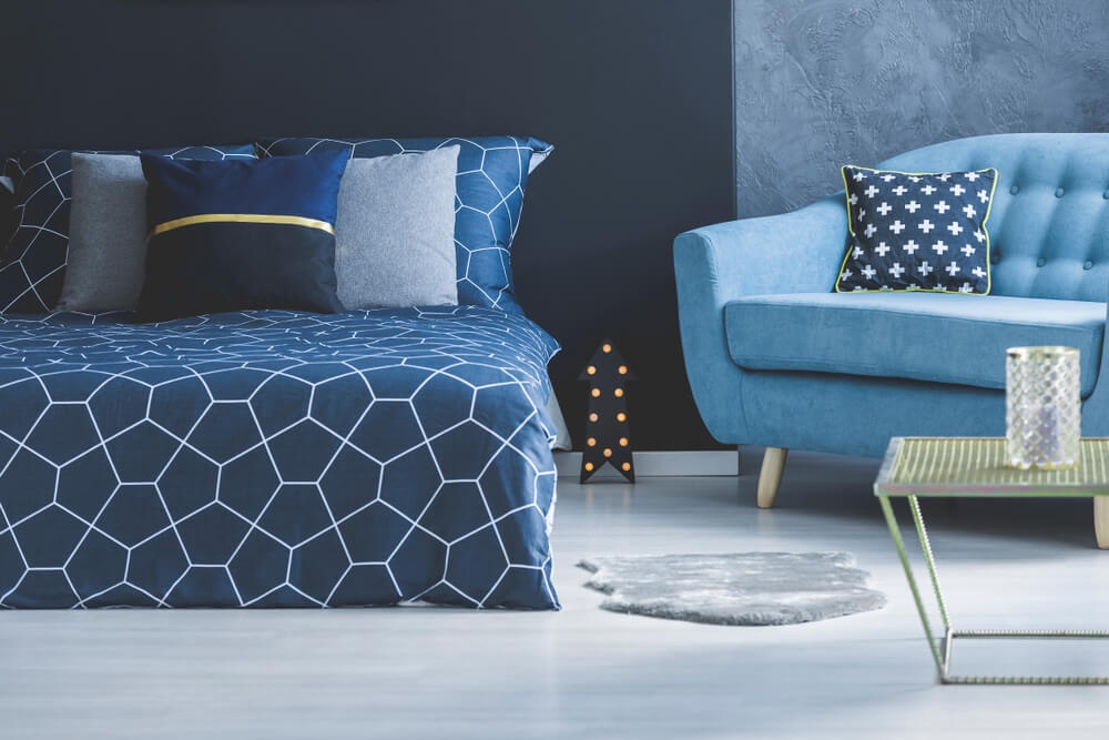
Within this color group, it’s necessary to mainly highlight the range of blues. Both indigo and navy blue are very closely related to each other.
Also, we must mention the family of green colors. Some, such as the bottle or the pine green, generate hope and, in turn, tranquility. Just with blue colors, they’re easily linked to other shades, such as neutrals and whites.
Dark colors offer a muted but accommodating look. Equally, they convey serenity, calm, and seriousness–as if they have a rather closed and gloomy character. Deep down, they directly influence the home.
Four shades and tones of anti-stress colors
When it comes to mentioning some of the most relaxing colors used in home interiors, we must choose those that are most appropriate for each room. Through them, we visually perceive feelings and subliminal experiences. Here are four shades and tones that offer a feeling of calm and reduce stress:
- Pastel pink is one of those tones that, surprisingly, transmits a feeling of calm and it’s relaxing. When it’s combined with warm colors, a unique and peaceful atmosphere is achieved. Its application with other shades is recommended to generate dynamism.
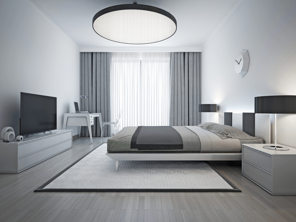
- The range of grays–both dark and light–also works well. It’s a good idea to add another warm and intense color for contrast since too much gray can be a little bland, feel dominating, and overwhelming.
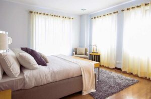
- Pastel blue is another of the most popular tones because it favors internal luminosity and softens the environment. Related to white, it helps to purify the room and completely clears our minds. In reality, it evokes feelings of the sky and, to a certain extent, water.
- In the event that you want to produce a more sophisticated and alternative effect, emerald blue is another feasible option for your walls. It’s preferable to use a dark shade in order to highlight the decorative resources that make up the space.
Anti-stress colors: white for purity and calm
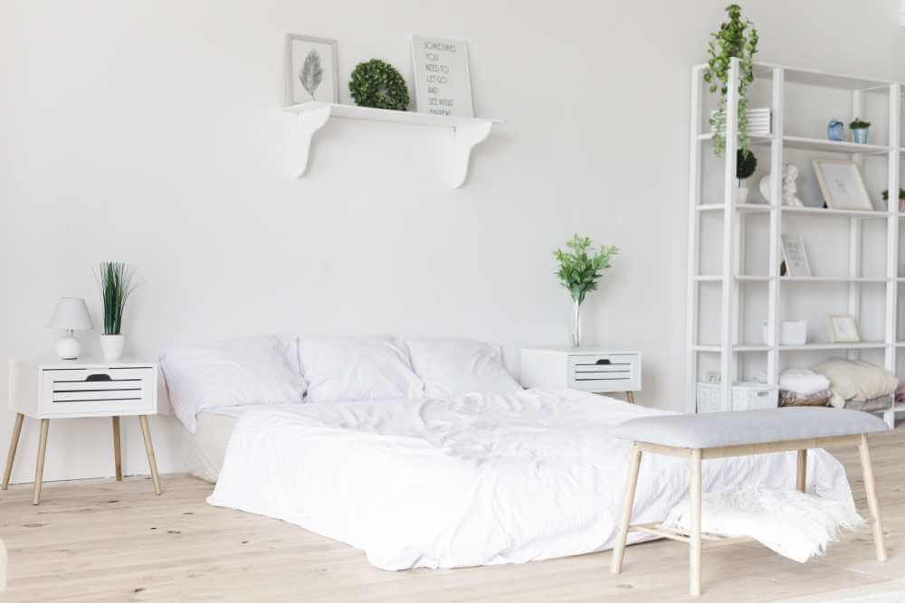
One of the best anti-stress colors is white. It promotes a feeling of hygiene and cleanliness and is great for enhancing the brightness of each room.
There are several shades such as off-white that tries to provide warmth without being too bright. In fact, it’s considered a dull color, but it offers a more palpable feel. Also, it calms the inner spirit.
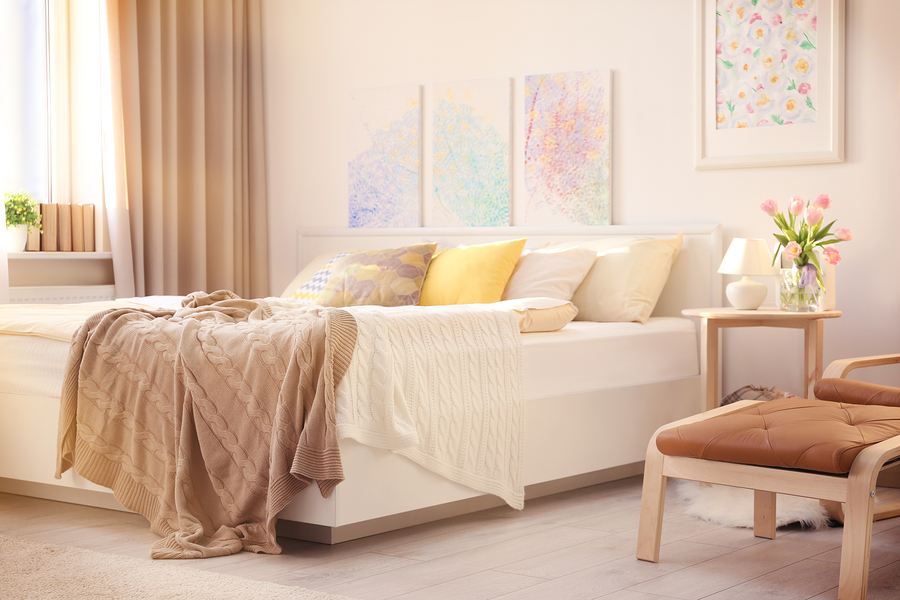
We associate white with purity. So it’s mainly used in bathrooms for the vision of health and cleanliness that it promotes. The refined character that it portrays means that it’s also appropriate for living rooms and bedrooms.
Warm tones are a good choice for anti-stress
Warm tones can’t be missing within our list of anti-stress colors. However, you need to know how to choose the most appropriate tones to generate a calm and stress-free environment.
Garnet is possibly the most underused warm tone for creating a feeling of calm. It’s one of the best choices, both for its elegant appearance and for the essence it possesses. Although it’s positioned closer to dark tones, it has the possibility to enhance interiors much more when it receives natural light.
Finally, special mention must be given to both beige and dark browns. These are suitable, for example, for rooms with wooden floors. Moreover, they convey naturalness, stability, greatness and temperance.
Main image: Pexels from Pixabay
Relaxation and disconnection are two concepts that we usually associate with our homes. We all like to walk through the door and let a restful feeling envelop us, but to achieve this, our decor is key. We’re going to explain more about anti-stress colors for your home.
The eyes are recipients of numerous images that, apparently, are nourished by chromaticism. If these are pleasant, then we achieve a state of inner well-being and, therefore, we feel that harmony is present.
It’s essential that there’s a concordance between the resources that make up our home interiors. From this, we conceive the idea of correlation and aesthetic stability that provides us with comfort, calm, and temperance.
Anti-stress colors: dark tones convey calm
Within this color group, it’s necessary to mainly highlight the range of blues. Both indigo and navy blue are very closely related to each other.
Also, we must mention the family of green colors. Some, such as the bottle or the pine green, generate hope and, in turn, tranquility. Just with blue colors, they’re easily linked to other shades, such as neutrals and whites.
Dark colors offer a muted but accommodating look. Equally, they convey serenity, calm, and seriousness–as if they have a rather closed and gloomy character. Deep down, they directly influence the home.
Four shades and tones of anti-stress colors
When it comes to mentioning some of the most relaxing colors used in home interiors, we must choose those that are most appropriate for each room. Through them, we visually perceive feelings and subliminal experiences. Here are four shades and tones that offer a feeling of calm and reduce stress:
- Pastel pink is one of those tones that, surprisingly, transmits a feeling of calm and it’s relaxing. When it’s combined with warm colors, a unique and peaceful atmosphere is achieved. Its application with other shades is recommended to generate dynamism.
- The range of grays–both dark and light–also works well. It’s a good idea to add another warm and intense color for contrast since too much gray can be a little bland, feel dominating, and overwhelming.
- Pastel blue is another of the most popular tones because it favors internal luminosity and softens the environment. Related to white, it helps to purify the room and completely clears our minds. In reality, it evokes feelings of the sky and, to a certain extent, water.
- In the event that you want to produce a more sophisticated and alternative effect, emerald blue is another feasible option for your walls. It’s preferable to use a dark shade in order to highlight the decorative resources that make up the space.
Anti-stress colors: white for purity and calm
One of the best anti-stress colors is white. It promotes a feeling of hygiene and cleanliness and is great for enhancing the brightness of each room.
There are several shades such as off-white that tries to provide warmth without being too bright. In fact, it’s considered a dull color, but it offers a more palpable feel. Also, it calms the inner spirit.
We associate white with purity. So it’s mainly used in bathrooms for the vision of health and cleanliness that it promotes. The refined character that it portrays means that it’s also appropriate for living rooms and bedrooms.
Warm tones are a good choice for anti-stress
Warm tones can’t be missing within our list of anti-stress colors. However, you need to know how to choose the most appropriate tones to generate a calm and stress-free environment.
Garnet is possibly the most underused warm tone for creating a feeling of calm. It’s one of the best choices, both for its elegant appearance and for the essence it possesses. Although it’s positioned closer to dark tones, it has the possibility to enhance interiors much more when it receives natural light.
Finally, special mention must be given to both beige and dark browns. These are suitable, for example, for rooms with wooden floors. Moreover, they convey naturalness, stability, greatness and temperance.
Main image: Pexels from Pixabay
All cited sources were thoroughly reviewed by our team to ensure their quality, reliability, currency, and validity. The bibliography of this article was considered reliable and of academic or scientific accuracy.
- Atkins, Caroline:Colorea tu hogar, Londres, Ceac, 2003.


