5 Striking Color Combinations for Your Home
Bright color combinations for your home are crucial in decoration and mean the difference between glorious success and complete failure. It’s possible to try too hard for a good result, and use low-risk color combinations. However, this can create the opposite effect and offer uncreative results that look like they’ve been hashed together.
There are also certain unusual combinations – which you would never expect – that work perfectly. Let’s have a look at some of the bold color combinations and how to apply them in your home – don’t miss out!
Great color combinations for your rooms
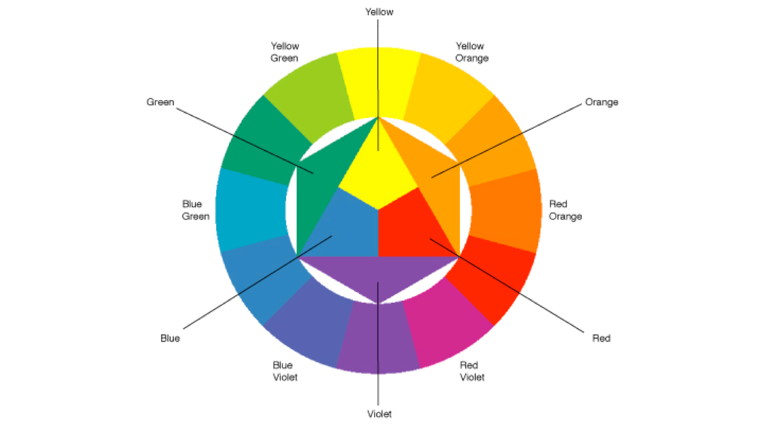
Although, in theory, many people know the best complementary color combinations, not everyone dares to put them into practice. This is because the shades contrast strongly when they’re on opposite sides of the Itten color wheel.
Despite the apparent risk, the truth is that they provide lively and energetic results. The contrasts are organic and you can create areas that are full of intensity with these combinations. They’re striking colors that match well and don’t look garish.
Contiguous tones create great atmospheres
Another way of making complementary color combinations for your home is by using what’s called analog combination. This technique is based on combining two to five colors that are side by side on the Itten wheel.
The effect you achieve in this case is a little different and doesn’t offer such an intense impact. It creates calmer rooms with harmony and softness. It can be a great hit in bedrooms, giving a touch of vitality.
It’s also a good idea to try the complementary combination separately. Again, the trick will be to look for the contiguous colors instead of the opposite ones. The right way to use this technique is to first choose a base color, if possible, a harmonious, soft one.
Then you take the two colors that are next to it for your accessories or complements. It creates a great contrast and works wonderfully.
The eye-catching colors you didn’t expect together – yellow with brown
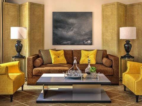
There are some striking color combinations that you would not have expected at all. One of the most surprising is the mixture of yellow and brown. At first glance, it might look a bit strange and too warm, and like something that wouldn’t work.
Instead, the yellow brings out the light and vitality that the brown tones need in a very organic way. Brown, on the other hand, gives the sobriety that yellow often requires to prevent it from looking too flashy or extravagant.
Pink and white give surprising results
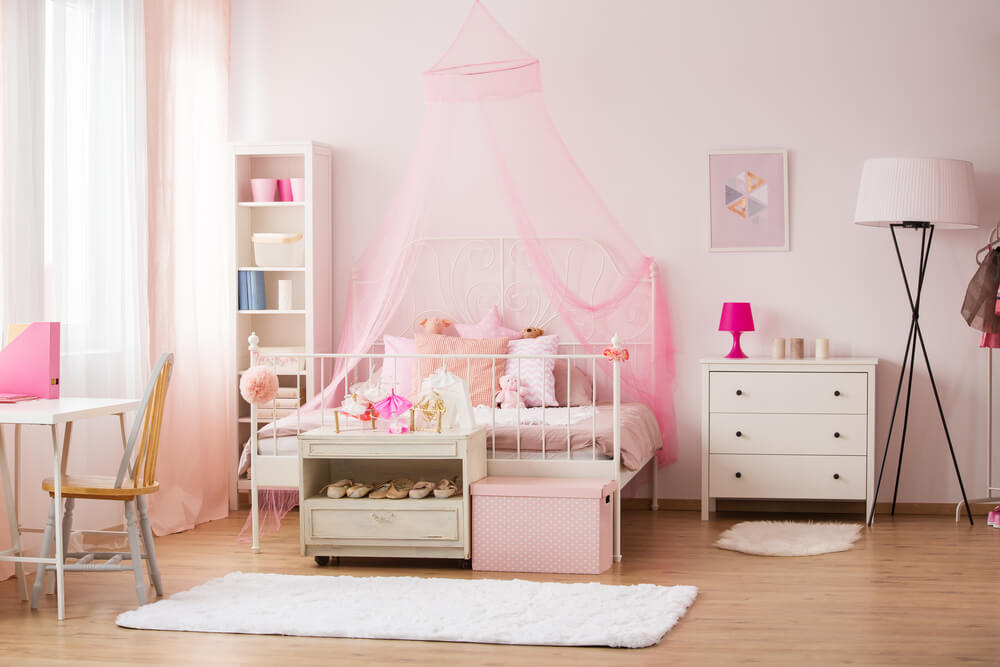
Soft pink is another one of those colors that we like to look at, but that seems difficult to combine. However, surprisingly, its greatest ally is one of the most obvious colors of all – white. This is a soft color, and very intimate, but it works and looks elegant. At the same time, it enhances the luminosity.
It’s a perfect option for small spaces that need depth. If you carry it out with elegance, then it gives a result that isn’t at all dull and adds personality.
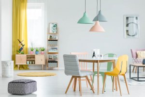
Pastels are striking tones. However, if you misuse them it can produce a somewhat childish effect.
This doesn’t happen if you look for contrast and cohesion. Moreover, a good combination will always create elegance and sobriety. If you use white as a base, then you’ll be able to achieve very interesting effects in your home.
Gray and orange as perfect allies
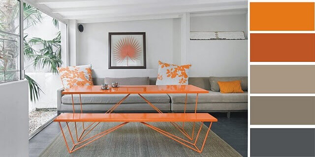
Two striking colors that are rarely seen together in houses are gray and orange. Orange has a lot of character, and it can create quite a quirky effect. Gray often implies seriousness, and so you wouldn’t normally think about combining it with orange.
This is exactly why it’s such a winning combination. Grays provide the calm base that the oranges need without dampening them, as black would do.
Indeed, this isn’t a valid option for every home or every room. The perfect setting would be the living room of an apartment or flat.
Combining grey furniture in light tones along with bright orange touches for accessories, rugs, or cushions can bring great personality to a room.
https://midecoracion.com/casas/5-combinaciones-de-colores-llamativos-para-tu-hogar/
Bright color combinations for your home are crucial in decoration and mean the difference between glorious success and complete failure. It’s possible to try too hard for a good result, and use low-risk color combinations. However, this can create the opposite effect and offer uncreative results that look like they’ve been hashed together.
There are also certain unusual combinations – which you would never expect – that work perfectly. Let’s have a look at some of the bold color combinations and how to apply them in your home – don’t miss out!
Great color combinations for your rooms
Although, in theory, many people know the best complementary color combinations, not everyone dares to put them into practice. This is because the shades contrast strongly when they’re on opposite sides of the Itten color wheel.
Despite the apparent risk, the truth is that they provide lively and energetic results. The contrasts are organic and you can create areas that are full of intensity with these combinations. They’re striking colors that match well and don’t look garish.
Contiguous tones create great atmospheres
Another way of making complementary color combinations for your home is by using what’s called analog combination. This technique is based on combining two to five colors that are side by side on the Itten wheel.
The effect you achieve in this case is a little different and doesn’t offer such an intense impact. It creates calmer rooms with harmony and softness. It can be a great hit in bedrooms, giving a touch of vitality.
It’s also a good idea to try the complementary combination separately. Again, the trick will be to look for the contiguous colors instead of the opposite ones. The right way to use this technique is to first choose a base color, if possible, a harmonious, soft one.
Then you take the two colors that are next to it for your accessories or complements. It creates a great contrast and works wonderfully.
The eye-catching colors you didn’t expect together – yellow with brown
There are some striking color combinations that you would not have expected at all. One of the most surprising is the mixture of yellow and brown. At first glance, it might look a bit strange and too warm, and like something that wouldn’t work.
Instead, the yellow brings out the light and vitality that the brown tones need in a very organic way. Brown, on the other hand, gives the sobriety that yellow often requires to prevent it from looking too flashy or extravagant.
Pink and white give surprising results
Soft pink is another one of those colors that we like to look at, but that seems difficult to combine. However, surprisingly, its greatest ally is one of the most obvious colors of all – white. This is a soft color, and very intimate, but it works and looks elegant. At the same time, it enhances the luminosity.
It’s a perfect option for small spaces that need depth. If you carry it out with elegance, then it gives a result that isn’t at all dull and adds personality.
Pastels are striking tones. However, if you misuse them it can produce a somewhat childish effect.
This doesn’t happen if you look for contrast and cohesion. Moreover, a good combination will always create elegance and sobriety. If you use white as a base, then you’ll be able to achieve very interesting effects in your home.
Gray and orange as perfect allies
Two striking colors that are rarely seen together in houses are gray and orange. Orange has a lot of character, and it can create quite a quirky effect. Gray often implies seriousness, and so you wouldn’t normally think about combining it with orange.
This is exactly why it’s such a winning combination. Grays provide the calm base that the oranges need without dampening them, as black would do.
Indeed, this isn’t a valid option for every home or every room. The perfect setting would be the living room of an apartment or flat.
Combining grey furniture in light tones along with bright orange touches for accessories, rugs, or cushions can bring great personality to a room.
https://midecoracion.com/casas/5-combinaciones-de-colores-llamativos-para-tu-hogar/


