The Application of Dark Tones in The Home
The colors that we incorporate in our interiors should be governed by the following principles: personal taste, appropriate combination, and aesthetic harmony. Therefore, we’re going to learn how the application of dark tones at home should be carried out.
Generally, we tend to choose those ranges that are more pleasant, such as warm and neutral. However, we can work through other formulations that, through an appropriate composition, can achieve a pleasant environment.
The idea is that we reach the degree of complacency; that’s to say, that we’re comfortable and in good harmony with our surroundings. Living space is synonymous with well-being; as basic as feeling comfortable in our own home.
Application of dark tones in the home: why choose dark tones?
Some shades, such as grays and blacks, go with everything. This premise can also be applied in the world of fashion, hence the general tendency to revert to these shades, without risking the color ratio.
In turn, dark tones provide us with feelings of depth, stability, and calm. Obviously, you shouldn’t abuse its use. It’s no use filling a room completely with black items. One factor that we must avoid is uneasiness.
Another guarantee they offer us is the perception of fullness. Wherever they’re placed, they help us to recharge and complete the set in a subtle and elegant way, without saturating. Of course, it’s unnecessary to exceed its use and thus avoid aesthetic disagreements.
Dark shades at home: main qualities
Before making the choice of colors, it’s necessary to assess what qualities they offer us and what they provide at a general level. Undoubtedly, some tones may be more attractive, but the basis of everything is found in the correct adaptation to the surrounding space.
- These tones help us to generate contrast, especially if we have light colors distributed throughout. The objective is that we achieve a pleasant appearance and, of course, attractiveness. We must bear in mind that they influence our emotions.
- When it comes to bringing seriousness to decor, these tones become a really interesting component. It doesn’t matter if they’re arranged in an object, a piece of furniture, or a wall since they provide a sense of solidity and roundness that’s difficult to achieve with other colors.
- They don’t produce a gloomy effect if we know how to work them. In reality, it’s not a matter of recharging a room, but of resorting to them in a more sporadic and unique way. In this way, we can achieve a much more dynamic style.
- They help to highlight other shades around them. For example, blues, greens, or neutrals are perfectly highlighted, but if we combine them with warm, light, or white colors, a more striking effect is produced.
- We must take them as a compliment unless we want to give them prominence.
Application of dark tones in the home: which colors do we consider dark?
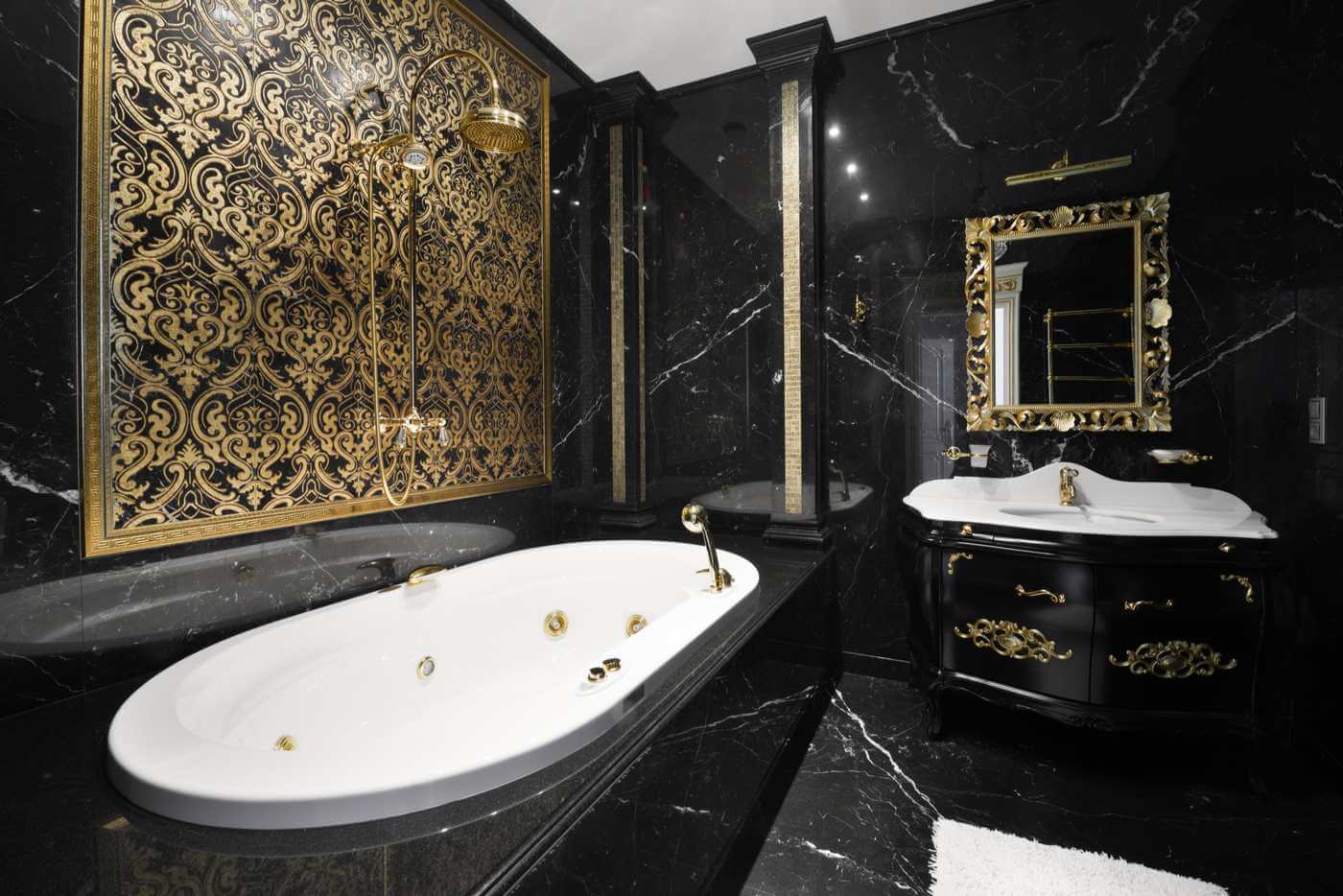
The classification of dark colors can be very broad. Therefore, we’re going to focus on those that can best fit in the home. Black is probably the best positioned, both for its good suitability in the spaces and for its correct relationship with the furniture.
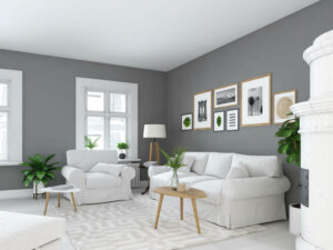
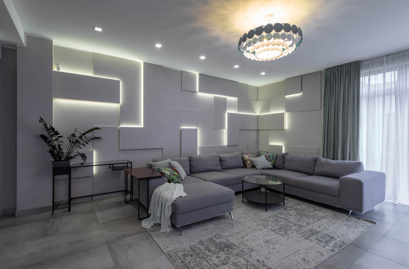
Another case can be, for example, dark gray. Although its appearance is a bit gloomy, it transmits serenity, neutrality, and solidity. It’s confirmed as a safe bet for the items that we want to use as a compliment.
As for the blues, we mustn’t forget that some such as indigo, ultramarine, or Oxford are among the most subtle and, perhaps, easier to combine. Undoubtedly, within the family of cold colors, the darkest categories can be used.
Which dark colors to choose for the home?
If we’ve got to decide which dark colors are more appropriate, we must start from a basic and elementary principle: style and interior design.
In this way, we can say that dark tones in the home are popular choices to create a feeling of stability, balance, and consistency.
The colors that we incorporate in our interiors should be governed by the following principles: personal taste, appropriate combination, and aesthetic harmony. Therefore, we’re going to learn how the application of dark tones at home should be carried out.
Generally, we tend to choose those ranges that are more pleasant, such as warm and neutral. However, we can work through other formulations that, through an appropriate composition, can achieve a pleasant environment.
The idea is that we reach the degree of complacency; that’s to say, that we’re comfortable and in good harmony with our surroundings. Living space is synonymous with well-being; as basic as feeling comfortable in our own home.
Application of dark tones in the home: why choose dark tones?
Some shades, such as grays and blacks, go with everything. This premise can also be applied in the world of fashion, hence the general tendency to revert to these shades, without risking the color ratio.
In turn, dark tones provide us with feelings of depth, stability, and calm. Obviously, you shouldn’t abuse its use. It’s no use filling a room completely with black items. One factor that we must avoid is uneasiness.
Another guarantee they offer us is the perception of fullness. Wherever they’re placed, they help us to recharge and complete the set in a subtle and elegant way, without saturating. Of course, it’s unnecessary to exceed its use and thus avoid aesthetic disagreements.
Dark shades at home: main qualities
Before making the choice of colors, it’s necessary to assess what qualities they offer us and what they provide at a general level. Undoubtedly, some tones may be more attractive, but the basis of everything is found in the correct adaptation to the surrounding space.
- These tones help us to generate contrast, especially if we have light colors distributed throughout. The objective is that we achieve a pleasant appearance and, of course, attractiveness. We must bear in mind that they influence our emotions.
- When it comes to bringing seriousness to decor, these tones become a really interesting component. It doesn’t matter if they’re arranged in an object, a piece of furniture, or a wall since they provide a sense of solidity and roundness that’s difficult to achieve with other colors.
- They don’t produce a gloomy effect if we know how to work them. In reality, it’s not a matter of recharging a room, but of resorting to them in a more sporadic and unique way. In this way, we can achieve a much more dynamic style.
- They help to highlight other shades around them. For example, blues, greens, or neutrals are perfectly highlighted, but if we combine them with warm, light, or white colors, a more striking effect is produced.
- We must take them as a compliment unless we want to give them prominence.
Application of dark tones in the home: which colors do we consider dark?
The classification of dark colors can be very broad. Therefore, we’re going to focus on those that can best fit in the home. Black is probably the best positioned, both for its good suitability in the spaces and for its correct relationship with the furniture.
Another case can be, for example, dark gray. Although its appearance is a bit gloomy, it transmits serenity, neutrality, and solidity. It’s confirmed as a safe bet for the items that we want to use as a compliment.
As for the blues, we mustn’t forget that some such as indigo, ultramarine, or Oxford are among the most subtle and, perhaps, easier to combine. Undoubtedly, within the family of cold colors, the darkest categories can be used.
Which dark colors to choose for the home?
If we’ve got to decide which dark colors are more appropriate, we must start from a basic and elementary principle: style and interior design.
In this way, we can say that dark tones in the home are popular choices to create a feeling of stability, balance, and consistency.
All cited sources were thoroughly reviewed by our team to ensure their quality, reliability, currency, and validity. The bibliography of this article was considered reliable and of academic or scientific accuracy.
- Lluch, Francisco Javier: Arte de armonizar los colores, Imprenta de El Porvenir, Barcelona, 1858.
- Montes de Oca, Irina; Risco, Lucía: Apuntes de diseño de interiores, Universidad Peruana de Ciencias Aplicadas, 2016.


