Kelly Wearstler Interior Design
Kelly Wearstler’s interior designs are synonymous for modernity, harmony and decorative balance. This young designer has made a big name for herself worldwide in the world of interior design.
We can find all kinds of compositions in her work. She actually doesn’t rely on a specific technique; instead she pulls a space together by applying the principles of well-being and rationality. Every resource she uses is placed thoughtfully and serves a purpose.
We’d really like to bring your attention to Wearstler’s lovely color palettes that she creates by using different colors.
Regardless of whether she uses pastel or neutral colors, they can all work well for a setting because she knows how to use them correctly.
Let’s get to know Kelly Wearstler

Born in 1967, this South Carolinian (USA) interior designer has plenty of experience in both decoration and design under her belt. In some of her projects, she’s taken risks, playing with balance and the tension between elements.
Her decor style is unmistakable, mixing together different styles and resources. She’s able to use different materials, eras, patterns, formats, scales, etc. together in the same setting.
You could say that she makes risky decisions in quite a few of her projects, but she always secures a balanced overall result.
Her rooms never lack harmony. She designs true works of art thanks to her careful study, creation and imagination process, which translate beautifully to smart decor. Wearstler always aims to create a healthy dialogue in decor.
Just take a look at Wearstler’s work and you’ll understand that her designs are amazing decor feats.
The completeness of her designs
Wearstler’s designs show a direct relationship between the decor and the resources that conform the space itself. As a result, the decor flows from not only the furniture pieces and objects she uses but also the colors of the room itself. And of course, she always maintains order and stability in the decor as well.
- The first component in her work is completeness. Just as we mentioned before, every decor element has an aesthetic function and creates dialogue with the pieces around them. It’s almost like an orchestra of decorative elements; each one has its own characteristics.
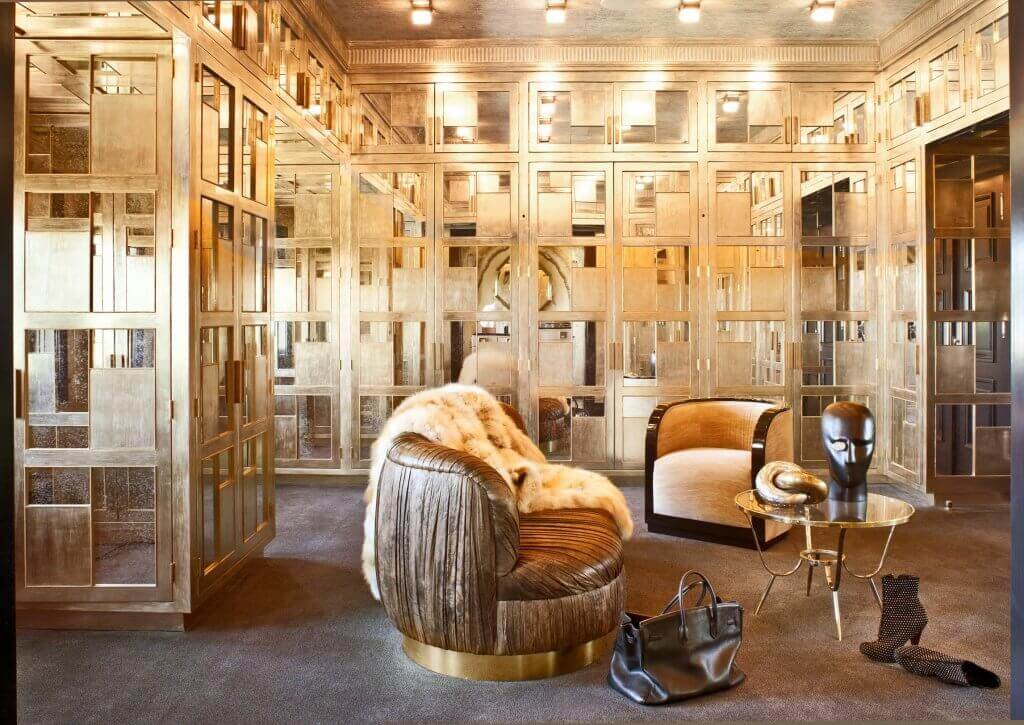
- Wearstler tends to use different various materials on walls and the furniture pieces themselves. By using different materials, each element is distinguishable but at the same time, play a role in the larger picture. She aims to create contrasts, even between materials. In the same setting, she might use marble, stone, plaster, leather, etc.
- Wearstler’s work isn’t saturated or a thoughtless mix of different resources. Instead, her rooms are full and whole. She integrates as many elements as possible to create excitement everywhere you look.
- Her work is absolutely original. She has a style that’s the exact opposite of austere minimalist but we can’t deny that she’s used it for some of her interior designs from time to time. In any case, her work is vanguard eclectic.
How does she use color?
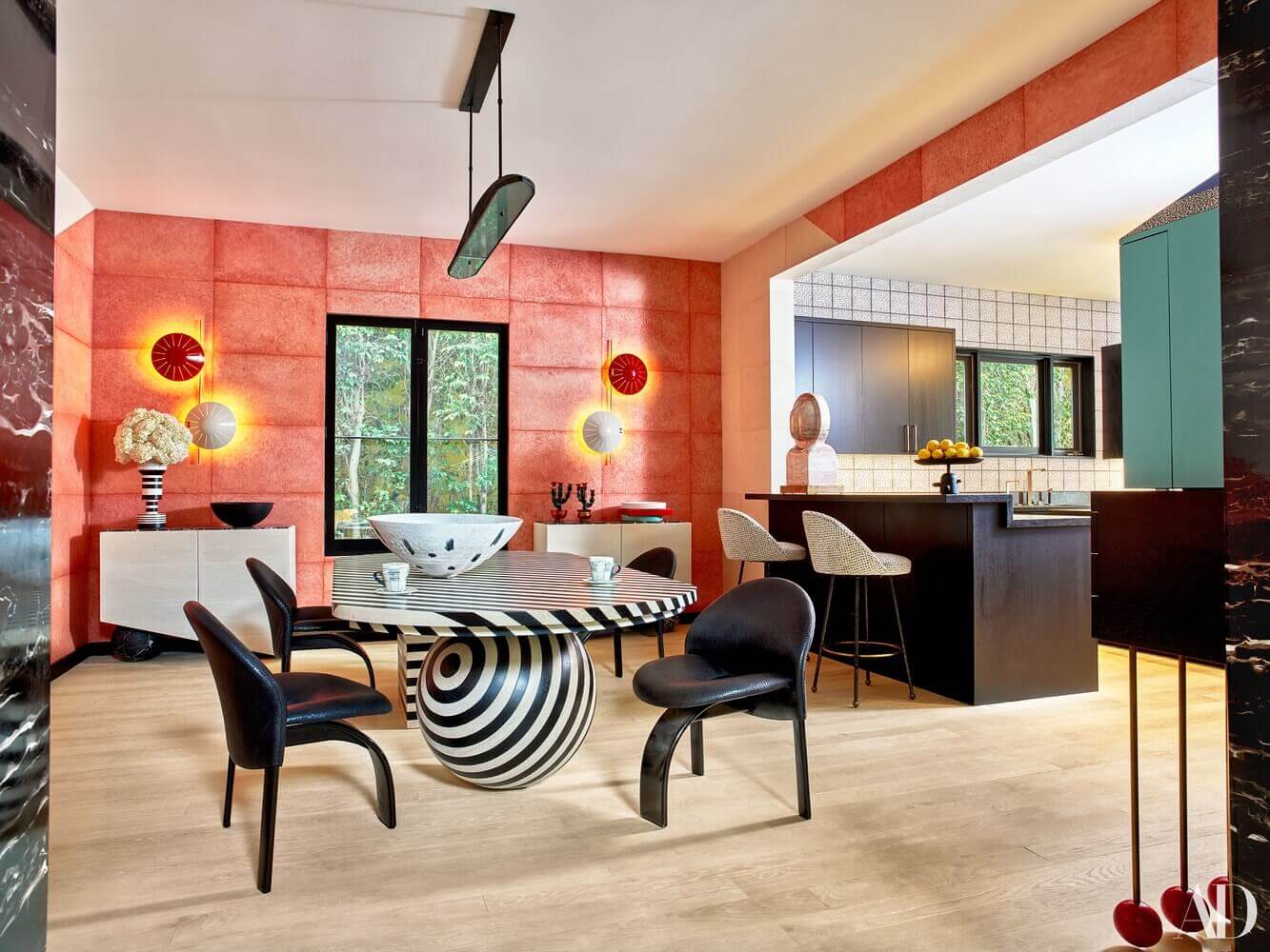
Simplicity isn’t her forte. Instead, Wearstler converts interior spaces into a canvas where she applies different colors that balance and harmonize together in a rational way. The elements she uses have their own character and as a result, she creates tasteful contrasts and an explicit differentiation.
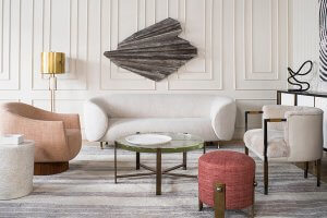
She usually chooses an eye-catching color as the protagonist and complements it with secondary colors. For example, she might use a color like salmon or beige to highlight a specific area while applying other neutrals and whites throughout the room.
Additionally, she often uses patterns on certain elements, such as rugs, seating or decorative pillows. With patterns, she can create a more dynamic, enjoyable room and save it from a monochrome palette.
Kelly Wearstler and her interest in pastel colors
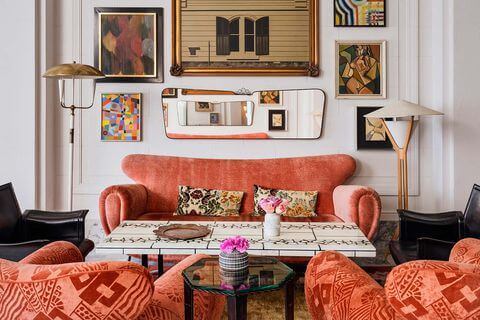
Looking at her work, you’ll notice that she uses plenty of pastels. Maybe she does it to highlight a certain area of a room, or maybe it’s because she simply likes using pastel colors.
In any case, remember that Kelly Wearstler approaches interior spaces like a big canvas for color where dialogue between elements and harmony come first.
Kelly Wearstler’s interior designs are synonymous for modernity, harmony and decorative balance. This young designer has made a big name for herself worldwide in the world of interior design.
We can find all kinds of compositions in her work. She actually doesn’t rely on a specific technique; instead she pulls a space together by applying the principles of well-being and rationality. Every resource she uses is placed thoughtfully and serves a purpose.
We’d really like to bring your attention to Wearstler’s lovely color palettes that she creates by using different colors.
Regardless of whether she uses pastel or neutral colors, they can all work well for a setting because she knows how to use them correctly.
Let’s get to know Kelly Wearstler
Born in 1967, this South Carolinian (USA) interior designer has plenty of experience in both decoration and design under her belt. In some of her projects, she’s taken risks, playing with balance and the tension between elements.
Her decor style is unmistakable, mixing together different styles and resources. She’s able to use different materials, eras, patterns, formats, scales, etc. together in the same setting.
You could say that she makes risky decisions in quite a few of her projects, but she always secures a balanced overall result.
Her rooms never lack harmony. She designs true works of art thanks to her careful study, creation and imagination process, which translate beautifully to smart decor. Wearstler always aims to create a healthy dialogue in decor.
Just take a look at Wearstler’s work and you’ll understand that her designs are amazing decor feats.
The completeness of her designs
Wearstler’s designs show a direct relationship between the decor and the resources that conform the space itself. As a result, the decor flows from not only the furniture pieces and objects she uses but also the colors of the room itself. And of course, she always maintains order and stability in the decor as well.
- The first component in her work is completeness. Just as we mentioned before, every decor element has an aesthetic function and creates dialogue with the pieces around them. It’s almost like an orchestra of decorative elements; each one has its own characteristics.
- Wearstler tends to use different various materials on walls and the furniture pieces themselves. By using different materials, each element is distinguishable but at the same time, play a role in the larger picture. She aims to create contrasts, even between materials. In the same setting, she might use marble, stone, plaster, leather, etc.
- Wearstler’s work isn’t saturated or a thoughtless mix of different resources. Instead, her rooms are full and whole. She integrates as many elements as possible to create excitement everywhere you look.
- Her work is absolutely original. She has a style that’s the exact opposite of austere minimalist but we can’t deny that she’s used it for some of her interior designs from time to time. In any case, her work is vanguard eclectic.
How does she use color?
Simplicity isn’t her forte. Instead, Wearstler converts interior spaces into a canvas where she applies different colors that balance and harmonize together in a rational way. The elements she uses have their own character and as a result, she creates tasteful contrasts and an explicit differentiation.
She usually chooses an eye-catching color as the protagonist and complements it with secondary colors. For example, she might use a color like salmon or beige to highlight a specific area while applying other neutrals and whites throughout the room.
Additionally, she often uses patterns on certain elements, such as rugs, seating or decorative pillows. With patterns, she can create a more dynamic, enjoyable room and save it from a monochrome palette.
Kelly Wearstler and her interest in pastel colors
Looking at her work, you’ll notice that she uses plenty of pastels. Maybe she does it to highlight a certain area of a room, or maybe it’s because she simply likes using pastel colors.
In any case, remember that Kelly Wearstler approaches interior spaces like a big canvas for color where dialogue between elements and harmony come first.
All cited sources were thoroughly reviewed by our team to ensure their quality, reliability, currency, and validity. The bibliography of this article was considered reliable and of academic or scientific accuracy.
- Wearstler, Kelly: Kelly Wearstler: evocative style, Rizzoli International Publications, 2019.


