How to Create Great Color Combinations: The Basics
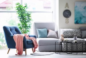
Learning how to use furniture, walls, and decorative objects to make color combinations is a true science. Colors say things about you, and they can make a room feel bigger or smaller, and encourage certain states of mind. Want to know where the mystery lies? The basic idea is to create a balance with analogous and contrasting colors.
Analogous color combinations
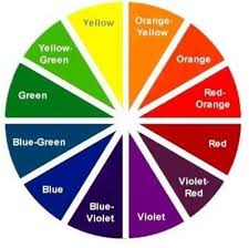
Analogous colors have similar components, which means it’s easy to create balanced combinations with them. It’s the safer, more conservative way to combine colors, and it can make for calm, relaxed rooms. One good example would be combining yellow with green or orange.
Contrasting color combinations

You can create contrasts without having to give up balance. The key is to always keep the color wheel in mind. You can consult it to find complementary colors and combine them, with one of them as a base and the others in a smaller role using decorative objects. Green and red, and yellow and purple are both good examples.
Using contrasting color combinations is good for making joyful spaces. That means they’re perfect for living rooms or a lively dining room. It’s generally best to use warm, neutral colors when it comes to decorating bedrooms.
Furniture and walls
When you’re thinking of how to combine cold, warm, and neutral colors, you should also be thinking about the materials involved, and whether the furniture is light or dark. Considering this will help you create spaces with more of a sense of intention.
Dark furniture
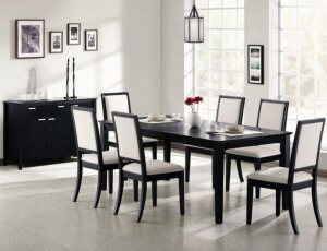
If you have dark furniture, you’ll need to surround it with lighter colors for it to stand out well. Pick out a neutral color for the walls, or even a bold one like blue or green that matches the sheets or tablecloth. That’s a great way to create balance and harmony.
Light furniture
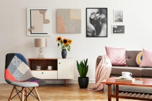
Natural wood is a safe, functional bet that goes with just about any style. You can always use color to make a room more charming and pleasant to be in.
If you’ve been feeling Nordic-inspired and want to create peaceful, warm rooms, you can use powdered pastel colors and add highlights of gray or beige. If you want to take a bit more of a risk, terracotta looks absolutely amazing alongside light wood.
White furniture
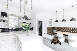
There’s no doubt: wood and white are two great allies in home decoration. They’re super warm and seem like they’ve been made for each other.
But if you want to give a bit more elegance to your white furniture, you can take some inspiration from the English style. It uses green and brick red to make a space seem sophisticated and serious. You’ll need warm colors like yellow, orange, or red to go with your white furniture. Square or floral patterns will add a nice final touch.
Other things to keep in mind for good color combinations
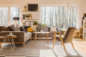
- Light: you have to keep in mind how much natural light each room gets, whether or not you need extra light sources, and if the rooms are dark. From there, you’ll be able to decide whether you need to make a room feel bigger through light colors or smaller with darker tones.
- Climate: you should also think about where you are in the world. If you live in a warm area, you can use colors that give off freshness like green and blue. Warm colors are great in colder parts of the world because they make rooms feel cozier and more inviting.
- What feeling you want to convey: the colors you use for your decorations have an impact on your state of mind. Depending on which room you’re thinking of, you might want it to be best for relaxation, energy, or focus.
Now you know how to create great color combinations. All that’s left is to pick out a room and start putting your knowledge into practice!
Learning how to use furniture, walls, and decorative objects to make color combinations is a true science. Colors say things about you, and they can make a room feel bigger or smaller, and encourage certain states of mind. Want to know where the mystery lies? The basic idea is to create a balance with analogous and contrasting colors.
Analogous color combinations

Analogous colors have similar components, which means it’s easy to create balanced combinations with them. It’s the safer, more conservative way to combine colors, and it can make for calm, relaxed rooms. One good example would be combining yellow with green or orange.
Contrasting color combinations

You can create contrasts without having to give up balance. The key is to always keep the color wheel in mind. You can consult it to find complementary colors and combine them, with one of them as a base and the others in a smaller role using decorative objects. Green and red, and yellow and purple are both good examples.
Using contrasting color combinations is good for making joyful spaces. That means they’re perfect for living rooms or a lively dining room. It’s generally best to use warm, neutral colors when it comes to decorating bedrooms.
Furniture and walls
When you’re thinking of how to combine cold, warm, and neutral colors, you should also be thinking about the materials involved, and whether the furniture is light or dark. Considering this will help you create spaces with more of a sense of intention.
Dark furniture

If you have dark furniture, you’ll need to surround it with lighter colors for it to stand out well. Pick out a neutral color for the walls, or even a bold one like blue or green that matches the sheets or tablecloth. That’s a great way to create balance and harmony.
Light furniture

Natural wood is a safe, functional bet that goes with just about any style. You can always use color to make a room more charming and pleasant to be in.
If you’ve been feeling Nordic-inspired and want to create peaceful, warm rooms, you can use powdered pastel colors and add highlights of gray or beige. If you want to take a bit more of a risk, terracotta looks absolutely amazing alongside light wood.
White furniture

There’s no doubt: wood and white are two great allies in home decoration. They’re super warm and seem like they’ve been made for each other.
But if you want to give a bit more elegance to your white furniture, you can take some inspiration from the English style. It uses green and brick red to make a space seem sophisticated and serious. You’ll need warm colors like yellow, orange, or red to go with your white furniture. Square or floral patterns will add a nice final touch.
Other things to keep in mind for good color combinations

- Light: you have to keep in mind how much natural light each room gets, whether or not you need extra light sources, and if the rooms are dark. From there, you’ll be able to decide whether you need to make a room feel bigger through light colors or smaller with darker tones.
- Climate: you should also think about where you are in the world. If you live in a warm area, you can use colors that give off freshness like green and blue. Warm colors are great in colder parts of the world because they make rooms feel cozier and more inviting.
- What feeling you want to convey: the colors you use for your decorations have an impact on your state of mind. Depending on which room you’re thinking of, you might want it to be best for relaxation, energy, or focus.
Now you know how to create great color combinations. All that’s left is to pick out a room and start putting your knowledge into practice!
