3 Mid-Century Modern Homes That Remind Us of Mad Men
Though the mid-century modern movement started in the 60s, today it’s still completely in style. The reason behind its ongoing success is the popular series, Mad Men. If you’ve seen it before, the decor throughout the series has probably distracted you from the plot at one point or another. If you want to replicate this peculiar style for your home, check out the mid-century modern homes in our post today.
Just like in other sectors, trends always come back into style in the world of decor. It’s the very case for the mid-century modern design; 60 years later, it’s back. Keep on reading and we’ll show you different houses that use this lovely decor.
Mid-century modern homes in gray and blue tones
The first mid-century modern homes that we’d like to share with use star gray and blue. Though the two colors are normally cold tones, you can create a warm ambiance through the right kind of decor.
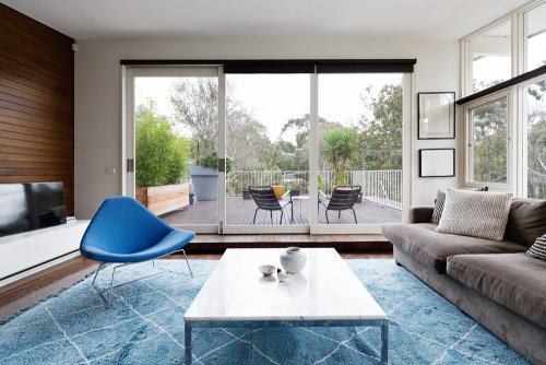
This home features one of the main mid-century modern design characteristics, which are big windows. The entire wall is nearly all window, which provides plenty of light. Additionally, it makes the room seem more spacious, creating more visual space.
Big windows also visually connect continuing rooms or exterior areas, like the patio shown in the picture above.
If you want to decorate your home in a mid-century modern way, you can apply the style to a conventional home, even if it doesn’t have big windows. What you need to make sure to do, however, is make the most of your windows for lighting, and make them the protagonists.
As for the furniture, go with straight, simple lines, which are the norm for mid-century design. Look for practicality and forget extravagant designs. The room in the photo uses an armchair with curved lines to contrast the straight lines on the sofa and coffee table.
Mid-century modern bedroom
Below, you can find an image of a bedroom that uses a mid-century modern design. Similar to the living room that we looked at previously, the straight lines in the bedroom act as focus. In this room, there isn’t anything curved in sight to break up the style.
Once again, we’re seeing simple, practical shapes. The main material here is wood that has a natural finish. A natural finish is another characteristic of mid-century modern designs.
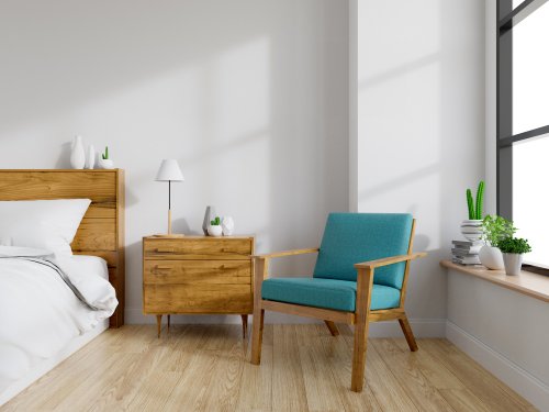
As for the design, it’s very discreet and unassuming. The bedroom uses a cactus set on the bed’s headboard as well as on the window sill. The decor sees different kinds and shapes of pots, but they all work well together thanks to their anchoring white color.
All the lines are straight, there aren’t curtains and the decor is minimal, but the room still feels cozy thanks to the balance between all of the elements and the comfort that they transmit.
Wooden mid-century modern style kitchen
In our last image, you’ll find a kitchen that uses mid-century decor. As you’ve seen in all of the examples that we’ve shown you so far, the decor is very much in style despite having started half a century ago.
In this kitchen, the designers have chosen one of the most popular materials for mid-century modern decor: wood. They use wood for the floors, countertops, chairs, and shelves as well. By using wood in all of these spaces, the kitchen has a nice flow of continuity.
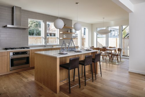
All of the furniture pieces follow straight lines and the only elements that contrast the harmony are the lamps that hang in both the dining area and kitchen. However, they’re in white to maintain the balance of the room.
In this kitchen, we can find another main characteristic of mid-century modern designs. We’re talking about amplitude. Rooms are spacious and on top of that, their minimal decor provides an even greater sensation of space.
Again, we can see nice, big windows. In this picture, they distinguish the kitchen from the dining room. Along with the rug, which uses simple and straight lines, the windows divide the spaces despite the fact that there’s nothing physically separating them.
All of these together can create a decor that follows the mid-century modern movement. How about applying the look to your home?
Though the mid-century modern movement started in the 60s, today it’s still completely in style. The reason behind its ongoing success is the popular series, Mad Men. If you’ve seen it before, the decor throughout the series has probably distracted you from the plot at one point or another. If you want to replicate this peculiar style for your home, check out the mid-century modern homes in our post today.
Just like in other sectors, trends always come back into style in the world of decor. It’s the very case for the mid-century modern design; 60 years later, it’s back. Keep on reading and we’ll show you different houses that use this lovely decor.
Mid-century modern homes in gray and blue tones
The first mid-century modern homes that we’d like to share with use star gray and blue. Though the two colors are normally cold tones, you can create a warm ambiance through the right kind of decor.

This home features one of the main mid-century modern design characteristics, which are big windows. The entire wall is nearly all window, which provides plenty of light. Additionally, it makes the room seem more spacious, creating more visual space.
Big windows also visually connect continuing rooms or exterior areas, like the patio shown in the picture above.
If you want to decorate your home in a mid-century modern way, you can apply the style to a conventional home, even if it doesn’t have big windows. What you need to make sure to do, however, is make the most of your windows for lighting, and make them the protagonists.
As for the furniture, go with straight, simple lines, which are the norm for mid-century design. Look for practicality and forget extravagant designs. The room in the photo uses an armchair with curved lines to contrast the straight lines on the sofa and coffee table.
Mid-century modern bedroom
Below, you can find an image of a bedroom that uses a mid-century modern design. Similar to the living room that we looked at previously, the straight lines in the bedroom act as focus. In this room, there isn’t anything curved in sight to break up the style.
Once again, we’re seeing simple, practical shapes. The main material here is wood that has a natural finish. A natural finish is another characteristic of mid-century modern designs.

As for the design, it’s very discreet and unassuming. The bedroom uses a cactus set on the bed’s headboard as well as on the window sill. The decor sees different kinds and shapes of pots, but they all work well together thanks to their anchoring white color.
All the lines are straight, there aren’t curtains and the decor is minimal, but the room still feels cozy thanks to the balance between all of the elements and the comfort that they transmit.
Wooden mid-century modern style kitchen
In our last image, you’ll find a kitchen that uses mid-century decor. As you’ve seen in all of the examples that we’ve shown you so far, the decor is very much in style despite having started half a century ago.
In this kitchen, the designers have chosen one of the most popular materials for mid-century modern decor: wood. They use wood for the floors, countertops, chairs, and shelves as well. By using wood in all of these spaces, the kitchen has a nice flow of continuity.

All of the furniture pieces follow straight lines and the only elements that contrast the harmony are the lamps that hang in both the dining area and kitchen. However, they’re in white to maintain the balance of the room.
In this kitchen, we can find another main characteristic of mid-century modern designs. We’re talking about amplitude. Rooms are spacious and on top of that, their minimal decor provides an even greater sensation of space.
Again, we can see nice, big windows. In this picture, they distinguish the kitchen from the dining room. Along with the rug, which uses simple and straight lines, the windows divide the spaces despite the fact that there’s nothing physically separating them.
All of these together can create a decor that follows the mid-century modern movement. How about applying the look to your home?
