Wes Anderson - Lessons on Decor
The world of cinema doesn’t only have masters of filming, acting or photography, there are also masters of decor. Aesthetics play a key role in scene arrangement and some directors have truly mastered the art of color and shape. Director of The Grand Budapest Hotel Wes Anderson is one of these directors. His amazing work can offer us valuable decor tips.
Decoding Wes Anderson
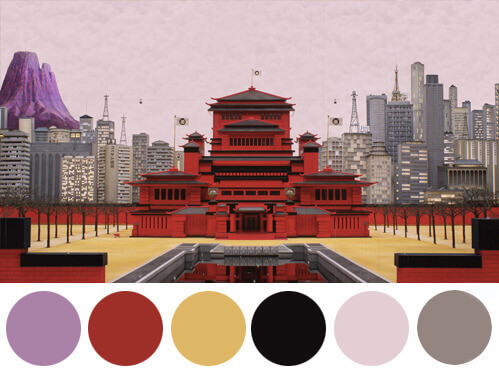
The three characteristics behind Wes Anderson’s decor are an impeccable use of the color palette; an innate gift for proportions and symmetry; and last, a wave of nostalgia. With these three keys, Anderson made himself a decor icon, regardless of if you like his movies or not.
His work has become so celebrated that you can find various websites that look for Wes-Anderson-style scenery in everyday life around the world. The most well-known example might very well be Wally Koval, who you can follow on Instagram @AccidentallyWesAnderson and send your own photos to.
The art of color per Wes Anderson
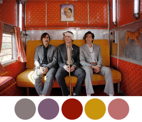
If Anderson had one telling characteristic, it’s his use of color. People who’ve seen his work will link his style to pastel colors. In addition to pastels, Anderson also boldly uses grays, browns, and black. Have you seen Isle of Dogs?
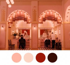
Check out the Tumblr account Wes Anderson Palettes to get an idea of how amazing his work is. The account really helps you appreciate how he uses color not just in a general sense, but in each of his scenes.
Ranging from the lovely pinks from the Mendl’s bakery in The Grand Budapest Hotel, the yellows and olive green in Moonrise kingdom, the ocher in Fantastic Mr. Fox, to the mustard yellow that Gwyneth Paltrow wears in The Royal Tenenbaums… And then you have those lovely greens, blues, and yellows from The Unlimited Darjeeling.
Through color, Anderson creates pure synesthesia. His work provokes a reaction from our senses that, in turn, creates emotions without a single word. And that is pure art.
A free symmetry
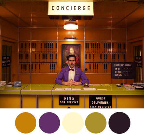
Another Wes Anderson seal is perfect geometry. Don’t misunderstand – he doesn’t aim for perfect pairs, identical halves or boring square perfection. Instead, he creates sets that are organized and fit seamlessly into the story. Each table, bookcase, and wall is yet another mark of his excellent work.
Retro vibe
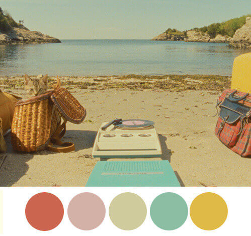
Nostalgia is the third point in the Wes Anderson design triangle. He covers his work in retro vibes with a touch of modernity peeking out. He looks for classic pieces, antiques, items linked to travel, patterned paper– and he looks for all of those elements with a plan in mind. As much as he may fill a set with details and objects, not one piece lacks a specific purpose.
The Wes Anderson effect, home decor lessons
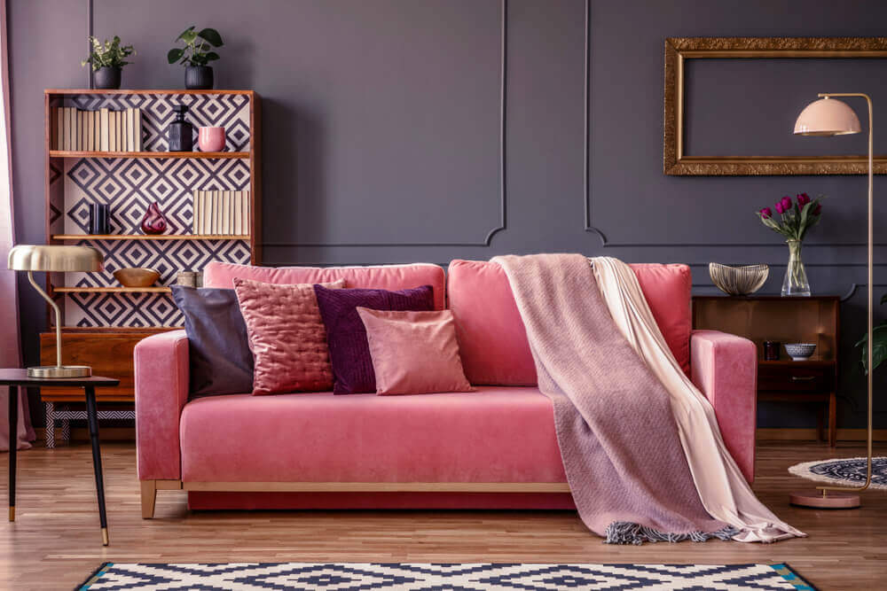
After reading our post, you might be wondering how you can apply this beautiful decor style to your own home? It’s easier than you think.
For starters, choose your color palette carefully. Look at some of the palettes from above. If you want to browse more examples, check out the account Tumblr Film Palettes for color palettes from movies like Titanic, Pulp Fiction, Pride and Prejudice, and more.
Next, give your decor a vintage feel with the right furniture piece, light fixtures or your fabrics. Lastly, make sure your proportions, layout, and symmetry are all in order. For example, use two side-tables in your living room with a bookcase nearby at the back.
Take the director’s chair to put together your home decor. Fill it with sensations by using color and layout. Use Wes Anderson’s movies as a guide and make your own beautiful scenes.
The world of cinema doesn’t only have masters of filming, acting or photography, there are also masters of decor. Aesthetics play a key role in scene arrangement and some directors have truly mastered the art of color and shape. Director of The Grand Budapest Hotel Wes Anderson is one of these directors. His amazing work can offer us valuable decor tips.
Decoding Wes Anderson

The three characteristics behind Wes Anderson’s decor are an impeccable use of the color palette; an innate gift for proportions and symmetry; and last, a wave of nostalgia. With these three keys, Anderson made himself a decor icon, regardless of if you like his movies or not.
His work has become so celebrated that you can find various websites that look for Wes-Anderson-style scenery in everyday life around the world. The most well-known example might very well be Wally Koval, who you can follow on Instagram @AccidentallyWesAnderson and send your own photos to.
The art of color per Wes Anderson

If Anderson had one telling characteristic, it’s his use of color. People who’ve seen his work will link his style to pastel colors. In addition to pastels, Anderson also boldly uses grays, browns, and black. Have you seen Isle of Dogs?
Check out the Tumblr account Wes Anderson Palettes to get an idea of how amazing his work is. The account really helps you appreciate how he uses color not just in a general sense, but in each of his scenes.
Ranging from the lovely pinks from the Mendl’s bakery in The Grand Budapest Hotel, the yellows and olive green in Moonrise kingdom, the ocher in Fantastic Mr. Fox, to the mustard yellow that Gwyneth Paltrow wears in The Royal Tenenbaums… And then you have those lovely greens, blues, and yellows from The Unlimited Darjeeling.
Through color, Anderson creates pure synesthesia. His work provokes a reaction from our senses that, in turn, creates emotions without a single word. And that is pure art.
A free symmetry

Another Wes Anderson seal is perfect geometry. Don’t misunderstand – he doesn’t aim for perfect pairs, identical halves or boring square perfection. Instead, he creates sets that are organized and fit seamlessly into the story. Each table, bookcase, and wall is yet another mark of his excellent work.
Retro vibe

Nostalgia is the third point in the Wes Anderson design triangle. He covers his work in retro vibes with a touch of modernity peeking out. He looks for classic pieces, antiques, items linked to travel, patterned paper– and he looks for all of those elements with a plan in mind. As much as he may fill a set with details and objects, not one piece lacks a specific purpose.
The Wes Anderson effect, home decor lessons

After reading our post, you might be wondering how you can apply this beautiful decor style to your own home? It’s easier than you think.
For starters, choose your color palette carefully. Look at some of the palettes from above. If you want to browse more examples, check out the account Tumblr Film Palettes for color palettes from movies like Titanic, Pulp Fiction, Pride and Prejudice, and more.
Next, give your decor a vintage feel with the right furniture piece, light fixtures or your fabrics. Lastly, make sure your proportions, layout, and symmetry are all in order. For example, use two side-tables in your living room with a bookcase nearby at the back.
Take the director’s chair to put together your home decor. Fill it with sensations by using color and layout. Use Wes Anderson’s movies as a guide and make your own beautiful scenes.


