Color Dissonance as a Creative Decor Trend

Is it possible to apply color dissonance as a decor trend? In the world of interior design, people usually seek aesthetic harmony between the colors and objects. However, a little bit of chaos could really make your home stand out.
The clashing of colors in the home is an aesthetic concept people have been using for a few years now. Furthermore, it’s considered a category without limits where randomness gains ground, and the concept of creative freedom finds a home.
Generally, people are used to being governed by trends set by fashion and the arts. A clear example is the patterns set by the avant-garde movement in the 20th century. Also, in the same way, globalization is a mechanism for spreading ideas.
Color dissonance and aesthetic perception

A space with color dissonance is composed of colors that don’t match. That is, they aren’t related, producing a certain clash and influence.
However, this doesn’t mean you should fill the room with as many colors as possible. You can even work with just 2 or 3, depending on your vision. Actually, your tastes and desires play a very important role.
On the aesthetic level, there’s a disharmony. That is, what you might conceive as a lack of arrangement. People usually play with complementary colors, but also with contrasting ranges of cold and warm to show an alternative and casual atmosphere.
The lack of harmony allows you to use combinations more freely.
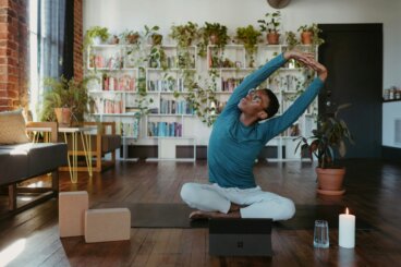
Color dissonance indoors

We should point out that the decor items will be able to express themselves much more with this style. Each element takes on a singular prominence and aesthetically separates from the whole. This is a new trend, however. Let’s look at 4 ways of establishing color dissonance:
- People don’t usually use yellow and pink together. Both strongly stand out, generating a chicer atmosphere. At the same time, they pleasantly battle, with the two trying to become the most prominent in the room.
- Another particular example is a combination of turquoise and red. Both transmit very different sensations and, when they come together, they establish an exotic feeling where they converge the cold character of one color with the strength and passion of the other.
- In the same way, as mentioned above, aqua green and orange clash with each other. The latter stands out much more, while the former is lighter and less striking.
- If you’re looking for something darker, whether it’s green, blue, or gray, all in the same place, the room can be complemented by adding bright colors.
Using pop art

When it comes to choosing a style composed of these qualities, pop art is probably the one that best combines them. There’s no doubt that the clashing of colors is what makes this style unique.
The use of different shades with no harmony between them makes it innovative, shocking, and exorbitant. It leaves room for all kinds of limitless ingenious intervention.
Creativity in the chromatic relationship is a factor that’s intrinsic to the space. Everything opens up to any type of combination, regardless of traditional aesthetics.
The strength and energy of pop art breaks the patterns of mid-twentieth century interior design.
Polychromy encourages diversity of meaning

Using many colors allows you to fill rooms with an aesthetic richness that’ll make you feel alive. The color dissonance in various corners forces the mind to try to harmonize them but this can’t happen.
In this way, people feel the need to relate and establish a common dialogue. On the other hand, it’s very difficult if they don’t have some stability, offering different meanings according to the place where they’re located.
All cited sources were thoroughly reviewed by our team to ensure their quality, reliability, currency, and validity. The bibliography of this article was considered reliable and of academic or scientific accuracy.
- Egon Schuler, Josef: Color y decoración en el hogar, Gustavo Gili, 1968.