Color Schemes for Your Terrace

You must pay attention to your home’s exterior image. It’s the first thing people see when they arrive. Therefore, aesthetics plays a very important role. Below, you can discover interesting color schemes for your terrace!
One of the mistakes people usually make is a lack of sensitivity when it comes to relating colors. You can’t randomly choose them. In fact, you have to study which ones will achieve harmony.
Homes reflect people’s individual personalities. Remember that your home’s exterior is part of the decoration. Therefore, you should create an environment that makes you feel proud of the decorative style you chose. Why not analyze some useful terrace color selection formulas step by step?
The choice of colors
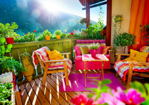
A terrace must include attractive and showy colors. You shouldn’t go for excessively dark or gloomy colors. The idea is for the colors to convey serenity and spark happiness.
You have to play with an important factor – natural light. It enhances shapes and achieves brightness and makes things feel natural. For this reason, it’s crucial to choose the colors that best suit the terrace.
The color schemes for your terrace will depend on what you want to convey. In fact, they will also influence the environment you want to achieve. Undoubtedly, the colors must be to your liking and transmit well-being and comfort.
Remember that you must make a considerable effort to properly combine the colors.
Different color schemes for your terrace
Before painting your terrace, you must carefully study the possible color combinations, a process that interior design professionals do. For this, you must know how much light it gets since a cloudy environment isn’t the same as a bright one that gets a lot of sun every day.
On the other hand, you must assess the environment you want to create and the sensations you want to convey. In fact, you can even use a color palette if you need to. Here are some examples:
- Warm colors such as pale yellow, salmon, or brick red can give you an interesting result. They go very well with neutral colors that you can introduce through the furniture, for example.
- Soft colors, such as off-white or ivory, create more radiance. They project softness and purify the environment. In fact, they contrast very well with materials such as wood or dark floors.
- Beige is one of the most popular colors for a terrace. It’s halfway between white and warm colors and creates harmony with dark decorative elements. Also, it goes very well with earthy tones.
- Work in dark colors if you want to use them. Remember that it’s best not to use blacks or blues that depress the environment. Instead, it’s a good idea to use neutrals and contrast them with lighter colors to establish the desired harmony.
Pastel colors – a good choice for your terrace

You should choose pastels to paint your terrace. There are so many different options! It doesn’t matter if they’re cold or warm colors, since they project a calm feeling.
An ideal case can be the color coral. It looks great on the walls and goes well with warm and earthy colors and even green. In fact, it can help you create a very romantic environment.
As for blue or turquoise, they refresh the atmosphere and are reminiscent of a Mediterranean environment. Of course, you need to match them with other warm colors. Also, they go very well with the brown color of wood.
The dialogue between the furniture and walls
As in the interiors, you’ll achieve overall harmony when you coordinate the different decorative resources, whether they’re furniture or structural.
The walls are the aesthetic support for what happens on the terrace. In other words, the colors of the sofa, the armchairs, the table, and other elements must be correctly combined with the colors of the walls.
In short, you must perfectly establish the color schemes of your terrace to create a perfect space to relax.
You must pay attention to your home’s exterior image. It’s the first thing people see when they arrive. Therefore, aesthetics plays a very important role. Below, you can discover interesting color schemes for your terrace!
One of the mistakes people usually make is a lack of sensitivity when it comes to relating colors. You can’t randomly choose them. In fact, you have to study which ones will achieve harmony.
Homes reflect people’s individual personalities. Remember that your home’s exterior is part of the decoration. Therefore, you should create an environment that makes you feel proud of the decorative style you chose. Why not analyze some useful terrace color selection formulas step by step?
The choice of colors
A terrace must include attractive and showy colors. You shouldn’t go for excessively dark or gloomy colors. The idea is for the colors to convey serenity and spark happiness.
You have to play with an important factor – natural light. It enhances shapes and achieves brightness and makes things feel natural. For this reason, it’s crucial to choose the colors that best suit the terrace.
The color schemes for your terrace will depend on what you want to convey. In fact, they will also influence the environment you want to achieve. Undoubtedly, the colors must be to your liking and transmit well-being and comfort.
Remember that you must make a considerable effort to properly combine the colors.
Different color schemes for your terrace
Before painting your terrace, you must carefully study the possible color combinations, a process that interior design professionals do. For this, you must know how much light it gets since a cloudy environment isn’t the same as a bright one that gets a lot of sun every day.
On the other hand, you must assess the environment you want to create and the sensations you want to convey. In fact, you can even use a color palette if you need to. Here are some examples:
- Warm colors such as pale yellow, salmon, or brick red can give you an interesting result. They go very well with neutral colors that you can introduce through the furniture, for example.
- Soft colors, such as off-white or ivory, create more radiance. They project softness and purify the environment. In fact, they contrast very well with materials such as wood or dark floors.
- Beige is one of the most popular colors for a terrace. It’s halfway between white and warm colors and creates harmony with dark decorative elements. Also, it goes very well with earthy tones.
- Work in dark colors if you want to use them. Remember that it’s best not to use blacks or blues that depress the environment. Instead, it’s a good idea to use neutrals and contrast them with lighter colors to establish the desired harmony.
Pastel colors – a good choice for your terrace
You should choose pastels to paint your terrace. There are so many different options! It doesn’t matter if they’re cold or warm colors, since they project a calm feeling.
An ideal case can be the color coral. It looks great on the walls and goes well with warm and earthy colors and even green. In fact, it can help you create a very romantic environment.
As for blue or turquoise, they refresh the atmosphere and are reminiscent of a Mediterranean environment. Of course, you need to match them with other warm colors. Also, they go very well with the brown color of wood.
The dialogue between the furniture and walls
As in the interiors, you’ll achieve overall harmony when you coordinate the different decorative resources, whether they’re furniture or structural.
The walls are the aesthetic support for what happens on the terrace. In other words, the colors of the sofa, the armchairs, the table, and other elements must be correctly combined with the colors of the walls.
In short, you must perfectly establish the color schemes of your terrace to create a perfect space to relax.
All cited sources were thoroughly reviewed by our team to ensure their quality, reliability, currency, and validity. The bibliography of this article was considered reliable and of academic or scientific accuracy.
- Egon Schuler, Josef: Color y decoración en el hogar, Gustavo Gili, 1968.


