Pastel Color Combinations For Interiors
The impact color schemes give to the home is remarkable. They are a fundamental component to build the internal discourse and configure a specific look. For this reason, let’s look at how pastel color combinations for interiors should be used.
One of the basic principles for the harmonization of the whole set is the correct matching of the tones in the decoration.
An aspect to value within the world of interior design is well-being. How can it be achieved? Mainly, through the relationship between the decorative elements that provide an essential link to define the style.
Aesthetic principles of pastel colors
How should you use pastel colors? First of all, bear in mind that they are a sophisticated range whose appearance is pleasing to the eye and that provides a comfortable feeling.
There are multiple varieties: from warm to cold, and some are more striking than others. However, they all have a common link – the creation of harmony.
No matter where they are placed or in what way they are presented, the most important thing is that pastel colors are prominent. Wherever they are they will contribute to the decor scheme.
Pastels are gentle colors and easy to work with.
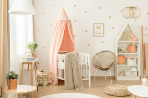
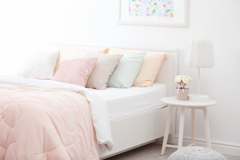
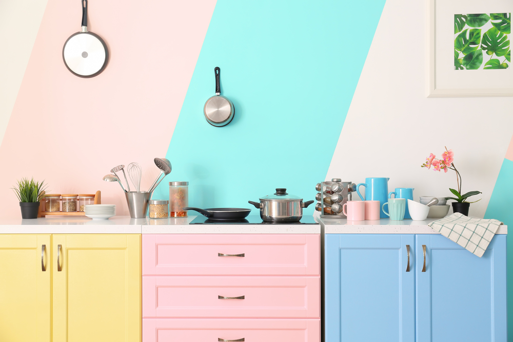
Combinations of pastel colors for interiors
When combining pastel colors you will find different possibilities. The material, the shape, or the product are not relevant, what matters most is the process of joining tones with others and the way in which they participate in the decoration. Let’s look at some examples:
- They can be easily used in carpets. Grays and whites can tone well with a room, while other more striking colors enhance, such as pink, yellow, orange, green, etc. Alternatively, red, purple, or deep blue will give contrast.
- In the case of the sofa, this should be in a dominant color so it’s the focus of the living room. Bright cushions can provide contrast. For example, blues with salmon, pinks and oranges, greens and blues, etc.
- If you want to use three different colors in the main areas of a room, you must be aware of the choice you make. The colors you choose will have great aesthetic repercussions. The most common to combine are blue, salmon, and beige.
- Those that belong to the cool family are somewhat more neutral and subtle. They’re not so dominant, but they still generate a calming effect. Light blues, purples, or turquoise are great for this.
Complementary colors
If you take into account how complementary colors work, pastel tones work on the aesthetic relationship while producing an elegant and unique contrast.
Blues with oranges, greens with reds, or yellows with violets generate a differentiation that provides sophistication with a spring appearance.
Concord and harmony predominate since the complementary colors are different but they have a dialogue with each other.
Why choose pastel colors for interiors?
In interior design, there are different ways of working with colors. And with pastels, a sensation of tranquility is easy to create.
These colors work well together. A feeling of cohesion shines through. Opting for these color ranges helps to consolidate the harmony of the whole.
The impact color schemes give to the home is remarkable. They are a fundamental component to build the internal discourse and configure a specific look. For this reason, let’s look at how pastel color combinations for interiors should be used.
One of the basic principles for the harmonization of the whole set is the correct matching of the tones in the decoration.
An aspect to value within the world of interior design is well-being. How can it be achieved? Mainly, through the relationship between the decorative elements that provide an essential link to define the style.
Aesthetic principles of pastel colors
How should you use pastel colors? First of all, bear in mind that they are a sophisticated range whose appearance is pleasing to the eye and that provides a comfortable feeling.
There are multiple varieties: from warm to cold, and some are more striking than others. However, they all have a common link – the creation of harmony.
No matter where they are placed or in what way they are presented, the most important thing is that pastel colors are prominent. Wherever they are they will contribute to the decor scheme.
Pastels are gentle colors and easy to work with.
Combinations of pastel colors for interiors
When combining pastel colors you will find different possibilities. The material, the shape, or the product are not relevant, what matters most is the process of joining tones with others and the way in which they participate in the decoration. Let’s look at some examples:
- They can be easily used in carpets. Grays and whites can tone well with a room, while other more striking colors enhance, such as pink, yellow, orange, green, etc. Alternatively, red, purple, or deep blue will give contrast.
- In the case of the sofa, this should be in a dominant color so it’s the focus of the living room. Bright cushions can provide contrast. For example, blues with salmon, pinks and oranges, greens and blues, etc.
- If you want to use three different colors in the main areas of a room, you must be aware of the choice you make. The colors you choose will have great aesthetic repercussions. The most common to combine are blue, salmon, and beige.
- Those that belong to the cool family are somewhat more neutral and subtle. They’re not so dominant, but they still generate a calming effect. Light blues, purples, or turquoise are great for this.
Complementary colors
If you take into account how complementary colors work, pastel tones work on the aesthetic relationship while producing an elegant and unique contrast.
Blues with oranges, greens with reds, or yellows with violets generate a differentiation that provides sophistication with a spring appearance.
Concord and harmony predominate since the complementary colors are different but they have a dialogue with each other.
Why choose pastel colors for interiors?
In interior design, there are different ways of working with colors. And with pastels, a sensation of tranquility is easy to create.
These colors work well together. A feeling of cohesion shines through. Opting for these color ranges helps to consolidate the harmony of the whole.
All cited sources were thoroughly reviewed by our team to ensure their quality, reliability, currency, and validity. The bibliography of this article was considered reliable and of academic or scientific accuracy.
- Atkins, Caroline:Colorea tu hogar, Londres, Ceac, 2003.


