Using Earth Tones in Your Home Decor

The idea of warmth indoors promotes a sense of calmness and comfort. Also, visually, it’s pleasant. For this reason, you should learn how to use earth tones and how to use them in your home decor. Furthermore, you’ll learn about their qualities, what they can provide, and what types there are.
How you feel in your home is related to the colors you use. When these colors aren’t integrated or you haven’t chosen the right color, it can create a feeling of discomfort.
Sometimes, you’ll not be sure about choices, such as which ones you like the most and which ones are better. If you don’t want to resort to the help of a professional, you can look at the options yourself and choose the best color.
The countless choices of brown

This color varies from dark to light, so it offers a strong and firm appearance with a clear idea in mind. Also, it creates a cozy effect when it’s on the walls.
Generally, we’re used to seeing dark brown on the floor, as wood. This is an option to create a feeling of warmth, consistency, and stability.
It isn’t a question of applying the darkest browns all over the house. In fact, there should be a certain contrast to produce an aesthetically unique dynamic.
On the other hand, it’s recommended the ceilings are white to establish a contrast with the brown of the walls. Otherwise, the room will be too dark, which is not suitable for children’s rooms.
You can count on brown to provide seriousness and maturity.
Earth tones – beige is peaceful and bright

Within the various earth tones, we must mention one of the lightest and most interesting for the home – beige. There’s no doubt that it’s lighter compared to other earth tones. Let’s look at how you can use it:
- The walls are the perfect place for beige. It can turn a space into a distinguished and elegant place. It helps enhance the decor items and brightens up the room.
- Also, you can use it on the floor, either in wood, ceramic tiles, or carpet. However, if you’re going to proceed in this way, the walls should be a little darker.
- It’s also a great shade for the central sofa in the living room. Also, you can produce very interesting contrasts with the cushions, to such an extent they can be of more radiant and intense colors.
- You mustn’t forget about the furniture. If it’s made of wood, it usually tends to be dark. However, there’s the option of finding wood in beige, a color that helps brighten up the room. In fact, it can fit in with any decor style.
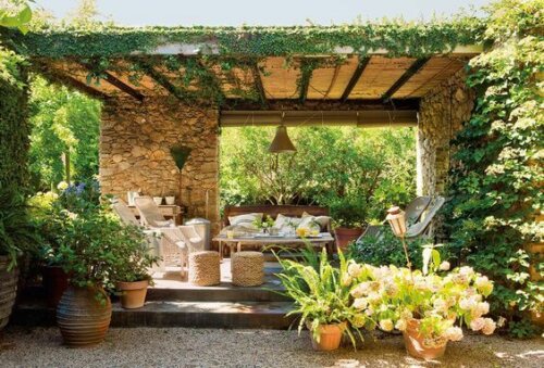
The powerful addition of terracotta

This tone is very close to red. However, it doesn’t have a singular expressive force. We’re talking about a very warm color, also called brick. It’s strong and intense, but, at the same time stable.
It’s very attractive and draws attention. You can find this color in a lot of ceramic objects.
So, where can you apply this color? On the walls, the cushions, the sofa, a rug, the curtains, etc. There are multiple ideas for using it and it goes very well with the rest of the earth tones. Also, it even looks great on the exterior walls of the house.
The brownish-gray range of earth tones
Finally, you should pay attention to the range of brownish grays. You see them everywhere and, obviously, they’re often used in interiors. Like browns, they can be light or dark, although the most common are those that tend to be yellowish or golden.
They’re a good option for furniture. However, they’re becoming a popular option on floors too. Earth tones generate a feeling of stability and make your home a more welcoming place.
All cited sources were thoroughly reviewed by our team to ensure their quality, reliability, currency, and validity. The bibliography of this article was considered reliable and of academic or scientific accuracy.
- Lluch, Francisco Javier: Arte de armonizar colores, Barcelona, Imprensa El Porvenir, 1858.