Chromatic Contrast Is Essential

Chromatic contrast is essential inside your home alongside many other variables. These include: organization, coherence, a defined style, and the furniture. By learning how to combine colors, you’ll have a beautiful home.
Obviously, in a house you can find different shades of cool, neutral and warm ranges. All of them are related to each other and produce unique combinations. Hence the need to carefully study how they go with each other.
The idea of having a cozy home isn’t just about having comfortable and pleasant items, the feeling of visual appeasement is also important. You can feel how all the elements are connected and in harmony with each other.
Good chemistry at home
Colors generate feelings in the home. Depending on which you use, you can give specific meanings and a determined aesthetic to correctly define the decor style.
The point is having an objective perception. Your eyes will judge whether you’re establishing full coherence. Only in this way will you achieve the degree of comfort we mentioned earlier.
For this reason, chromatic contrast must be present in the rooms. Tones should be in harmony and produce uniformity. That is, you must avoid tension, random combinations and bad color distribution.
The colors must be in order and have a mutual understanding.
Indoor chromatic contrast
Below, we’ll explain some ideas to correctly establish chromatic contrast without making mistakes. To combine like a professional, you can start with these steps:
- Firstly, you can’t just choose different colors and apply them in a random space. It’s important to analyze what the possibilities are and what you want to achieve before making a choice.
- Generally, people tend to use warm tones for walls and furniture. In the end, this is a good idea, but we recommend the whole set is counterbalanced by cool or dark tones on the sofa, cushions, carpets, bedspread, etc.
- In the case of a room dominated by cool tones, for example, the blue in a child’s room, earthy tones are ideal so they stand out without generating unnecessary tension. On the other hand, red or purple can radically clash.
- Setting the mood with different tones can be a good option, but which ones to choose? If you have an intense warm tone on the wall, you can use neutral tones for contrast.
- If you use dark colors, such as navy blue, black or gray, the space should have some other tone that stands out: yellow, orange, pistachio green, etc.
How to use complementary colors
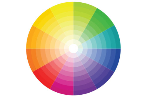
One of the great difficulties people face is how to work with complementary colors. They’re not easy to use and combining them is complicated, taking into account that, according to the color wheel, they’re shades that are the opposite of each other.
It’s not a good idea to have them on large surfaces. Instead, use them on certain furniture to produce an environment where the chromatic contrast is harmonious.
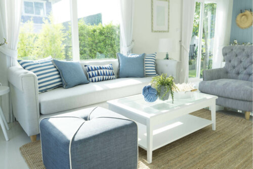
For example, if you have a blue sofa, in order to achieve a coherent contrast, you can place yellow or orange cushions. The same can be said if it’s green, you can use red or pink cushions for contrast.
White spaces need a little chromatic contrast
Undoubtedly, white appears in lots of rooms: the kitchen, bathroom, living room, bedroom, etc. It can be on the walls, tiles, fabrics, etc. In other words, it has a big role in making the room bright.
You shouldn’t resort only to white and complement it with neutral colors as the house might feel too boring. White can have an easy combination with other colors.
In short, white is considered a comfortable complement to distinguish it from other colors, whether they’re warm or cold.
All cited sources were thoroughly reviewed by our team to ensure their quality, reliability, currency, and validity. The bibliography of this article was considered reliable and of academic or scientific accuracy.
- Atkins, Caroline:Colorea tu hogar, Londres, Ceac, 2003.