The Red and Blue Chair - A Furniture Design Icon
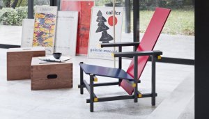
The Red and Blue Chair, an object of culture, is considered the first modern armchair. It is important in design. It signified a breakthrough in furniture design. We can consider the Red and Blue chair to be an icon of the 20th century. The Dutch architect, Gerrit Rietveld, designed the chair in 1917.
Because of its popularity, it became the most well-known design of this architect. This is because he was able to synthesize the ideas that he created. The movement that De Stijl created influenced his ideas.
The neoplastic painters were members of the De Stijl Movement. Rietveld influenced this group of painters because he began to experiment with using primary colors with white, black, and gray in his designs. Rietveld thought that the use of color should adjust to the structure and even emphasize it.
This synthesized chair reflects the universal harmony of nature. In fact, one of the great features of the Red and Blue Chair is that the structure is simple and utilizes horizontal lines and black vertical lines.
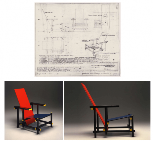
Two large rectangles, one red and one blue compose the basic structure. What’s more, the black structure supports them independently. Therefore, this composition of shapes and simple lines create a harmonious and beautiful result.
Starting in 1919, Gerrit Rietveld became part of the De Stijl Movement, collaborating with the magazine of that trend. Then this opened the door for new opportunities, which exposed his work to other countries.
Characteristics of the Red and Blue Chair
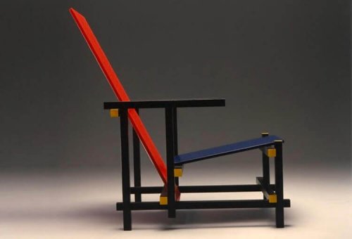
Red and Blue Chair/plataformaarquitectura.cl
As we have seen, the chair was composed of flat pieces and simple shapes, which a black structure supported. This chair was intended to be produced in a series, which never took place.
Also, there are unattached horizontal and vertical bars, with two simple flat sides that support the structure.
This design has a single purpose – to reach a formal equilibrium by means of its simple structure. The configuration with the use of shapes and geometric lines synthesizes the formality of the movement.
We can also say that it responds to a rigorous chromatic hierarchy. This means that each element is a different color according to its function.
This chair even stands out without color. However, Rietveld wanted to experiment so he chose to paint it. The first attempts were black, white, and gray. Due to various influences, such as Piet Mondrian, the chair is now the typical red and blue.
Decoration above function
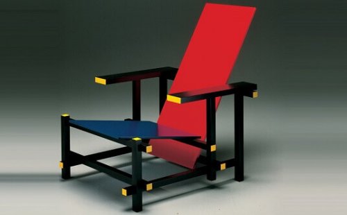
Estructura/technne.com
This chair is not a comfortable piece of furniture. It’s a decorative piece. It does what the designer strives for – being an experimental chair.
The design of this chair is from a modular system. Rietveld wasn’t looking for an exhibition piece. What he wanted was to reflect new ideas of art in an everyday object like a chair. The great achievement of this chair is that it brings a three-dimensional aspect to modern artists, such as Piet Mondrian.
The simplicity of this geometric construction is so clear that the chair can be constructed without any type of design blueprint.
Gerrit Thomas Rietveld
The Red and Blue Chair and the search for the modern aesthetic
The constant search and experimentation of Rietveld cause us to come to the conclusion that the object and the designer generate the comfort and well-being of the spirit through furniture. As part of the Stijl movement, Rietveld with other architects was searching for human harmonious invention.
These ideas emerged after the First World War when Europe was devastated. It needed some new ways to understand architecture and design for its reconstruction.
It was looking for industrial production. Since the Red and Blue Chair had a simple structure, it was easy to reproduce on an assembly line. Unfortunately, this chair was never produced in mass, ending up as an exclusive object. Due to this, the neoplastic movement of pure forms and basic colors is an ideological manifesto.
With this chair, we can clearly see all of the planes that make up the chair. The idea was to show which was the part to sit on. To achieve this, all of the points of intersection are exaggerated and there are contrasting colors on the parts.
Utilitarian furniture
Utilitarian furniture:lara.es
The thinking of the artists at this time generates contempt for ostentation and excessive ornamentation. The designers, such as Rietveld, looked to produce products with simple materials and simple technology.
These days, the current historicists reject styles such as art nouveau; movements connected to symbols of power. Therefore, they’re attracted to the creation of functional designs. They are trying to optimize everything that is related to structure and form. As a result, this minimalizes costs and parts, reducing production to the essential.
The Red and Blue Chair is an object that is a visual form, as an object of art. Rietveld’s vision was to solve the structural problems of the chair, putting the person using it second. In fact, this chair has ergonomic problems. Nevertheless, that doesn’t discount the fact that it’s an item of culture in the world of design.
The Red and Blue Chair, an object of culture, is considered the first modern armchair. It is important in design. It signified a breakthrough in furniture design. We can consider the Red and Blue chair to be an icon of the 20th century. The Dutch architect, Gerrit Rietveld, designed the chair in 1917.
Because of its popularity, it became the most well-known design of this architect. This is because he was able to synthesize the ideas that he created. The movement that De Stijl created influenced his ideas.
The neoplastic painters were members of the De Stijl Movement. Rietveld influenced this group of painters because he began to experiment with using primary colors with white, black, and gray in his designs. Rietveld thought that the use of color should adjust to the structure and even emphasize it.
This synthesized chair reflects the universal harmony of nature. In fact, one of the great features of the Red and Blue Chair is that the structure is simple and utilizes horizontal lines and black vertical lines.
Two large rectangles, one red and one blue compose the basic structure. What’s more, the black structure supports them independently. Therefore, this composition of shapes and simple lines create a harmonious and beautiful result.
Starting in 1919, Gerrit Rietveld became part of the De Stijl Movement, collaborating with the magazine of that trend. Then this opened the door for new opportunities, which exposed his work to other countries.
Characteristics of the Red and Blue Chair

Red and Blue Chair/plataformaarquitectura.cl
As we have seen, the chair was composed of flat pieces and simple shapes, which a black structure supported. This chair was intended to be produced in a series, which never took place.
Also, there are unattached horizontal and vertical bars, with two simple flat sides that support the structure.
This design has a single purpose – to reach a formal equilibrium by means of its simple structure. The configuration with the use of shapes and geometric lines synthesizes the formality of the movement.
We can also say that it responds to a rigorous chromatic hierarchy. This means that each element is a different color according to its function.
This chair even stands out without color. However, Rietveld wanted to experiment so he chose to paint it. The first attempts were black, white, and gray. Due to various influences, such as Piet Mondrian, the chair is now the typical red and blue.
Decoration above function

Estructura/technne.com
This chair is not a comfortable piece of furniture. It’s a decorative piece. It does what the designer strives for – being an experimental chair.
The design of this chair is from a modular system. Rietveld wasn’t looking for an exhibition piece. What he wanted was to reflect new ideas of art in an everyday object like a chair. The great achievement of this chair is that it brings a three-dimensional aspect to modern artists, such as Piet Mondrian.
The simplicity of this geometric construction is so clear that the chair can be constructed without any type of design blueprint.
Gerrit Thomas Rietveld
The Red and Blue Chair and the search for the modern aesthetic
The constant search and experimentation of Rietveld cause us to come to the conclusion that the object and the designer generate the comfort and well-being of the spirit through furniture. As part of the Stijl movement, Rietveld with other architects was searching for human harmonious invention.
These ideas emerged after the First World War when Europe was devastated. It needed some new ways to understand architecture and design for its reconstruction.
It was looking for industrial production. Since the Red and Blue Chair had a simple structure, it was easy to reproduce on an assembly line. Unfortunately, this chair was never produced in mass, ending up as an exclusive object. Due to this, the neoplastic movement of pure forms and basic colors is an ideological manifesto.
With this chair, we can clearly see all of the planes that make up the chair. The idea was to show which was the part to sit on. To achieve this, all of the points of intersection are exaggerated and there are contrasting colors on the parts.
Utilitarian furniture

Utilitarian furniture:lara.es
The thinking of the artists at this time generates contempt for ostentation and excessive ornamentation. The designers, such as Rietveld, looked to produce products with simple materials and simple technology.
These days, the current historicists reject styles such as art nouveau; movements connected to symbols of power. Therefore, they’re attracted to the creation of functional designs. They are trying to optimize everything that is related to structure and form. As a result, this minimalizes costs and parts, reducing production to the essential.
The Red and Blue Chair is an object that is a visual form, as an object of art. Rietveld’s vision was to solve the structural problems of the chair, putting the person using it second. In fact, this chair has ergonomic problems. Nevertheless, that doesn’t discount the fact that it’s an item of culture in the world of design.


