Spring Pantone Colors: Shades to Add to Your Decor
Did you know that every year it’s decided which colors will be the stars of the season? Today we’ll tell you about the spring Pantone colors. These can be great additions to your decor at this time of year. We’ll also explain what each one means.
Through the Pantone Fashion Color Trend Report, experts produce an outline of what the color palette will be for each season.
These experts choose colors based on the main fashion designers at London Fashion Week. This then becomes a guide to trends that we’ll see in fashion and decor over the coming months.
Chosen colors
The chromatic palette that gives us an idea of what spring colors will be is made up of 16 colors. These mostly offer tones of vitality and optimism, but also show off some neutral tones to give structure and serve as a basis to create a story through color.
“Spring/summer 2019 reflects our desire to face the future with empowering colors that provide confidence and spirit; colors that are uplifting; joyful hues that lend themselves to playful expressionism and take us down a path of creative and unexpected combinations,” says Laurie Pressman of the Pantone Color Institute.
The 16 spring Pantone colors
PANTONE 17-1564 Fiesta
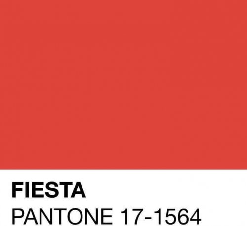
This is an orange-red that radiates energy, passion, and emotion. It’s an ideal festive tone the combine with neutral tones and fills any environment with joy.
PANTONE 19-1862 Jester Red
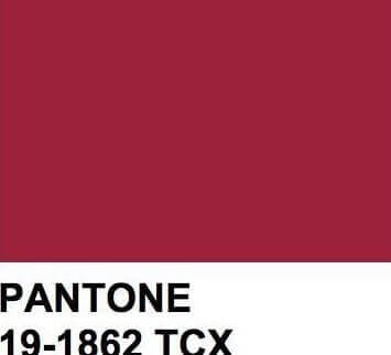
This is a reddish, deep, and intense clay color that knows how to combine the elegance of a classic color with an urban spirit.
PANTONE 15-1264 Tumeric
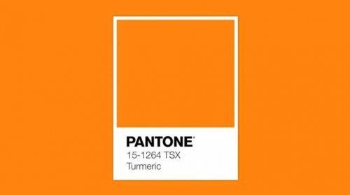
This orange transports us directly to the warm smells and colors of spices. It adds a jovial feel to the palette. We can even imagine it in ceramic form, giving a dash of color to your table.
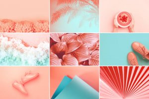
PANTONE 16-1546 Living Coral
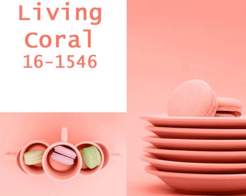
Living Coral is the color of the year. It’s delicate, affable, and full of vitality and dynamism. Just take a look at this color and you’ll want to add it to your home.
PANTONE 18-2045 Pink Peacock
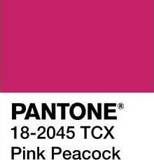
Beware of saturating any environment with a theatrical, seductive color. It can be used, however, in small doses, such as with cushions or on an armchair in the living room.
PANTONE 17-0542 Pepper Stem

This color pays homage to nature. It’s also generous and full of vitality. You can splash this tone through fabrics with a plant design or in the bedding of a bedroom.
PANTONE 12-0742 Lemon Verbena
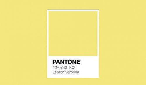
Clear and sunny. This color is tremendously cheerful and reminds us of the sun, freshness, and good times. This is also ideal for a spring terrace.
PANTONE 19-4150 Princess Blue
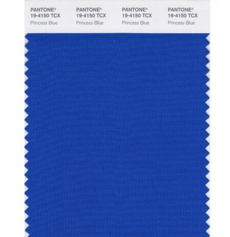
The Pantone Institute defines this as a real and majestic blue tone, brilliant and full. Where would you put it? We’re thinking it would be great in the bathroom.
PANTONE 18-1031 Toffee
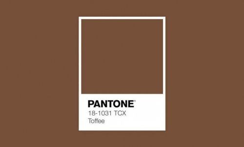
This is a delicious and irresistible color. It’s like a piece of candy that you can’t wait to taste. We recommend you use it in large spaces.
PANTONE 15-0960 Mango Mojito
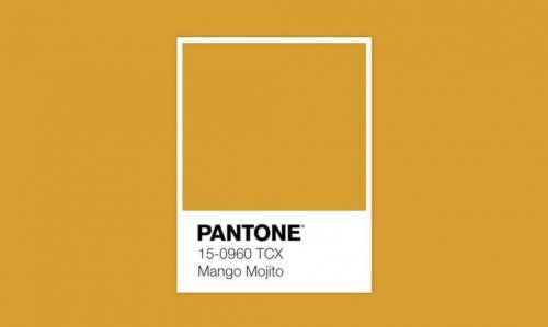
This golden yellow tone is associated with pleasant moments. It’s warm and energetic. However, it doesn’t feel overwhelming. It also gives out a lot of calm, good vibes.
PANTONE 18-0416 Terrarium Moss
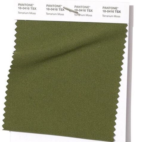
This reminds us of a lush landscape of vegetation and infinite natural beauty. It creates a serene tone that’s elegant, and very versatile as well. So much so that we can see this color in almost any space.
PANTONE 15-1619 Pressed Rose
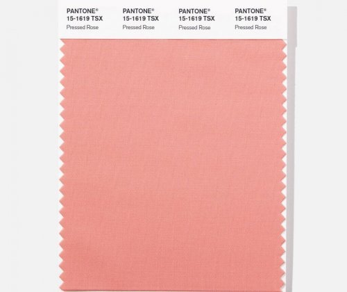
This is the most romantic of the spring Pantone colors. It’s sensual and sentimental. It can be used for walls or also to add touches of pink using quilts of rugs.
Neutral spring Pantone colors
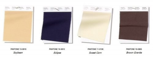
As in all chromatic palettes, there are neutral tones that combine perfectly with the rest. Pantone has made a selection of neutral tones that we’ll describe below:
- PANTONE 13-0919 Soybean: A natural color full of subtleties. It’s reliable and discreet. You can also combine it with any of the previous options.
- PANTONE 19-3810 Eclipse: This is an intense blue, like the midnight sky. It’s a reflective tone, but also serious and mysterious at the same time.
- PANTONE 11-0106 Sweet Corn: A smooth and creamy neutral, which can be mixed with any color or decorative style.
- PANTONE 19-0805 Brown Granite: One of the strongest, authentic, and timeless colors. This is an earth tone that evokes a cozy and warm ambiance.
Ready to put the spring Pantone colors in your house? You’ll get a splash of dynamism, vitality, and positivity in your home with these 16 colors.
Did you know that every year it’s decided which colors will be the stars of the season? Today we’ll tell you about the spring Pantone colors. These can be great additions to your decor at this time of year. We’ll also explain what each one means.
Through the Pantone Fashion Color Trend Report, experts produce an outline of what the color palette will be for each season.
These experts choose colors based on the main fashion designers at London Fashion Week. This then becomes a guide to trends that we’ll see in fashion and decor over the coming months.
Chosen colors
The chromatic palette that gives us an idea of what spring colors will be is made up of 16 colors. These mostly offer tones of vitality and optimism, but also show off some neutral tones to give structure and serve as a basis to create a story through color.
“Spring/summer 2019 reflects our desire to face the future with empowering colors that provide confidence and spirit; colors that are uplifting; joyful hues that lend themselves to playful expressionism and take us down a path of creative and unexpected combinations,” says Laurie Pressman of the Pantone Color Institute.
The 16 spring Pantone colors
PANTONE 17-1564 Fiesta

This is an orange-red that radiates energy, passion, and emotion. It’s an ideal festive tone the combine with neutral tones and fills any environment with joy.
PANTONE 19-1862 Jester Red

This is a reddish, deep, and intense clay color that knows how to combine the elegance of a classic color with an urban spirit.
PANTONE 15-1264 Tumeric

This orange transports us directly to the warm smells and colors of spices. It adds a jovial feel to the palette. We can even imagine it in ceramic form, giving a dash of color to your table.
PANTONE 16-1546 Living Coral

Living Coral is the color of the year. It’s delicate, affable, and full of vitality and dynamism. Just take a look at this color and you’ll want to add it to your home.
PANTONE 18-2045 Pink Peacock

Beware of saturating any environment with a theatrical, seductive color. It can be used, however, in small doses, such as with cushions or on an armchair in the living room.
PANTONE 17-0542 Pepper Stem

This color pays homage to nature. It’s also generous and full of vitality. You can splash this tone through fabrics with a plant design or in the bedding of a bedroom.
PANTONE 12-0742 Lemon Verbena

Clear and sunny. This color is tremendously cheerful and reminds us of the sun, freshness, and good times. This is also ideal for a spring terrace.
PANTONE 19-4150 Princess Blue

The Pantone Institute defines this as a real and majestic blue tone, brilliant and full. Where would you put it? We’re thinking it would be great in the bathroom.
PANTONE 18-1031 Toffee

This is a delicious and irresistible color. It’s like a piece of candy that you can’t wait to taste. We recommend you use it in large spaces.
PANTONE 15-0960 Mango Mojito

This golden yellow tone is associated with pleasant moments. It’s warm and energetic. However, it doesn’t feel overwhelming. It also gives out a lot of calm, good vibes.
PANTONE 18-0416 Terrarium Moss

This reminds us of a lush landscape of vegetation and infinite natural beauty. It creates a serene tone that’s elegant, and very versatile as well. So much so that we can see this color in almost any space.
PANTONE 15-1619 Pressed Rose

This is the most romantic of the spring Pantone colors. It’s sensual and sentimental. It can be used for walls or also to add touches of pink using quilts of rugs.
Neutral spring Pantone colors

As in all chromatic palettes, there are neutral tones that combine perfectly with the rest. Pantone has made a selection of neutral tones that we’ll describe below:
- PANTONE 13-0919 Soybean: A natural color full of subtleties. It’s reliable and discreet. You can also combine it with any of the previous options.
- PANTONE 19-3810 Eclipse: This is an intense blue, like the midnight sky. It’s a reflective tone, but also serious and mysterious at the same time.
- PANTONE 11-0106 Sweet Corn: A smooth and creamy neutral, which can be mixed with any color or decorative style.
- PANTONE 19-0805 Brown Granite: One of the strongest, authentic, and timeless colors. This is an earth tone that evokes a cozy and warm ambiance.
Ready to put the spring Pantone colors in your house? You’ll get a splash of dynamism, vitality, and positivity in your home with these 16 colors.
