Small Rooms - 7 Rules That You Should Break
Are you among those who have to put up with small rooms in your home? Have you tried all kinds of strategies, rules, and tips to make your small rooms look bigger, without success?
We’ve got some good news for you! Instead of giving you suggestions on what you should do, today we’re going to show you what not to do. Below are the rules you should break to be successful in decorating small rooms.
At the end of the day, rules are made to be kept sometimes and to break when the situation calls for it. Once you’ve learned some basic principles of interior design for small rooms, it’s time to apply them and look for the options that will suit your home best. Anything to add a couple of extra feet, visually speaking.
Breaking rules and making small rooms bigger
Rule 1: dark walls are a no-no
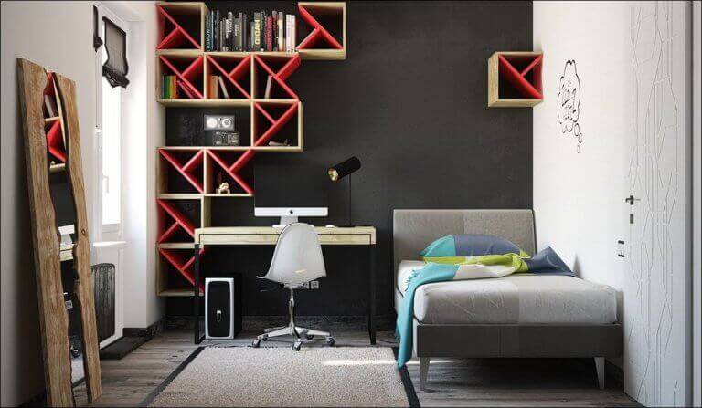
There seems to be a consensus regarding the color of the walls and the square feet of the room. If it’s small, forget about intense colors. However, the most important thing here is lighting, and your ability to create different light sources that make the features of the room stand out.
This is to do with taking into account the different levels of lighting and working from there. You have 3 basic areas: the ceiling, eye level, and the walls.
When you consider these three areas and control the lighting in each area, really any wall color can work in any room. Choose soft ceiling lighting, and different foot lamps and table lamps to complete your strategy, putting special emphasis on warm light. Once you’ve worked out the lighting, check out these ideas for decorating the walls.
Rule 2: lots of glass objects for small rooms
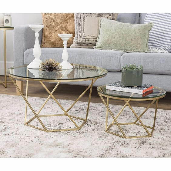
Another one of the classic tips for small rooms consists of including glass furniture and other glass decorations in the room. Of course, a glass-topped table can give the impression of lightness and transparency, and can even serve to increase the lighting of the room.
However, if you go overboard with this material, you’ll just succeed in drawing the eye too much to all the glass, visually saturating the room. That will produce the opposite effect to what you want.
A small glass-topped coffee table combined with metal to create a contrast would be a good idea. But a sofa with raised legs can also give that sensation of space that you’re looking for, for example. Don’t exaggerate the glass.
Rule 3: only use bench seats and stools
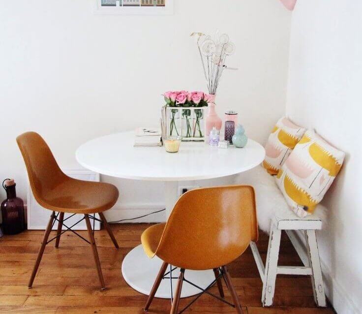
There’s a legend that exists that says that bench seats or stools without a back are perfect for small rooms, thanks to the fact that visually there seem to be fewer items in the room. This gives the idea of spaciousness, they say.
However, many interior decorators have added a discordant note to this theory. Why? They believe that a small stool or bench seat doesn’t do anything more than let you know that the room is too small, so small that normal chairs won’t fit.
So what can you do? We recommend compact chairs or made to size designs. You could also go for some iconic seats to give the room more personality. For instance, a Chester dining chair is a classic that you can adapt to almost any decor style.
Rule 4: does the size of the furniture matter in small rooms?
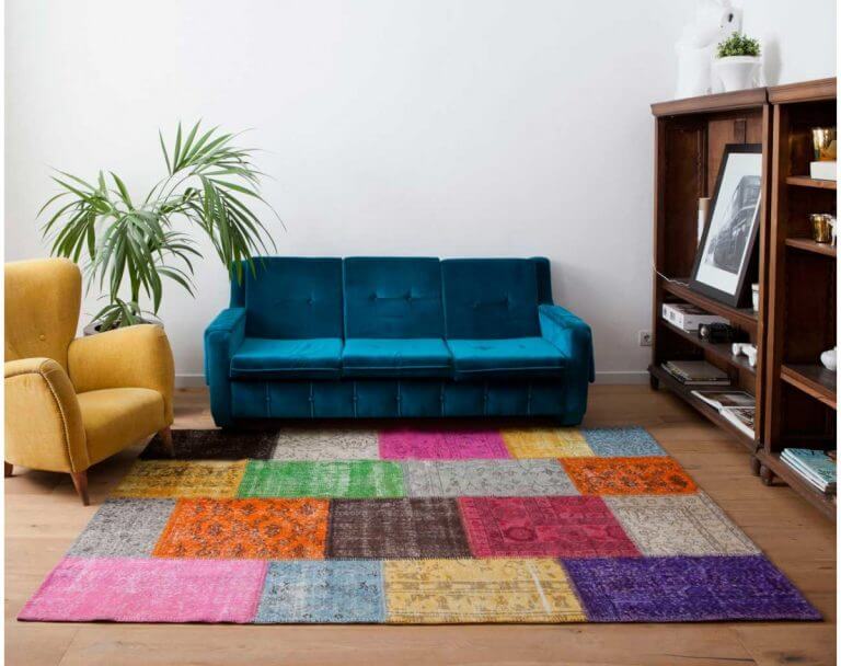
It would seem to be logical – small rooms = small furniture. Spacious rooms = big furniture. However, using many different small pieces of furniture in a room that’s not large can produce the exact opposite effect.
The best thing is actually to choose just a few pieces of furniture, regardless of the size. Modular furniture goes perfectly in smaller spaces since the sense of continuity lightens the atmosphere.
Another option is to put a rug down and make it a big one. A rug will visually create the impression of space, and better yet if you choose lighter colors.
Rule 5: rules on decorating small rooms only in neutral colors

A monochrome color palette may seem to be ideal for small rooms. However, once again it can create the opposite effect. The eye needs contrast and movement to be able to compare and move freely about the room. When you feature distinct colors, you increase the visual richness of the room. This contrast makes the room seem bigger.
Rule 6: open shelving is better
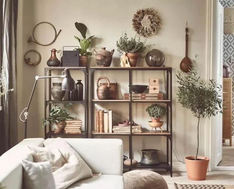
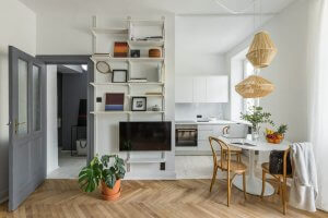
You’ve probably heard the idea that open shelving and bookcases are ideal for small rooms to create a sense of more space and openness. However, if you’re not a neat freak, you will cause the opposite effect.
The least appearance of disorder or untidiness on your shelves will be magnified in a small room and will appear much more chaotic. That, of course, is a far cry from the essence of cleanness and visual order you’re looking for. Put doors on your shelves that are the same color as the walls and you’ll appear to increase the size of the room.
Rule 7: rules of simplicity come first in small rooms
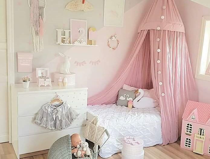
Don’t get confused – it’s one thing to not overdecorate a room and another to have a decor that’s dull and boring.
Add a dramatic focal point to the room, to be the center of attention. If you don’t, you won’t accomplish anything except highlighting the fact that you have a small house. Play around with the heights of the furniture, put a spider lamp in the living room or include a canopy above your bed, anything goes.
At the end of the day, rules are made to be questioned. While they can sometimes give you some useful ideas, when decorating your house creativity comes into play. It’s worth breaking a few rules and being daring to obtain the results you want to create more space in your small rooms.
Are you among those who have to put up with small rooms in your home? Have you tried all kinds of strategies, rules, and tips to make your small rooms look bigger, without success?
We’ve got some good news for you! Instead of giving you suggestions on what you should do, today we’re going to show you what not to do. Below are the rules you should break to be successful in decorating small rooms.
At the end of the day, rules are made to be kept sometimes and to break when the situation calls for it. Once you’ve learned some basic principles of interior design for small rooms, it’s time to apply them and look for the options that will suit your home best. Anything to add a couple of extra feet, visually speaking.
Breaking rules and making small rooms bigger
Rule 1: dark walls are a no-no

There seems to be a consensus regarding the color of the walls and the square feet of the room. If it’s small, forget about intense colors. However, the most important thing here is lighting, and your ability to create different light sources that make the features of the room stand out.
This is to do with taking into account the different levels of lighting and working from there. You have 3 basic areas: the ceiling, eye level, and the walls.
When you consider these three areas and control the lighting in each area, really any wall color can work in any room. Choose soft ceiling lighting, and different foot lamps and table lamps to complete your strategy, putting special emphasis on warm light. Once you’ve worked out the lighting, check out these ideas for decorating the walls.
Rule 2: lots of glass objects for small rooms

Another one of the classic tips for small rooms consists of including glass furniture and other glass decorations in the room. Of course, a glass-topped table can give the impression of lightness and transparency, and can even serve to increase the lighting of the room.
However, if you go overboard with this material, you’ll just succeed in drawing the eye too much to all the glass, visually saturating the room. That will produce the opposite effect to what you want.
A small glass-topped coffee table combined with metal to create a contrast would be a good idea. But a sofa with raised legs can also give that sensation of space that you’re looking for, for example. Don’t exaggerate the glass.
Rule 3: only use bench seats and stools

There’s a legend that exists that says that bench seats or stools without a back are perfect for small rooms, thanks to the fact that visually there seem to be fewer items in the room. This gives the idea of spaciousness, they say.
However, many interior decorators have added a discordant note to this theory. Why? They believe that a small stool or bench seat doesn’t do anything more than let you know that the room is too small, so small that normal chairs won’t fit.
So what can you do? We recommend compact chairs or made to size designs. You could also go for some iconic seats to give the room more personality. For instance, a Chester dining chair is a classic that you can adapt to almost any decor style.
Rule 4: does the size of the furniture matter in small rooms?

It would seem to be logical – small rooms = small furniture. Spacious rooms = big furniture. However, using many different small pieces of furniture in a room that’s not large can produce the exact opposite effect.
The best thing is actually to choose just a few pieces of furniture, regardless of the size. Modular furniture goes perfectly in smaller spaces since the sense of continuity lightens the atmosphere.
Another option is to put a rug down and make it a big one. A rug will visually create the impression of space, and better yet if you choose lighter colors.
Rule 5: rules on decorating small rooms only in neutral colors

A monochrome color palette may seem to be ideal for small rooms. However, once again it can create the opposite effect. The eye needs contrast and movement to be able to compare and move freely about the room. When you feature distinct colors, you increase the visual richness of the room. This contrast makes the room seem bigger.
Rule 6: open shelving is better

You’ve probably heard the idea that open shelving and bookcases are ideal for small rooms to create a sense of more space and openness. However, if you’re not a neat freak, you will cause the opposite effect.
The least appearance of disorder or untidiness on your shelves will be magnified in a small room and will appear much more chaotic. That, of course, is a far cry from the essence of cleanness and visual order you’re looking for. Put doors on your shelves that are the same color as the walls and you’ll appear to increase the size of the room.
Rule 7: rules of simplicity come first in small rooms

Don’t get confused – it’s one thing to not overdecorate a room and another to have a decor that’s dull and boring.
Add a dramatic focal point to the room, to be the center of attention. If you don’t, you won’t accomplish anything except highlighting the fact that you have a small house. Play around with the heights of the furniture, put a spider lamp in the living room or include a canopy above your bed, anything goes.
At the end of the day, rules are made to be questioned. While they can sometimes give you some useful ideas, when decorating your house creativity comes into play. It’s worth breaking a few rules and being daring to obtain the results you want to create more space in your small rooms.
