Perfume and Architecture - From Fragrance to Form

Perfume and architecture are two very different worlds. Evocative yet strangely comforting, these two art forms devote themselves to the creation of abstract concepts, which take on a physical form.
Both these industries use materials and components which, outside of their traditional context, suddenly take on a whole new dimension. Architecture, like many other art forms, has a huge influence on the perfume industry.
Whether designing a building or a fragrance, an architect strives to spark the imagination. They transport us to a time or place where we were happiest, and bring back a wave of memories and experiences.
Some companies are able to capitalize on the power of the humble perfume bottle, using their designs to appeal to a wider audience. In fact, many of them take their inspiration from the world of architecture.
One of the most important ways perfume brands create and maintain their image is through their packaging. In fact, their perfume bottles are so important that they represent a symbol of the company itself.
When the worlds of perfume and architecture come together, they can produce some truly incredible designs. Let’s take a look at some of the most interesting examples:
Woman, by Zaha Hadid for Donna Karan
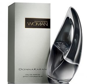
Late Iranian architect Zaha Hadid has left behind a fantastic legacy in the world of product design. Not only did she create several collections of designer shoes, but she also worked side-by-side with Donna Karan to design this striking bottle for her fragrance, Woman.
Donna Karan described this perfume as complex. Full of intense emotion and feeling, she compared the fragrance to the female mind. And what better way to express the complexities of Hadid’s work?
Hadid took inspiration for the design from the daring lines she so often used in her architectural work. With its elegant, curving shape, her creation is ultra feminine. Carved in beautiful black glass, this design gives the bottle a sense of energy and movement.
I still believe in the impossible.
-Zaha Hadid
Perfume and architecture, The One Sport, Dolce & Gabbana
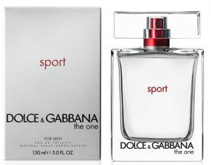
The bottle for this fragrance looks almost like an Ancient Greek column. It boasts the typical characteristics of the classic Doric Order – symmetrical, with straight lines and a sturdy, block-ish shape. This bottle was chosen for the fragrance, The One Sport, by Dolce & Gabbana, who filmed their advertisement among the Roman ruins in Tarragon.
This is an excellent example of how architecture influences perfume bottles. It was Dolce and Gabbana themselves who requested this design, instructing their team to use a glass column as the basis for their new bottle.
La Nuit de l’Homme, Yves Saint Laurent
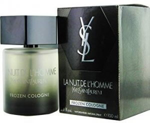
Following the example of Dolce & Gabbana, the designers at Yves Saint Laurent also took inspiration from architecture to create this powerful design. This cologne, La Nuit de L’homme, also took its inspiration from Ancient Greek columns. However, in this case, the designers opted for a different material.
Made from smoked glass, the top of the bottle is comprised of a large geometric lid, which crowns the Doric column.
Perfume and Architecture, Flower, by Kenzo
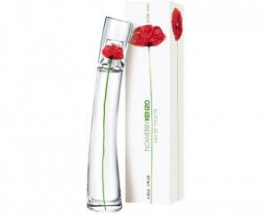
This iconic bottle was designed by the French artist Serge Mansau, who has a vast catalog of perfume bottles under his belt. This bottle first appeared back in the year 2000, displaying a strikingly minimalist design.
Resembling a transparent, stylized glass tower, the interior is decorated with a single, elegant poppy. This simple flower has an earthy, heady scent that stimulates the senses.
Mansau’s ethereal design is almost audacious in its simplicity and has made it one of the most iconic bottles the brand has ever produced.
Very Irresistible, Givenchy
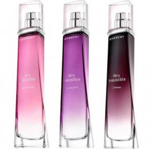
This perfume bottle is a stylized homage to the curving female body, representing sensuality in its purest form. Heading up the Cent Degrés architecture and design firm, Pablo Reinoso created the bottle for Very Irresistible in 2003.
The bottle itself is triangular in shape, allowing the light to shine through and enhance the soft pink tone of the glass. With this bottle, Givenchy sought to evoke femininity at its most mysterious.
J’adore, Dior
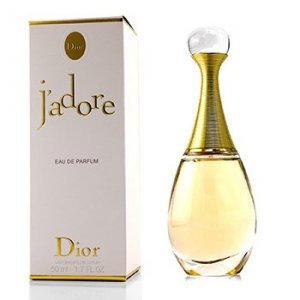
This design takes its inspiration from the early days of Dior. Drawing inspiration from the New Look aesthetic, it is a homage to the company’s first-ever perfume – a crystal bottle in the form of an amphora. The original version was made by Hervé van der Straeten, a French jewelry and furniture designer.
This beautiful bottle, created for the fragrance J’adore, was designed as a symbol of elegance and femininity. It is a curving, delicate bottle, with a long neck and an exaggerated “waist”. Since it first appeared on the market, this design has undergone a number of transformations to create an array of limited edition bottles.
As you can see, perfume and architecture have a lot in common. When it comes to marketing, they represent powerful tools, capable of creating products that are famous the world over.
Perfume and architecture are two very different worlds. Evocative yet strangely comforting, these two art forms devote themselves to the creation of abstract concepts, which take on a physical form.
Both these industries use materials and components which, outside of their traditional context, suddenly take on a whole new dimension. Architecture, like many other art forms, has a huge influence on the perfume industry.
Whether designing a building or a fragrance, an architect strives to spark the imagination. They transport us to a time or place where we were happiest, and bring back a wave of memories and experiences.
Some companies are able to capitalize on the power of the humble perfume bottle, using their designs to appeal to a wider audience. In fact, many of them take their inspiration from the world of architecture.
One of the most important ways perfume brands create and maintain their image is through their packaging. In fact, their perfume bottles are so important that they represent a symbol of the company itself.
When the worlds of perfume and architecture come together, they can produce some truly incredible designs. Let’s take a look at some of the most interesting examples:
Woman, by Zaha Hadid for Donna Karan

Late Iranian architect Zaha Hadid has left behind a fantastic legacy in the world of product design. Not only did she create several collections of designer shoes, but she also worked side-by-side with Donna Karan to design this striking bottle for her fragrance, Woman.
Donna Karan described this perfume as complex. Full of intense emotion and feeling, she compared the fragrance to the female mind. And what better way to express the complexities of Hadid’s work?
Hadid took inspiration for the design from the daring lines she so often used in her architectural work. With its elegant, curving shape, her creation is ultra feminine. Carved in beautiful black glass, this design gives the bottle a sense of energy and movement.
I still believe in the impossible.
-Zaha Hadid
Perfume and architecture, The One Sport, Dolce & Gabbana

The bottle for this fragrance looks almost like an Ancient Greek column. It boasts the typical characteristics of the classic Doric Order – symmetrical, with straight lines and a sturdy, block-ish shape. This bottle was chosen for the fragrance, The One Sport, by Dolce & Gabbana, who filmed their advertisement among the Roman ruins in Tarragon.
This is an excellent example of how architecture influences perfume bottles. It was Dolce and Gabbana themselves who requested this design, instructing their team to use a glass column as the basis for their new bottle.
La Nuit de l’Homme, Yves Saint Laurent

Following the example of Dolce & Gabbana, the designers at Yves Saint Laurent also took inspiration from architecture to create this powerful design. This cologne, La Nuit de L’homme, also took its inspiration from Ancient Greek columns. However, in this case, the designers opted for a different material.
Made from smoked glass, the top of the bottle is comprised of a large geometric lid, which crowns the Doric column.
Perfume and Architecture, Flower, by Kenzo

This iconic bottle was designed by the French artist Serge Mansau, who has a vast catalog of perfume bottles under his belt. This bottle first appeared back in the year 2000, displaying a strikingly minimalist design.
Resembling a transparent, stylized glass tower, the interior is decorated with a single, elegant poppy. This simple flower has an earthy, heady scent that stimulates the senses.
Mansau’s ethereal design is almost audacious in its simplicity and has made it one of the most iconic bottles the brand has ever produced.
Very Irresistible, Givenchy

This perfume bottle is a stylized homage to the curving female body, representing sensuality in its purest form. Heading up the Cent Degrés architecture and design firm, Pablo Reinoso created the bottle for Very Irresistible in 2003.
The bottle itself is triangular in shape, allowing the light to shine through and enhance the soft pink tone of the glass. With this bottle, Givenchy sought to evoke femininity at its most mysterious.
J’adore, Dior

This design takes its inspiration from the early days of Dior. Drawing inspiration from the New Look aesthetic, it is a homage to the company’s first-ever perfume – a crystal bottle in the form of an amphora. The original version was made by Hervé van der Straeten, a French jewelry and furniture designer.
This beautiful bottle, created for the fragrance J’adore, was designed as a symbol of elegance and femininity. It is a curving, delicate bottle, with a long neck and an exaggerated “waist”. Since it first appeared on the market, this design has undergone a number of transformations to create an array of limited edition bottles.
As you can see, perfume and architecture have a lot in common. When it comes to marketing, they represent powerful tools, capable of creating products that are famous the world over.


