Nate Berkus Interior Design: Learn About a Decor Icon
Whenever you’re getting ready to decorate a room, it’s good to do a deep dig through decor magazines and websites. If you want a fascinating, original place to look for inspiration, Nate Berkus and his interior design concepts are the best place to look, no matter which room you’re trying to decorate.
This interior designer has become one of the most famous in the world. What’s so amazing about his work is that you can apply it to any modern home. His concepts have revolutionized our understanding of decor, and are simply stunning to look at.
In this article, we’re going to talk a bit about Nate Berkus, his work, and some of the things that have made him one of the most important figures in the interior design world.
Who is Nate Berkus?

Born in California (US), this interior designer began his decor career at just 24. He took an early interest in interior design and all the principles involved in organizing a space and putting things exactly where they belong.
His main goal is to change some of the formulas of the past and find new directions to explore for the future. To him, we need to explore new avenues in homes, combining both originality and comfort. He doesn’t see any need for those two ideas to be mutually exclusive.
His work has appeared in all kinds of magazines from Architectural Digest to Vogue. This has obviously meant that his name has started to earn a lot of respect, and that people all over the world are seeing images of his designs. Many see him as one of the best interior designers in recent decades.
“The best design projects are the ones where people broke the rules.”
-Nate Berkus-
Nate Berkus: opening interiors to exteriors
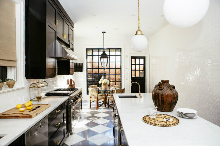
If you look at his work, you can tell that Nate Berkus tries to open interior spaces out to the exterior. He does this in more ways than simply having big windows that make a room feel open, he also uses colors that truly pop in natural light.
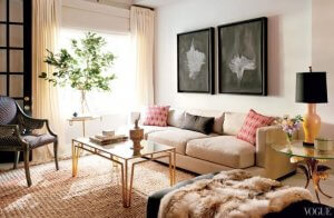
- This designer’s projects show a huge range of possibilities of how you can exteriorize your rooms. One of the best examples of that is his living room designs. He uses lots of different color schemes that natural light makes stand out beautifully.
- He also tries to avoid the common tendency to fill spaces with a single color. That doesn’t mean there’s no main color, it just means that he uses multiple to create contrasts. But he uses those contrasts to create calm, balanced spaces.
- Of course, there also needs to be warm light from artificial sources, but you should only use lamps and other lights during the parts of the day when there isn’t much natural light. Having big windows is so important here because the goal is to get as much natural light as possible.
The main goal: achieving balance
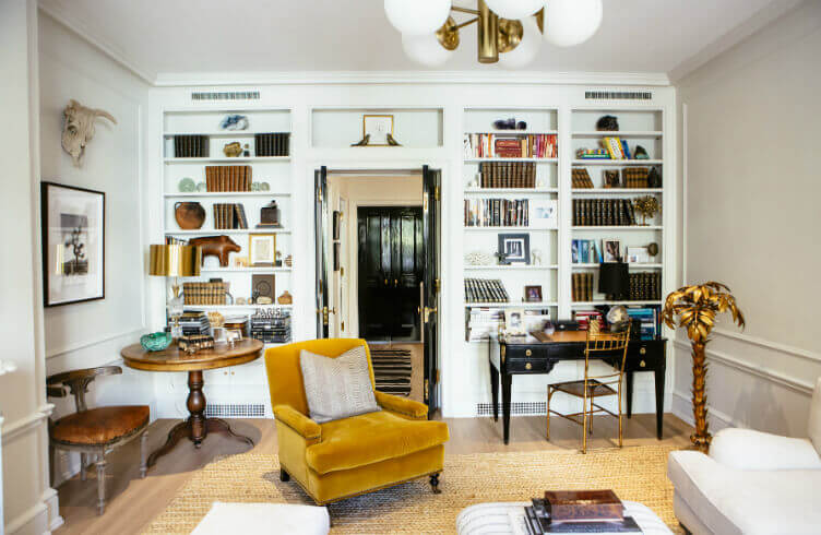
Nate Berkus always puts a heavy emphasis on finding a spatial balance in every room. He sees stability and a balance between colors and shapes as a way to make your home feel inviting and in a state of perfect harmony.
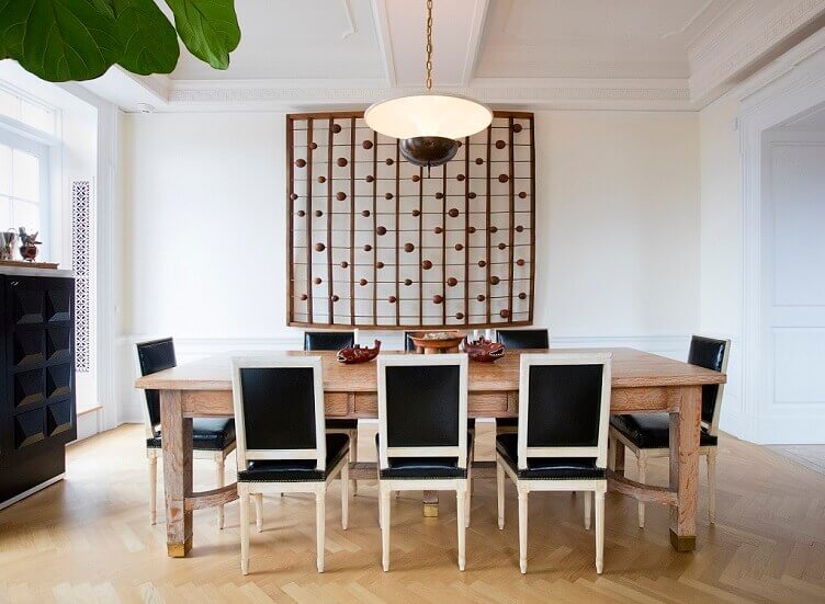
This means that the way you lay out your furniture in each and every room is extremely important. In Nate Berkus’ designs, you’ll see that the rooms are never empty. He likes to have a wide range of decorative elements spread throughout each room.
But having lots of things doesn’t mean filling up every corner. The point is still to organize your space in the most efficient way possible. You also want to have a balance between the shapes and sizes of things, and as we said above, colors that go well with the shapes.
Shape and color have an important relationship in interior design.
Nate Berkus and his tendency towards light brown, neutral tones
Berkus has a clear tendency for using light brown and neutral colors. He generally uses the browns for tables, shelves, and couches. The neutral colors usually go places like walls, rugs, and other secondary pieces of furniture.
Beyond those colors, he also tries to use some that stand out for some of the more important elements of a room. In other words, he tries to make sure there’s a sense of harmony between everything, and that a small amount of a striking color will stand out easily. Look at it this way: he thinks his designs through down to the millimeter.
Whenever you’re getting ready to decorate a room, it’s good to do a deep dig through decor magazines and websites. If you want a fascinating, original place to look for inspiration, Nate Berkus and his interior design concepts are the best place to look, no matter which room you’re trying to decorate.
This interior designer has become one of the most famous in the world. What’s so amazing about his work is that you can apply it to any modern home. His concepts have revolutionized our understanding of decor, and are simply stunning to look at.
In this article, we’re going to talk a bit about Nate Berkus, his work, and some of the things that have made him one of the most important figures in the interior design world.
Who is Nate Berkus?
Born in California (US), this interior designer began his decor career at just 24. He took an early interest in interior design and all the principles involved in organizing a space and putting things exactly where they belong.
His main goal is to change some of the formulas of the past and find new directions to explore for the future. To him, we need to explore new avenues in homes, combining both originality and comfort. He doesn’t see any need for those two ideas to be mutually exclusive.
His work has appeared in all kinds of magazines from Architectural Digest to Vogue. This has obviously meant that his name has started to earn a lot of respect, and that people all over the world are seeing images of his designs. Many see him as one of the best interior designers in recent decades.
“The best design projects are the ones where people broke the rules.”
-Nate Berkus-
Nate Berkus: opening interiors to exteriors
If you look at his work, you can tell that Nate Berkus tries to open interior spaces out to the exterior. He does this in more ways than simply having big windows that make a room feel open, he also uses colors that truly pop in natural light.
- This designer’s projects show a huge range of possibilities of how you can exteriorize your rooms. One of the best examples of that is his living room designs. He uses lots of different color schemes that natural light makes stand out beautifully.
- He also tries to avoid the common tendency to fill spaces with a single color. That doesn’t mean there’s no main color, it just means that he uses multiple to create contrasts. But he uses those contrasts to create calm, balanced spaces.
- Of course, there also needs to be warm light from artificial sources, but you should only use lamps and other lights during the parts of the day when there isn’t much natural light. Having big windows is so important here because the goal is to get as much natural light as possible.
The main goal: achieving balance
Nate Berkus always puts a heavy emphasis on finding a spatial balance in every room. He sees stability and a balance between colors and shapes as a way to make your home feel inviting and in a state of perfect harmony.
This means that the way you lay out your furniture in each and every room is extremely important. In Nate Berkus’ designs, you’ll see that the rooms are never empty. He likes to have a wide range of decorative elements spread throughout each room.
But having lots of things doesn’t mean filling up every corner. The point is still to organize your space in the most efficient way possible. You also want to have a balance between the shapes and sizes of things, and as we said above, colors that go well with the shapes.
Shape and color have an important relationship in interior design.
Nate Berkus and his tendency towards light brown, neutral tones
Berkus has a clear tendency for using light brown and neutral colors. He generally uses the browns for tables, shelves, and couches. The neutral colors usually go places like walls, rugs, and other secondary pieces of furniture.
Beyond those colors, he also tries to use some that stand out for some of the more important elements of a room. In other words, he tries to make sure there’s a sense of harmony between everything, and that a small amount of a striking color will stand out easily. Look at it this way: he thinks his designs through down to the millimeter.
All cited sources were thoroughly reviewed by our team to ensure their quality, reliability, currency, and validity. The bibliography of this article was considered reliable and of academic or scientific accuracy.
- Berkus, Nate: The things that matter, Nueva York, Spiegel & Grau, 2012.


