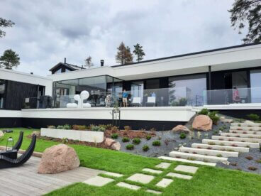
Interior Design According to Alvaro Siza

The creations of Alvaro Siza are authentic representative works that are purely formal and completely functional.
In the world of modern architecture, designs are becoming purer. We are talking about not only furniture but about architecture itself. Right now we’re going to study the interior design according to Alvaro Siza. To be more exact, we’re going to study his novel perspectives that serve as a base for future architects.
His works go well with constructions of a grand scale because the different ambiance helps us to understand reality from a different point of view.
Alvaro Siza is an architect whose works are setting the scene for modern construction. Besides the aesthetic aspect and his sense of space, they are innovating concepts. Without a doubt, they demonstrate appreciation and sensibility for the art of architecture.
Humans feel small
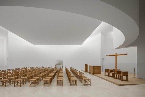
church/arquitecturaydiseño.es
The works of this Portuguese artist attempt to open spaces and each corner has a mission.
He configures structures like consistent and robust pieces of art. The walls are wide and huge and establish an intersection of shapes and the point is to achieve the feeling of a block.
Siza’s style doesn’t support the idea of furniture overshadowing architectural design because it tends to remove the design as the main feature. In reality, the creation is worth more than what’s inside. Nevertheless, there must be a common link among all the resources, including the person.
If people are ignored, architecture is unnecessary.
Alvaro Siza
Solitude and spacial purity in the architecture of Alvaro Siza
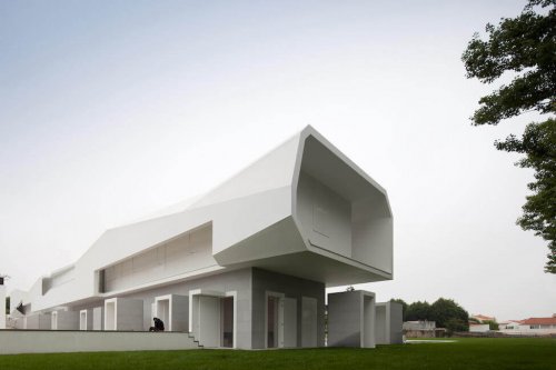
Building/archdaily,pe
The main aim of this architect is to embody the idea of environmental purity. As a result, this concept can be abstract and a bit subjective. But at the core, the objective is to achieve a process of structural amplitude.
- In their horizontal form, as well as the vertical form, the works of Siza are configured with designs on a grand scale. Here is where the lines direct us to the sensations that we want to perceive.
- Purity is present in the works. You don’t have to create interiors with extravagant elements. Instead, design them with simplicity and functionality. Always try to avoid decorative saturation. Living quarters should mesh correctly with the people and facilitate the use of the space.
- Don’t clutter the interior with too much furniture. In reality, it’s not necessary. There can be simple organization without overloading the space. As we mentioned before, the container directly influences the contents.
- The interiors are always basic. Don’t complicate life with useless items. On the contrary; there should always be general harmony. This means from the entrance to the rooms inside.
Long hallways and absolute transparency
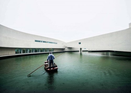 Building over water/magaceen.com
The fundamental object that Alvaro Siza wants to show is transparency. This is the characteristic that dominates his works. The interiors are large areas and long halls where perspective plays a very important role.
Directionality, as much in the floors as in the ceilings, opens completely innovative fields of vision. It’s these designs that you see in his public buildings, auditoriums, and huge spaces. In fact, in this field of work is where Siza truly stands out.
Because of this, the work of Siza is a true innovation for today’s world. We must add that he doesn’t like filling spaces with decorative articles and other items that can distract. The main focus is the design of the building that remains the magnificence of art.
The work of the architect is an answer to the space
Alvaro Siza
Practical interiors and subtleties of Alvaro Siza 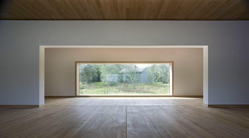
The most representative feature of this architect’s work is his way of distributing interiors. This refers to the fact that he always tries to interconnect everything. There can’t be too much radical separation among the parts. The idea of this is to have stable communication.
There is practicality, facilitating of entrances, making wide spaces, and adequate space for the location of everything. He tries to achieve the idea of abundance and he prioritizes functionality and guarantees minimalist aesthetic, combining certain touches of the influence of Bauhaus.
The creations of Alvaro Siza are authentic representative works that are purely formal and completely functional.
In the world of modern architecture, designs are becoming purer. We are talking about not only furniture but about architecture itself. Right now we’re going to study the interior design according to Alvaro Siza. To be more exact, we’re going to study his novel perspectives that serve as a base for future architects.
His works go well with constructions of a grand scale because the different ambiance helps us to understand reality from a different point of view.
Alvaro Siza is an architect whose works are setting the scene for modern construction. Besides the aesthetic aspect and his sense of space, they are innovating concepts. Without a doubt, they demonstrate appreciation and sensibility for the art of architecture.
Humans feel small

church/arquitecturaydiseño.es
The works of this Portuguese artist attempt to open spaces and each corner has a mission.
He configures structures like consistent and robust pieces of art. The walls are wide and huge and establish an intersection of shapes and the point is to achieve the feeling of a block.
Siza’s style doesn’t support the idea of furniture overshadowing architectural design because it tends to remove the design as the main feature. In reality, the creation is worth more than what’s inside. Nevertheless, there must be a common link among all the resources, including the person.
If people are ignored, architecture is unnecessary.
Alvaro Siza
Solitude and spacial purity in the architecture of Alvaro Siza

Building/archdaily,pe
The main aim of this architect is to embody the idea of environmental purity. As a result, this concept can be abstract and a bit subjective. But at the core, the objective is to achieve a process of structural amplitude.
- In their horizontal form, as well as the vertical form, the works of Siza are configured with designs on a grand scale. Here is where the lines direct us to the sensations that we want to perceive.
- Purity is present in the works. You don’t have to create interiors with extravagant elements. Instead, design them with simplicity and functionality. Always try to avoid decorative saturation. Living quarters should mesh correctly with the people and facilitate the use of the space.
- Don’t clutter the interior with too much furniture. In reality, it’s not necessary. There can be simple organization without overloading the space. As we mentioned before, the container directly influences the contents.
- The interiors are always basic. Don’t complicate life with useless items. On the contrary; there should always be general harmony. This means from the entrance to the rooms inside.
Long hallways and absolute transparency
 Building over water/magaceen.com
The fundamental object that Alvaro Siza wants to show is transparency. This is the characteristic that dominates his works. The interiors are large areas and long halls where perspective plays a very important role.
Directionality, as much in the floors as in the ceilings, opens completely innovative fields of vision. It’s these designs that you see in his public buildings, auditoriums, and huge spaces. In fact, in this field of work is where Siza truly stands out.
Because of this, the work of Siza is a true innovation for today’s world. We must add that he doesn’t like filling spaces with decorative articles and other items that can distract. The main focus is the design of the building that remains the magnificence of art.
The work of the architect is an answer to the space
Alvaro Siza
Practical interiors and subtleties of Alvaro Siza 
The most representative feature of this architect’s work is his way of distributing interiors. This refers to the fact that he always tries to interconnect everything. There can’t be too much radical separation among the parts. The idea of this is to have stable communication.
There is practicality, facilitating of entrances, making wide spaces, and adequate space for the location of everything. He tries to achieve the idea of abundance and he prioritizes functionality and guarantees minimalist aesthetic, combining certain touches of the influence of Bauhaus.
All cited sources were thoroughly reviewed by our team to ensure their quality, reliability, currency, and validity. The bibliography of this article was considered reliable and of academic or scientific accuracy.
Fleck, Brigitte: Álvaro Siza, Madrid, Akal, 1999.


