Discover 3 Striking Wall Colors
You can make a specific room stand out by both organizing the furniture and combining resources. For this reason, we’re going to show you three striking wall colors that will allow you to make a room pop.
From a chromatic point of view, it’s important to emphasize the need to adequately mix and match the colors. But if you’re attracted to one, in particular, you can always resort to solutions that help establish harmony.
Some colors can indeed be somewhat strong and stand out from the rest. Therefore, it’s a matter of studying and looking for new formulations that adapt to your environment.
What are striking colors?
The concept “striking” could be defined as something that stands out. In other words, an element that doesn’t give rise to confusion or discussion. It’s eloquent and stands out on its own.
If we apply this explanation within the world of interior design, we could consider that some colors play a determining role in a room, standing out considerably and offering their own identity.
Striking colors attract attention and must enhance the atmosphere since it plays a very important role in the environment where it’s used. So you should carefully study how to work the internal color scheme.
Some colors are noticeably stronger than others.
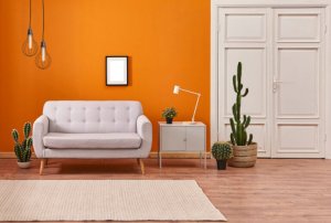
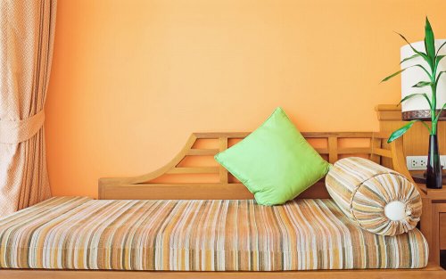
One of the striking colors – orange

The freshness and radiant appearance this color offers differentiate it from other cold and dark ones. It’s associated with a feeling of joy and enthusiasm and arouses a certain degree of inner activity. Here are three characteristics that define it:
- Its application in a room rejuvenates the environment and transmits a warm and enveloping feeling. It’s quite intense and you can find it in different shades.
- It helps generate lucidity, especially in a room with a lot of natural light. Also, it’s a diligent color that directly affects emotions, offering a certain energy that, combined with the lighting of any space, promotes a more intense aesthetic appearance.
- Its relationship with other colors may be more complex. However, all you have to do is analyze possible combinations. For example, it’s closely linked to green, white, or neutral colors such as gray.
Emerald green, another of the striking colors
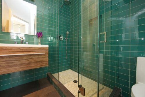
Emerald green has established itself as one of the most sophisticated colors in interior design. It’s used more and more often, basically because it offers personality and sophistication. It fits very well in classic or alternative decorative styles.
The combination with other colors is limited. In other words, it’s easy to mix and match with white, gray, and neutral colors.
This color is effective to use in the living room or bedroom. Also, you can also put it in the bathroom, especially with marble and tiles.
Although it’s a cold color, it clearly reflects subtlety and solidity.
Indigo blue, the last of the striking wall colors

This is a cold color. Nevertheless, its seriousness and gentleness combine to reflect a sober and sensitive feeling in any room. For example, this color fits perfectly well in a living room, since it transmits a lot of strength.
It’s one of those colors that people usually choose to convey a masculine touch, especially in men’s homes or offices. However, you can also use it in bathrooms, where it establishes a clean and hygienic feel.
When it comes to relating it to other colors, earthy ones look great, especially with wooden furniture, as well as others such as green and blue, which are very similar to this blue. If you want to establish a certain contrast, white will help you distinguish colors.
In short, these three striking colors help intensify interiors, by transmitting strength and activating the senses.
You can make a specific room stand out by both organizing the furniture and combining resources. For this reason, we’re going to show you three striking wall colors that will allow you to make a room pop.
From a chromatic point of view, it’s important to emphasize the need to adequately mix and match the colors. But if you’re attracted to one, in particular, you can always resort to solutions that help establish harmony.
Some colors can indeed be somewhat strong and stand out from the rest. Therefore, it’s a matter of studying and looking for new formulations that adapt to your environment.
What are striking colors?
The concept “striking” could be defined as something that stands out. In other words, an element that doesn’t give rise to confusion or discussion. It’s eloquent and stands out on its own.
If we apply this explanation within the world of interior design, we could consider that some colors play a determining role in a room, standing out considerably and offering their own identity.
Striking colors attract attention and must enhance the atmosphere since it plays a very important role in the environment where it’s used. So you should carefully study how to work the internal color scheme.
Some colors are noticeably stronger than others.
One of the striking colors – orange
The freshness and radiant appearance this color offers differentiate it from other cold and dark ones. It’s associated with a feeling of joy and enthusiasm and arouses a certain degree of inner activity. Here are three characteristics that define it:
- Its application in a room rejuvenates the environment and transmits a warm and enveloping feeling. It’s quite intense and you can find it in different shades.
- It helps generate lucidity, especially in a room with a lot of natural light. Also, it’s a diligent color that directly affects emotions, offering a certain energy that, combined with the lighting of any space, promotes a more intense aesthetic appearance.
- Its relationship with other colors may be more complex. However, all you have to do is analyze possible combinations. For example, it’s closely linked to green, white, or neutral colors such as gray.
Emerald green, another of the striking colors
Emerald green has established itself as one of the most sophisticated colors in interior design. It’s used more and more often, basically because it offers personality and sophistication. It fits very well in classic or alternative decorative styles.
The combination with other colors is limited. In other words, it’s easy to mix and match with white, gray, and neutral colors.
This color is effective to use in the living room or bedroom. Also, you can also put it in the bathroom, especially with marble and tiles.
Although it’s a cold color, it clearly reflects subtlety and solidity.
Indigo blue, the last of the striking wall colors
This is a cold color. Nevertheless, its seriousness and gentleness combine to reflect a sober and sensitive feeling in any room. For example, this color fits perfectly well in a living room, since it transmits a lot of strength.
It’s one of those colors that people usually choose to convey a masculine touch, especially in men’s homes or offices. However, you can also use it in bathrooms, where it establishes a clean and hygienic feel.
When it comes to relating it to other colors, earthy ones look great, especially with wooden furniture, as well as others such as green and blue, which are very similar to this blue. If you want to establish a certain contrast, white will help you distinguish colors.
In short, these three striking colors help intensify interiors, by transmitting strength and activating the senses.
All cited sources were thoroughly reviewed by our team to ensure their quality, reliability, currency, and validity. The bibliography of this article was considered reliable and of academic or scientific accuracy.
- Egon Schuler, Josef: Color y decoración en el hogar, Gustavo Gili, 1968.


