Summer Bedspreads: 5 Ideas for Summer Blankets

Sometimes we worry so much about not being cold in the winter that we neglect blankets for other seasons. Here, we’re going to focus on summer bedspreads, which can be practical and versatile.
The end of spring and the beginning of summer means you’ll need lighter bedding. You can also consider more cheerful colors, which will be a fresh touch for the bedroom.
In this article, we’re basing our recommendations on data by Pantone, a company focused on the differentiation and comparison of colors. Since 2000, this company has published what we know as the “color of the year.” This color is a prediction of what color will be the feature of walls, bedding, textiles, clothing…
During 2018, the color chosen was ultraviolet.
The best thing about Pantone is they have samples of each color on small cards so you can easily recognize each color. In turn, each color is described with numbers and acronyms. Therefore, you won’t have any problem when searching and finding one in particular.
We’ve decided to focus on colors that you’ll see in the world of fashion during the year, both in clothing and accessories as in interior design. In this case, we’re talking about summer bedspreads.
1. Roses and violets
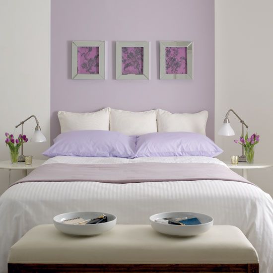
First, we have to talk about ultraviolet, which, as we said, was the color 2018. Although this color is a bit cold, if you’re careful, you won’t have a problem using it in your bedroom. On the other hand, it is an intense color that can remind of us of the cosmos, the universe.
“It was chosen to evoke a counterculture flair, a grab for originality, ingenuity and visionary thinking.”
-Laurie Pressman-
Therefore, choosing summer bedspreads in this color means following the latest trends. Even so, you shouldn’t ignore the following colors:
- Rose lavender: for relaxing and calm interiors. This can be good for children’s rooms.
- Fuchsia pink: ideal in expressive, bright interiors. Without a doubt, this should be the main color of the room and paired with white.
- Almost mauve: This is practically like a mauve or a light pink. We think this is perfect for interiors with a romantic touch.
2. Arcadia Green
Without a doubt, this is an intense, fresh color, which is ideal for the summer. This reminds us of emerald green.
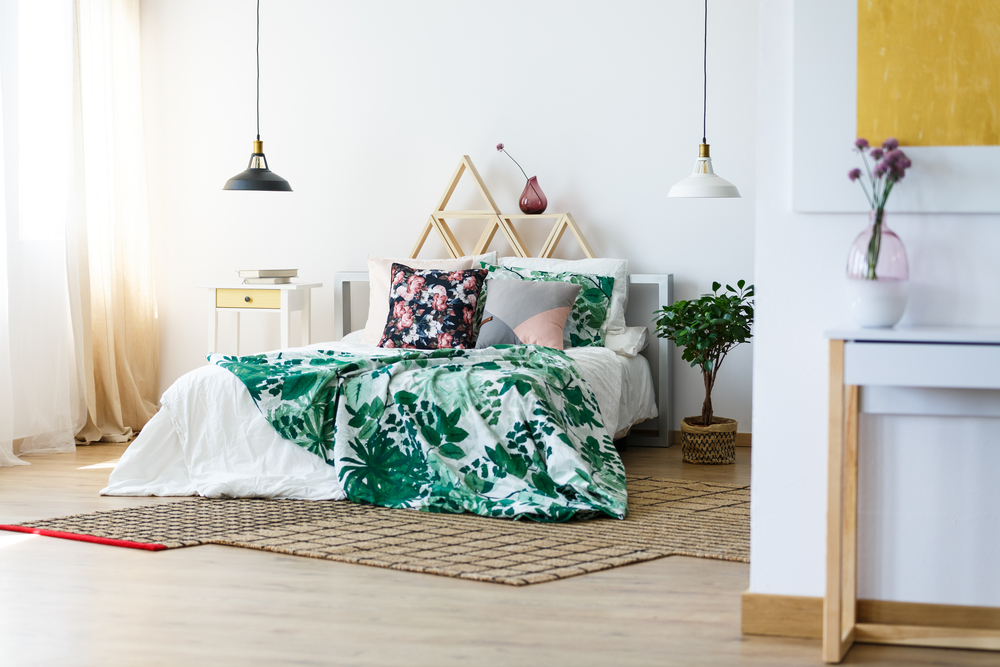
In addition, let’s not forget that there is an important trend towards natural looks. You might think that you’ll start to see all green interiors. However, we recommend combining this with fairly neutral tones.
3. Reds and oranges
Next, we’ll talk about reds and oranges that, according to Pantone, we’ll start to see more of.
- Blooming Dahlia: a similar tone to peach. This is definitely a warm tone, although it is neutral and discreet.
- Cherry Tomato: the name says it all. This is a strong color. It is alive, striking, and explosive. This could be a risky option. Therefore, you should be careful when combining it with other colors.
- Chili Oil: this is an earthy red that seems more like autumn than spring or summer. However, by combining it with more summery colors, you can create a beautiful interior.

4. Yellows
As for yellows for summer bedspreads, two stand out:
- Lime Punch: choosing this bright lime color is a little daring. With this color, you’ll definitely have a summery, cheery interior.
- Meadowlark: This is a vivid, striking color. This is a more classic option from the previous. However, these two colors will make your interior brighter.

If you’re looking for originality, these colors are perfect. Usually, these are only used for accessories to add small pops of color. However, if you decide to turn them into the main color of your bedroom, you’ll end up with a space that gives off a feeling of liveliness and joy.
5. Brown for summer bedspreads
Finally, we’ll talk about Emperor brown. This reminds us a lot of the color of chocolate. It is perfect for bedrooms that have a more classic and traditional touch.
We know that most people associate browns with autumn and winter. However, you should consider this for summer bedspreads. To give it a summery feel, you should combine it with neutral, lighter tones, such as gold or a sandy color.
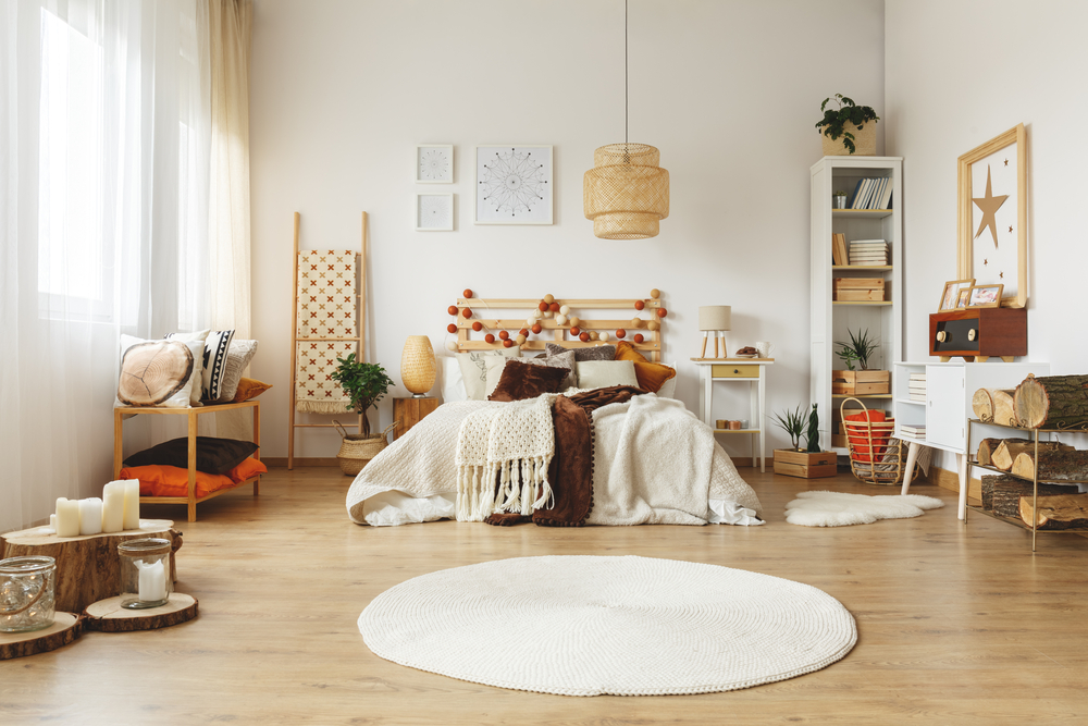
Obviously, you should take into account the other colors that you already have in your bedroom. Consider other accessories, textiles, cushions, and wall colors. Also, you have to know how to combine these colors to create a beautiful, harmonious space with these summer bedspreads. You can also take a look at other colors, such as Little Boy Blue, which is light and soft.
As you’ve seen, it’s just as important to decorate your house in the summer, as well as in the winter. Remember that it’s easy to find each color, thanks to Pantone’s organizing system.
One last idea: don’t forget that you can choose the color as a pattern on another lighter or neutral background color.
Sometimes we worry so much about not being cold in the winter that we neglect blankets for other seasons. Here, we’re going to focus on summer bedspreads, which can be practical and versatile.
The end of spring and the beginning of summer means you’ll need lighter bedding. You can also consider more cheerful colors, which will be a fresh touch for the bedroom.
In this article, we’re basing our recommendations on data by Pantone, a company focused on the differentiation and comparison of colors. Since 2000, this company has published what we know as the “color of the year.” This color is a prediction of what color will be the feature of walls, bedding, textiles, clothing…
During 2018, the color chosen was ultraviolet.
The best thing about Pantone is they have samples of each color on small cards so you can easily recognize each color. In turn, each color is described with numbers and acronyms. Therefore, you won’t have any problem when searching and finding one in particular.
We’ve decided to focus on colors that you’ll see in the world of fashion during the year, both in clothing and accessories as in interior design. In this case, we’re talking about summer bedspreads.
1. Roses and violets
First, we have to talk about ultraviolet, which, as we said, was the color 2018. Although this color is a bit cold, if you’re careful, you won’t have a problem using it in your bedroom. On the other hand, it is an intense color that can remind of us of the cosmos, the universe.

“It was chosen to evoke a counterculture flair, a grab for originality, ingenuity and visionary thinking.”
-Laurie Pressman-
Therefore, choosing summer bedspreads in this color means following the latest trends. Even so, you shouldn’t ignore the following colors:
- Rose lavender: for relaxing and calm interiors. This can be good for children’s rooms.
- Fuchsia pink: ideal in expressive, bright interiors. Without a doubt, this should be the main color of the room and paired with white.
- Almost mauve: This is practically like a mauve or a light pink. We think this is perfect for interiors with a romantic touch.
2. Arcadia Green
Without a doubt, this is an intense, fresh color, which is ideal for the summer. This reminds us of emerald green.

In addition, let’s not forget that there is an important trend towards natural looks. You might think that you’ll start to see all green interiors. However, we recommend combining this with fairly neutral tones.
3. Reds and oranges
Next, we’ll talk about reds and oranges that, according to Pantone, we’ll start to see more of.
- Blooming Dahlia: a similar tone to peach. This is definitely a warm tone, although it is neutral and discreet.
- Cherry Tomato: the name says it all. This is a strong color. It is alive, striking, and explosive. This could be a risky option. Therefore, you should be careful when combining it with other colors.
- Chili Oil: this is an earthy red that seems more like autumn than spring or summer. However, by combining it with more summery colors, you can create a beautiful interior.

4. Yellows
As for yellows for summer bedspreads, two stand out:
- Lime Punch: choosing this bright lime color is a little daring. With this color, you’ll definitely have a summery, cheery interior.
- Meadowlark: This is a vivid, striking color. This is a more classic option from the previous. However, these two colors will make your interior brighter.

If you’re looking for originality, these colors are perfect. Usually, these are only used for accessories to add small pops of color. However, if you decide to turn them into the main color of your bedroom, you’ll end up with a space that gives off a feeling of liveliness and joy.
5. Brown for summer bedspreads
Finally, we’ll talk about Emperor brown. This reminds us a lot of the color of chocolate. It is perfect for bedrooms that have a more classic and traditional touch.
We know that most people associate browns with autumn and winter. However, you should consider this for summer bedspreads. To give it a summery feel, you should combine it with neutral, lighter tones, such as gold or a sandy color.

Obviously, you should take into account the other colors that you already have in your bedroom. Consider other accessories, textiles, cushions, and wall colors. Also, you have to know how to combine these colors to create a beautiful, harmonious space with these summer bedspreads. You can also take a look at other colors, such as Little Boy Blue, which is light and soft.
As you’ve seen, it’s just as important to decorate your house in the summer, as well as in the winter. Remember that it’s easy to find each color, thanks to Pantone’s organizing system.
One last idea: don’t forget that you can choose the color as a pattern on another lighter or neutral background color.


