The Interior Design of the Hôtel Tassel
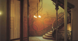
Within the entire history of modernist architecture, there’s one building that has had a particularly noteworthy impact: the Hôtel Tassel. With a fascinating interior design scheme, it is a historical reference point and source of inspiration for many artists since its construction.
People often study and dig deep into the work of architects and interior designers from the end of the 19th century and the beginning of the 20th century. This is largely because of their creative, innovative aesthetics. They completely broke away from the traditional schemes of the past.
The Hôtel Tassel is just one example of that, but it’s also one of the most famous, most useful buildings in the history of architecture. It has been a source of inspiration for lots of interior designers well into this 21st century. The furniture, the structure, and the internal layout are all innovative in ways that we can still apply to homes today.
A bit of history
The person who designed the Hôtel Tassel was the architect and artist, Víctor Horta. He worked on it between 1892-1893, in Brussels (Belgium). You’ll find all the concepts and theories at work in modernism in this building. In a sense, it’s the product of all those ideas, at a time when they were really starting to take shape.
Horta studied architecture, art, and design in France. He also started to find his way into various artistic circles. What he wanted was to get more education and ideas that would help him make his projects real. According to lots of people who knew him, or his work, he was a true specialist in his field.
At this time, we were starting to learn how to control iron and glass, and thanks to the Industrial Revolution, architects had all kinds of different tools at their disposal to give shape to their ideas. This is how the art nouveau movement began.
Modernism was a complete break from all the architectural dogma of the 19th century.
The natural feel of the Hôtel Tassel
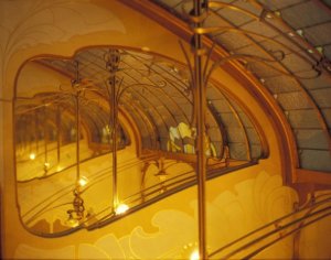
The main objective of the interior design scheme was to create a sense of nature, of the organic world. To put it more simply, if you take a deep look at the natural world, you’ll see that this building has an aesthetic that’s completely different from tradition, and is closer to the nature of life.
- One of its most unique aspects is the curves and winding shapes all over the building. Why did they focus so much on that? Their main goal was to try to create organic shapes that reflected life and nature.
- One of the common characteristics of all the rooms is that they’re dynamic. No matter where you look, you’ll see all kinds of subtle, delicate things. It’s like there’s a kind of structural “restlessness.” Horta used all kinds of formats, and they were all different than what you would have seen in buildings in the 19th century.
- Fluidity is another big characteristic of the interior spaces in the Hôtel Tassel. You’ll see lots of wavy and asymmetrical shapes–the goal was to break away from completely from classic ideas of interior design.
- You’ll also see a lot of the “whiplash” curves characteristic of art nouveau. This is an aesthetic element unique to the movement, that shows up all over, whether in physical decorations or paintings.
The staircase: a modernist marvel
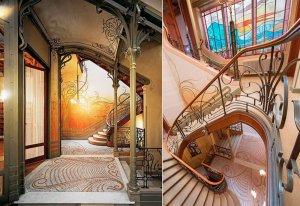
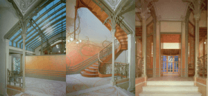
The unhabitable part of the house is nearly 11,000 square feet. Right in the center of it, you’ll find its famous multi-directional staircase. That design makes it much easier to access other rooms in the house, and go up to other floors.
It has a cast-iron rail with wavy lines and no concrete shape in particular. There’s a glass covering on the ceiling that makes the room feel light, dynamic, and above all, very bright.
The steps fall towards the floor as if they were a waterfall. The last step is wider than all the rest, and, of course, has a curved shape.
This architectural marvel is all about innovation and creativity.
Iron and plasticity in the Hôtel Tassel
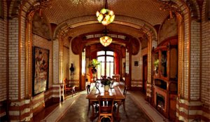
Iron is the main material in the building. Horta used it as the backbone for a frame with lots of long, thin columns. He wanted to give the interior of the building a lot of elegance, and a structure that would hold it up easily.
All that goes perfectly with the curving designs on the floors and the way the walls were painted. They have the “whiplash” curves we mentioned earlier, which turn it into an absolutely magical space. There’s a constant sense of plasticity and flexibility because the curves are present in just about every aspect of the decoration.
Within the entire history of modernist architecture, there’s one building that has had a particularly noteworthy impact: the Hôtel Tassel. With a fascinating interior design scheme, it is a historical reference point and source of inspiration for many artists since its construction.
People often study and dig deep into the work of architects and interior designers from the end of the 19th century and the beginning of the 20th century. This is largely because of their creative, innovative aesthetics. They completely broke away from the traditional schemes of the past.
The Hôtel Tassel is just one example of that, but it’s also one of the most famous, most useful buildings in the history of architecture. It has been a source of inspiration for lots of interior designers well into this 21st century. The furniture, the structure, and the internal layout are all innovative in ways that we can still apply to homes today.
A bit of history

The person who designed the Hôtel Tassel was the architect and artist, Víctor Horta. He worked on it between 1892-1893, in Brussels (Belgium). You’ll find all the concepts and theories at work in modernism in this building. In a sense, it’s the product of all those ideas, at a time when they were really starting to take shape.
Horta studied architecture, art, and design in France. He also started to find his way into various artistic circles. What he wanted was to get more education and ideas that would help him make his projects real. According to lots of people who knew him, or his work, he was a true specialist in his field.
At this time, we were starting to learn how to control iron and glass, and thanks to the Industrial Revolution, architects had all kinds of different tools at their disposal to give shape to their ideas. This is how the art nouveau movement began.
Modernism was a complete break from all the architectural dogma of the 19th century.
The natural feel of the Hôtel Tassel

The main objective of the interior design scheme was to create a sense of nature, of the organic world. To put it more simply, if you take a deep look at the natural world, you’ll see that this building has an aesthetic that’s completely different from tradition, and is closer to the nature of life.
- One of its most unique aspects is the curves and winding shapes all over the building. Why did they focus so much on that? Their main goal was to try to create organic shapes that reflected life and nature.
- One of the common characteristics of all the rooms is that they’re dynamic. No matter where you look, you’ll see all kinds of subtle, delicate things. It’s like there’s a kind of structural “restlessness.” Horta used all kinds of formats, and they were all different than what you would have seen in buildings in the 19th century.
- Fluidity is another big characteristic of the interior spaces in the Hôtel Tassel. You’ll see lots of wavy and asymmetrical shapes–the goal was to break away from completely from classic ideas of interior design.
- You’ll also see a lot of the “whiplash” curves characteristic of art nouveau. This is an aesthetic element unique to the movement, that shows up all over, whether in physical decorations or paintings.
The staircase: a modernist marvel

The unhabitable part of the house is nearly 11,000 square feet. Right in the center of it, you’ll find its famous multi-directional staircase. That design makes it much easier to access other rooms in the house, and go up to other floors.
It has a cast-iron rail with wavy lines and no concrete shape in particular. There’s a glass covering on the ceiling that makes the room feel light, dynamic, and above all, very bright.
The steps fall towards the floor as if they were a waterfall. The last step is wider than all the rest, and, of course, has a curved shape.
This architectural marvel is all about innovation and creativity.
Iron and plasticity in the Hôtel Tassel

Iron is the main material in the building. Horta used it as the backbone for a frame with lots of long, thin columns. He wanted to give the interior of the building a lot of elegance, and a structure that would hold it up easily.
All that goes perfectly with the curving designs on the floors and the way the walls were painted. They have the “whiplash” curves we mentioned earlier, which turn it into an absolutely magical space. There’s a constant sense of plasticity and flexibility because the curves are present in just about every aspect of the decoration.
All cited sources were thoroughly reviewed by our team to ensure their quality, reliability, currency, and validity. The bibliography of this article was considered reliable and of academic or scientific accuracy.
- H., Kliczkowski: Victor Horta, Loft, 2003.


