Monochrome Settings: A Safe Bet
Monochrome palettes create a simple, sure-win color scheme for any setting. A single color used with shades varying in the amounts of white, gray or black can create a variety of gentle settings.
With just a single color, you can play around with light or dark shades that will always harmonize while breaking the monotony of your rooms.
Monochrome settings are perfect for anyone who is looking for an appropriate, but discreet color. They’re a solution for those who want to avoid risky colors or too much contrast. And they’re also ideal if you have a specific color in mind.
Harmonizing two or three shades of the same color will always yield wonderful results. Don’t forget that a single color can have many shades.
Monochrome settings: a smart decision
As you’re thinking about which color to use for your monochrome setting, look for the shades that can complete the chromatic scale. The color variations play a crucial role in decor.
With these variations, you can add more life to a room. Or, you can make a room seem bigger or achieve other effects as well depending on what you need. If you’re hesitating between using a monochrome or a contrasting setting, remember that you can always add a piece of furniture or decor in a different color later.
Ideas for your home decor
Monochrome settings create relaxing, harmonious spaces. If you use different shades together in one room, they can establish a perfect balance.
The main things you have to think about in deciding to go monochrome or not are: the size of the space you want to decorate, the amount of light that it receives and the room’s purpose.
Small spaces

One single, bright color will work best in small settings that lack natural light. For example: if you’re working on a baby room, try a light shade of yellow. Yellow is a joyful color that won’t make your room look smaller. In addition, match the yellow walls with some decor accessories in a darker shade of yellow.
Or if you are decorating a work zone, try going for a relaxing shade of green. Light or pastel greens are warm, bright tones and can create a beautiful contrast with dark green decor accessories.
Big spaces
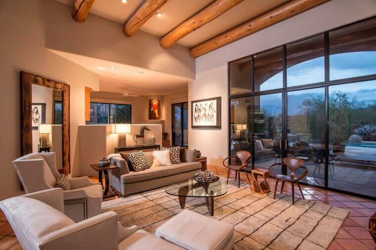
Big living rooms or bedrooms that receive plenty of light should contain strong, warm colors such as red, terracotta orange, ocher… You can use lighter tones of the same color on your walls as well as a gray-scale on your other surfaces.
On a different note, if your setting has a lot of furniture, try a light or pastel color instead to visually lighten the load. If you have a big living room, you can also consider using two color schemes within the setting.
Color distribution in monochrome settings
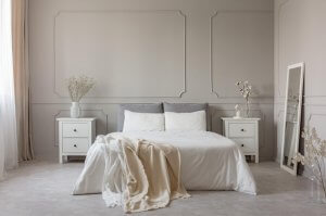
Choosing a single light color, such as off-white, is a safe monochrome bet for the main pieces of furniture in a room. In addition, add a few pops of gray-white throughout the room with decor accessories.
Another bright idea is balancing different tones by using a warm cream color, such as beige, or earthy colors on your walls and rugs. Then, bring them together with a darker color on your couch and curtains.
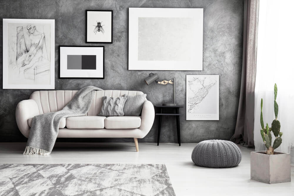
Using different kinds of texture is also a way to jazz up your monochrome palette a bit. The textures will work to create contrast in your setting. Decorative paint methods for furniture and walls are a great way to add texture. Or, throw in some fabrics, such as chiffon, silk or velvet…
Another fundamental aspect that you should remember is that the darker and more intense your base color is, the more you’ll need to lighten it with your other tones. Ready to get to work? We know you’ll nail a beautiful monochrome setting for your home.
Monochrome palettes create a simple, sure-win color scheme for any setting. A single color used with shades varying in the amounts of white, gray or black can create a variety of gentle settings.
With just a single color, you can play around with light or dark shades that will always harmonize while breaking the monotony of your rooms.
Monochrome settings are perfect for anyone who is looking for an appropriate, but discreet color. They’re a solution for those who want to avoid risky colors or too much contrast. And they’re also ideal if you have a specific color in mind.
Harmonizing two or three shades of the same color will always yield wonderful results. Don’t forget that a single color can have many shades.
Monochrome settings: a smart decision
As you’re thinking about which color to use for your monochrome setting, look for the shades that can complete the chromatic scale. The color variations play a crucial role in decor.
With these variations, you can add more life to a room. Or, you can make a room seem bigger or achieve other effects as well depending on what you need. If you’re hesitating between using a monochrome or a contrasting setting, remember that you can always add a piece of furniture or decor in a different color later.
Ideas for your home decor
Monochrome settings create relaxing, harmonious spaces. If you use different shades together in one room, they can establish a perfect balance.
The main things you have to think about in deciding to go monochrome or not are: the size of the space you want to decorate, the amount of light that it receives and the room’s purpose.
Small spaces
One single, bright color will work best in small settings that lack natural light. For example: if you’re working on a baby room, try a light shade of yellow. Yellow is a joyful color that won’t make your room look smaller. In addition, match the yellow walls with some decor accessories in a darker shade of yellow.
Or if you are decorating a work zone, try going for a relaxing shade of green. Light or pastel greens are warm, bright tones and can create a beautiful contrast with dark green decor accessories.
Big spaces
Big living rooms or bedrooms that receive plenty of light should contain strong, warm colors such as red, terracotta orange, ocher… You can use lighter tones of the same color on your walls as well as a gray-scale on your other surfaces.
On a different note, if your setting has a lot of furniture, try a light or pastel color instead to visually lighten the load. If you have a big living room, you can also consider using two color schemes within the setting.
Color distribution in monochrome settings
Choosing a single light color, such as off-white, is a safe monochrome bet for the main pieces of furniture in a room. In addition, add a few pops of gray-white throughout the room with decor accessories.
Another bright idea is balancing different tones by using a warm cream color, such as beige, or earthy colors on your walls and rugs. Then, bring them together with a darker color on your couch and curtains.
Using different kinds of texture is also a way to jazz up your monochrome palette a bit. The textures will work to create contrast in your setting. Decorative paint methods for furniture and walls are a great way to add texture. Or, throw in some fabrics, such as chiffon, silk or velvet…
Another fundamental aspect that you should remember is that the darker and more intense your base color is, the more you’ll need to lighten it with your other tones. Ready to get to work? We know you’ll nail a beautiful monochrome setting for your home.


