How to Avoid Color Overload
There are several decor trends and colors play an important role in them. However, their excessive use can lead to tension and become a real problem. Therefore, it’s time to ask how to avoid color overload.
When choosing colors, you must be aware of the role they play, the combinations you can make, and the feelings they convey. Then you can contemplate the possibility of achieving a harmonious decoration.
Continually adding objects and other materials that have different shades can lead to decorative saturation and, color overload that denotes a lack of harmony.
Detect ambience color overload
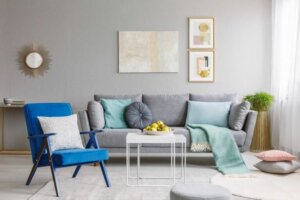
The first thing you must do is analyze the situation in your home. It’s essential that you carefully look at the rooms and study the state of each one. Then you’ll see if there’s an ambience color overload.
In the event there’s a random clash of shades without a predetermined scheme, there’ll be a lack of decorative coherence.
It’s essential to decide if colors are adequately combined, as often we associate colors with certain ambiances. The important thing here is a good aesthetic relationship and creating a dialogue between the furniture and the colors.
In order not to saturate the ambience, you must analyze the situation of each room.
Five steps to solve the problem of color overload
Once you’ve detected what the problem is in your home decor, you can solve this issue and try to improve the ambience of each room.
- Try to set a clear objective where you know what suits your home and what shade you’d like to predominate. Remember that, although there may be a color that has a widespread presence, you can also apply others in order to balance the chromaticity.
- The important thing is that there’s a controlled variable. Establish limits and try to keep within a certain group of colors in order to establish a dialogue between them. This idea is a fundamental objective.
- If you want to use a striking color (red, orange, green …), you must counter it with others that are more moderate, such as neutral shades.
- Warm colors shouldn’t be focused on a single point. There must be a balanced distribution throughout the room to provide certain color touches in a coherent way.
- It isn’t necessary to use only muted tones in order to avoid feelings of tension. This can create a depressing ambience, when what you need, in fact, is to establish a comfortable environment. There should be other colors that energize and collaborate in harmony.
Color overload – avoid bright colors
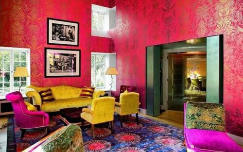
Today, garments with excessively striking colors have become fashionable, especially in sportswear. Yellow and orange are common, but you can also find them in pink, red, and blue.
These colors shouldn’t be used in the home. They’re too strong to look at and can cause discomfort. In addition, they don’t usually fit in well with other shades, especially if you use dark and earthy tones.
If you have an object in a bright color, it must be something sporadic, but it must never dominate or have an abundant presence.
The key to everything is to seek a general balance.
Be selective with the products you buy

You should try not to fill the house with gadgets and objects of different sizes and colors. Avoid overloading and decorative saturation. It’s better to choose what you really need and manage your purchases.
Given the question we asked at the beginning of how to avoid color overload, we have one last tip – select your products according to need, function, and color. Sometimes decor simplicity is the easiet way to achieve comfort.
There are several decor trends and colors play an important role in them. However, their excessive use can lead to tension and become a real problem. Therefore, it’s time to ask how to avoid color overload.
When choosing colors, you must be aware of the role they play, the combinations you can make, and the feelings they convey. Then you can contemplate the possibility of achieving a harmonious decoration.
Continually adding objects and other materials that have different shades can lead to decorative saturation and, color overload that denotes a lack of harmony.
Detect ambience color overload
The first thing you must do is analyze the situation in your home. It’s essential that you carefully look at the rooms and study the state of each one. Then you’ll see if there’s an ambience color overload.
In the event there’s a random clash of shades without a predetermined scheme, there’ll be a lack of decorative coherence.
It’s essential to decide if colors are adequately combined, as often we associate colors with certain ambiances. The important thing here is a good aesthetic relationship and creating a dialogue between the furniture and the colors.
In order not to saturate the ambience, you must analyze the situation of each room.
Five steps to solve the problem of color overload
Once you’ve detected what the problem is in your home decor, you can solve this issue and try to improve the ambience of each room.
- Try to set a clear objective where you know what suits your home and what shade you’d like to predominate. Remember that, although there may be a color that has a widespread presence, you can also apply others in order to balance the chromaticity.
- The important thing is that there’s a controlled variable. Establish limits and try to keep within a certain group of colors in order to establish a dialogue between them. This idea is a fundamental objective.
- If you want to use a striking color (red, orange, green …), you must counter it with others that are more moderate, such as neutral shades.
- Warm colors shouldn’t be focused on a single point. There must be a balanced distribution throughout the room to provide certain color touches in a coherent way.
- It isn’t necessary to use only muted tones in order to avoid feelings of tension. This can create a depressing ambience, when what you need, in fact, is to establish a comfortable environment. There should be other colors that energize and collaborate in harmony.
Color overload – avoid bright colors
Today, garments with excessively striking colors have become fashionable, especially in sportswear. Yellow and orange are common, but you can also find them in pink, red, and blue.
These colors shouldn’t be used in the home. They’re too strong to look at and can cause discomfort. In addition, they don’t usually fit in well with other shades, especially if you use dark and earthy tones.
If you have an object in a bright color, it must be something sporadic, but it must never dominate or have an abundant presence.
The key to everything is to seek a general balance.
Be selective with the products you buy
You should try not to fill the house with gadgets and objects of different sizes and colors. Avoid overloading and decorative saturation. It’s better to choose what you really need and manage your purchases.
Given the question we asked at the beginning of how to avoid color overload, we have one last tip – select your products according to need, function, and color. Sometimes decor simplicity is the easiet way to achieve comfort.
All cited sources were thoroughly reviewed by our team to ensure their quality, reliability, currency, and validity. The bibliography of this article was considered reliable and of academic or scientific accuracy.
- Lava Oliva, Rocío: Interiorismo, Vértice, 2008.


