Bottle Green and White: A Sophisticated Combination
The relationship between colors established in the home must follow stable parameters that provide harmony and well-being. Visually, it’s good for there to be harmony. For this reason, we’re going to look at how to incorporate the combination of bottle green and white.
Generally, we use one or two colors that predominate in spaces more impactfully. At the same time, there are complementary colors that collaborate in constructing an internal discourse that’s pleasing to the eyes.
Through chromaticism, we also establish our own personality. We’re referring to the ability to show what we’re like and what we want to express, defining our tastes at a decorative level and the different aesthetic purposes that we want to achieve.
Sensations from bottle green and white
What sensations do we perceive through the combination of bottle green and white? You may not be so used to using them together; in fact, they’re usually separated, but there’s a positive contrast between them that, in the end, favors the internal image.
Within the classic styles, this combination has its place; that is, in those styles that aim to show elegance and distinction. In addition, they’re commonly used in restaurants or hotels to convey a luxury, contemporary, or modern trend.
At the same time, we must also highlight the strength and firmness of bottle green against the purity and clarity of white. The first can darken the environment a little more, while the other enriches the entire space with light and refinement. For this reason, the association that occurs confirms the balance.
Decoration is based on the contrast between both shades.
How to work them indoors?
When it comes to relating the two colors, we can arrange them in different spaces. Deep down, they’re versatile and have a lot to say in any room, you just have to keep in mind that there must be coordination and good harmony between the two. Let’s see some examples:
- One of the most interesting formulas is the application of green on the walls, covering the entire surface, while white can be placed on the door and window frames or simply on the shelves and some other furniture.
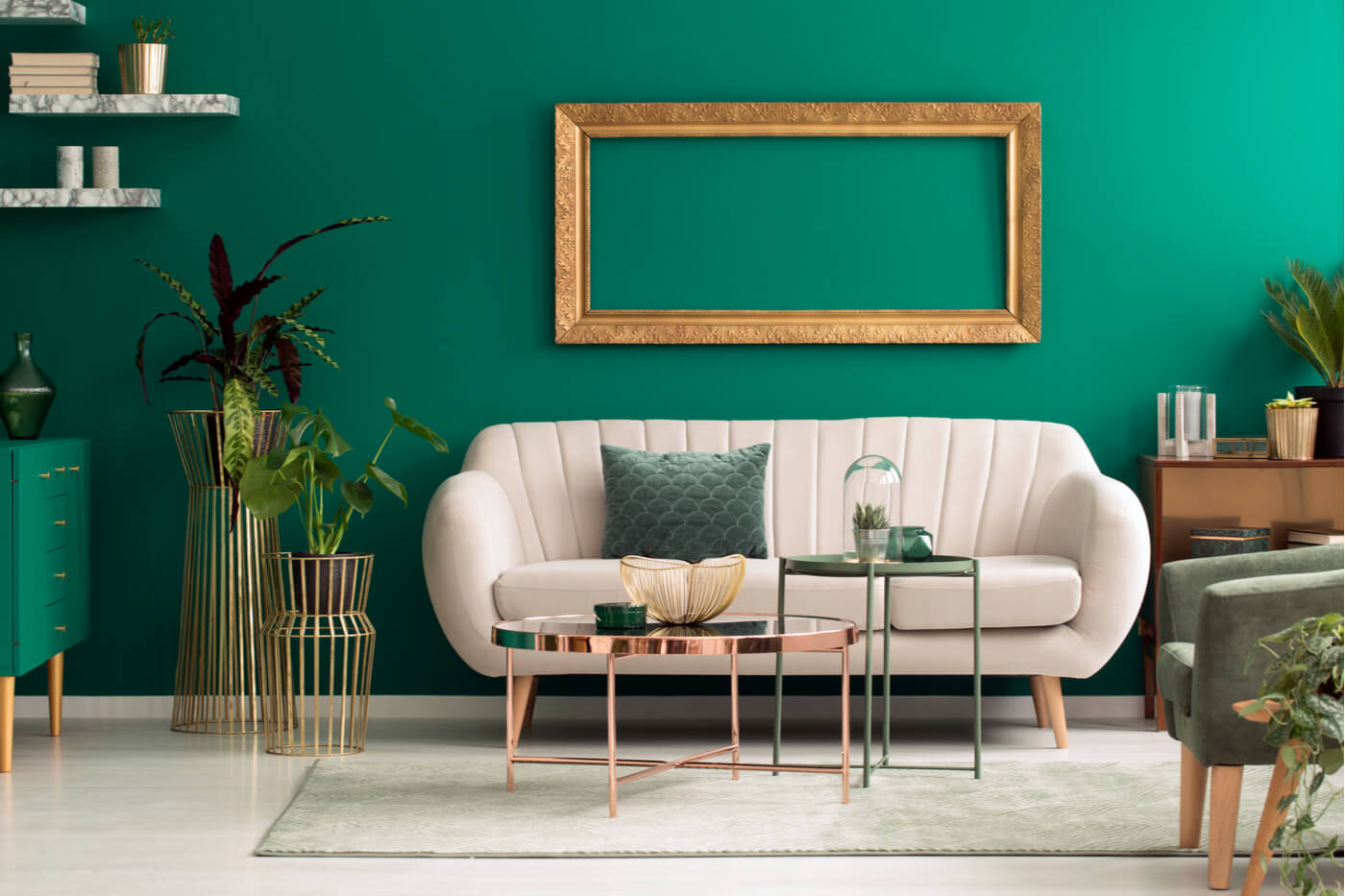
- You can also choose to use green on a single wall and leave the rest white. This relationship is a way to energize and attract more attention. In addition, the combination looks very good in city apartments and in youthful environments.
- A white sofa with green cushions is, without a doubt, one of the most used formats. In this way, the seat is configured as clear support that helps to highlight the cushions that stand out boldly.
- Nowadays, it’s trendy to use white furniture with objects of other tones on top. In this regard, this color is confirmed as a simple support that goes well with anything. It’s a concept very similar to the one practiced in the world of fashion.
Application in the bedroom
The bedroom is considered the most private place in the house. It’s we who enjoy it; therefore, we mustn’t miss the opportunity to properly choose the most suitable colors for adding personality and character.
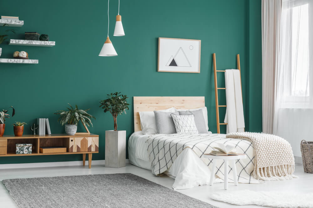
Bottle green is a good option. If you look at it carefully, it conveys seriousness and sophistication, which is why it can have a certain impact on the walls or, for example, on the bedspread or the headboard itself.
With regard to white, the furniture, the bed, and the rugs are ideal elements to work on this idea. The most important thing is that we achieve full contrast. It’s the only way to achieve stable harmonization.
The kitchen: A sophisticated touch
To achieve full sophistication in the contents of your home, it’s important to pay attention to the kitchen. The simplest approach would be, fundamentally, the incorporation of green in the furniture and white in the walls. However, you can also do just the opposite.
At the same time, there’s no need to add any other dominating colors; that is, they can be interspersed to generate contrasts, but it’s not an essential issue, quite the contrary. If you dedicate yourself to only bottle green and white, there’s no need to choose other colors.
The relationship between colors established in the home must follow stable parameters that provide harmony and well-being. Visually, it’s good for there to be harmony. For this reason, we’re going to look at how to incorporate the combination of bottle green and white.
Generally, we use one or two colors that predominate in spaces more impactfully. At the same time, there are complementary colors that collaborate in constructing an internal discourse that’s pleasing to the eyes.
Through chromaticism, we also establish our own personality. We’re referring to the ability to show what we’re like and what we want to express, defining our tastes at a decorative level and the different aesthetic purposes that we want to achieve.
Sensations from bottle green and white

What sensations do we perceive through the combination of bottle green and white? You may not be so used to using them together; in fact, they’re usually separated, but there’s a positive contrast between them that, in the end, favors the internal image.
Within the classic styles, this combination has its place; that is, in those styles that aim to show elegance and distinction. In addition, they’re commonly used in restaurants or hotels to convey a luxury, contemporary, or modern trend.
At the same time, we must also highlight the strength and firmness of bottle green against the purity and clarity of white. The first can darken the environment a little more, while the other enriches the entire space with light and refinement. For this reason, the association that occurs confirms the balance.
Decoration is based on the contrast between both shades.
How to work them indoors?
When it comes to relating the two colors, we can arrange them in different spaces. Deep down, they’re versatile and have a lot to say in any room, you just have to keep in mind that there must be coordination and good harmony between the two. Let’s see some examples:
- One of the most interesting formulas is the application of green on the walls, covering the entire surface, while white can be placed on the door and window frames or simply on the shelves and some other furniture.
- You can also choose to use green on a single wall and leave the rest white. This relationship is a way to energize and attract more attention. In addition, the combination looks very good in city apartments and in youthful environments.
- A white sofa with green cushions is, without a doubt, one of the most used formats. In this way, the seat is configured as clear support that helps to highlight the cushions that stand out boldly.
- Nowadays, it’s trendy to use white furniture with objects of other tones on top. In this regard, this color is confirmed as a simple support that goes well with anything. It’s a concept very similar to the one practiced in the world of fashion.
Application in the bedroom

The bedroom is considered the most private place in the house. It’s we who enjoy it; therefore, we mustn’t miss the opportunity to properly choose the most suitable colors for adding personality and character.
Bottle green is a good option. If you look at it carefully, it conveys seriousness and sophistication, which is why it can have a certain impact on the walls or, for example, on the bedspread or the headboard itself.
With regard to white, the furniture, the bed, and the rugs are ideal elements to work on this idea. The most important thing is that we achieve full contrast. It’s the only way to achieve stable harmonization.
The kitchen: A sophisticated touch
To achieve full sophistication in the contents of your home, it’s important to pay attention to the kitchen. The simplest approach would be, fundamentally, the incorporation of green in the furniture and white in the walls. However, you can also do just the opposite.
At the same time, there’s no need to add any other dominating colors; that is, they can be interspersed to generate contrasts, but it’s not an essential issue, quite the contrary. If you dedicate yourself to only bottle green and white, there’s no need to choose other colors.
All cited sources were thoroughly reviewed by our team to ensure their quality, reliability, currency, and validity. The bibliography of this article was considered reliable and of academic or scientific accuracy.
- Atkins, Caroline:Colorea tu hogar, Londres, Ceac, 2003.
