The Aesthetics of the Secession Building in Vienna
For sure you’ve been amazed at the various styles of architecture and street art you can see if you’ve ever been to Vienna. However, the aesthetics of the Secession Building stand out and represent this city.
Modernism has a huge representation in Europe. Its expression was stronger at the turn of the nineteenth century due to the many artists who joined the movement.
We’ll address the most interesting parts of the aesthetics of the Secession Building. It’s a significant landmark in European modern art. You’ll learn what the fundamental characteristics of this movement are to understand the general concept behind it.
The historical context of the Secession Building
The Secession Building is the work of Joseph María Olbrich. He built it between 1897 and 1898. He framed it within the Viennese modern style, historically referred to as Jugendstil.
The building, built in the Vienna Secession style, brought about by a series of artists who wanted to focus on the kind of artistic renovation that could end realism (the previous movement). This way they could reinterpret the styles of the past and change their aesthetics to make them more beautiful.
In reality, the industrial style brought about a structural functionality that directly affected art, architecture and interior design. Secession artists tried to change this dynamic to enhance the external decor by designing more interesting things.
Decor gained ground for functionality again, thanks to the Vienna Secession.
The Secession Building – a somewhat peculiar way
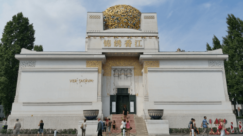
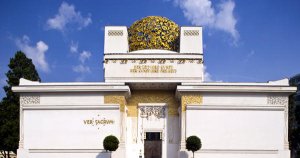
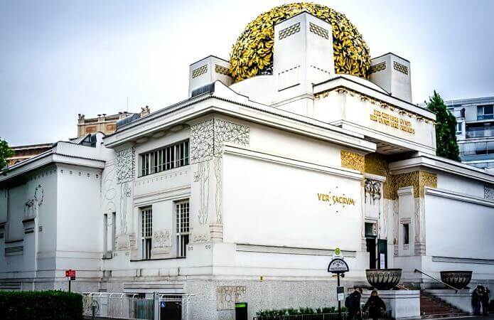
The first thing you see if you’re in front of this building is the format of the construction. This is because it’s rather original and out of the ordinary due to its structure and outer details.
- The pillars that support this building are anchored deep down in the ground.
- The structure is light and conveys a sense of stability, mainly because it’s a large rectangular box that’s wider than it’s high.
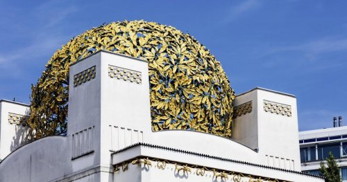
- Just above the entrance, there’s a golden ball made up of metal leaves that climb up the facade to the top. They’re an aesthetic enhancement that reflects elegance and glamor.
- The building has no windows and an opaque, robust and consistent format that’s similar to a mausoleum or a temple. However, it was created for artistic endeavors so it often houses art exhibitions.
The Viennese refer to the ball of leaves as “the Golden Cabbage.”
What’s inside?
The interior of the building is for art exhibitions. However, the building itself is a work of art and people seldom pay attention to its contents.
- Note that, on an aesthetic level, the internal decor is rather and attracts more attention than anything placed in it. Thus, it loses functionality.
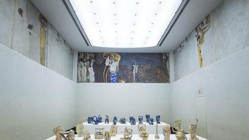
- Likewise, we must mention Beethoven’s Frieze by Gustav Klimt, an artist who left his mark on the building. This is because his paintings were truly modern and their extravagant forms and contents are somewhat peculiar.
- Also, white is the predominant color, both inside and outside, and it contrasts with the white, gold and black lines.
The symbolism as a reference point
The ornaments and colors used have a symbolic connotation that prevails both inside and outside. One can see modernism in every corner of this building, especially in the paintings.
This is because movement, dynamism, and turbulence are the aesthetic principles that prevail in the paintings.
https://midecoracion.com/casas/la-estetica-del-pabellon-de-la-secesion-de-viena/
For sure you’ve been amazed at the various styles of architecture and street art you can see if you’ve ever been to Vienna. However, the aesthetics of the Secession Building stand out and represent this city.
Modernism has a huge representation in Europe. Its expression was stronger at the turn of the nineteenth century due to the many artists who joined the movement.
We’ll address the most interesting parts of the aesthetics of the Secession Building. It’s a significant landmark in European modern art. You’ll learn what the fundamental characteristics of this movement are to understand the general concept behind it.
The historical context of the Secession Building
The Secession Building is the work of Joseph María Olbrich. He built it between 1897 and 1898. He framed it within the Viennese modern style, historically referred to as Jugendstil.
The building, built in the Vienna Secession style, brought about by a series of artists who wanted to focus on the kind of artistic renovation that could end realism (the previous movement). This way they could reinterpret the styles of the past and change their aesthetics to make them more beautiful.
In reality, the industrial style brought about a structural functionality that directly affected art, architecture and interior design. Secession artists tried to change this dynamic to enhance the external decor by designing more interesting things.
Decor gained ground for functionality again, thanks to the Vienna Secession.
The Secession Building – a somewhat peculiar way
The first thing you see if you’re in front of this building is the format of the construction. This is because it’s rather original and out of the ordinary due to its structure and outer details.
- The pillars that support this building are anchored deep down in the ground.
- The structure is light and conveys a sense of stability, mainly because it’s a large rectangular box that’s wider than it’s high.
- Just above the entrance, there’s a golden ball made up of metal leaves that climb up the facade to the top. They’re an aesthetic enhancement that reflects elegance and glamor.
- The building has no windows and an opaque, robust and consistent format that’s similar to a mausoleum or a temple. However, it was created for artistic endeavors so it often houses art exhibitions.
The Viennese refer to the ball of leaves as “the Golden Cabbage.”
What’s inside?
The interior of the building is for art exhibitions. However, the building itself is a work of art and people seldom pay attention to its contents.
- Note that, on an aesthetic level, the internal decor is rather and attracts more attention than anything placed in it. Thus, it loses functionality.
- Likewise, we must mention Beethoven’s Frieze by Gustav Klimt, an artist who left his mark on the building. This is because his paintings were truly modern and their extravagant forms and contents are somewhat peculiar.
- Also, white is the predominant color, both inside and outside, and it contrasts with the white, gold and black lines.
The symbolism as a reference point
The ornaments and colors used have a symbolic connotation that prevails both inside and outside. One can see modernism in every corner of this building, especially in the paintings.
This is because movement, dynamism, and turbulence are the aesthetic principles that prevail in the paintings.
https://midecoracion.com/casas/la-estetica-del-pabellon-de-la-secesion-de-viena/
All cited sources were thoroughly reviewed by our team to ensure their quality, reliability, currency, and validity. The bibliography of this article was considered reliable and of academic or scientific accuracy.
Pile, John: A history of interior design, Londres, Laurence King Publishing, 2005.


