Prussian Blue and Its Unique Character
You can create a very serene look by using Prussian blue. This color can contribute in a unique way by providing depth, intensity, and vigor.
You might not be familiar with this color by name. However, you’ve probably seen it in museums, palaces, or other public buildings. It’s not as common in homes. Regardless, there is no doubt that it stands out strikingly and aesthetically.
For this reason, it’s best to understand some ways to apply it appropriately in interiors. You shouldn’t use it in all areas of your home, but instead, you can put it in specific areas of a room to add some prominence role.
Prussian blue – a sensational color
When describing this color, you should bear in mind that, from an aesthetic point of view, it creates numerous sensations. It can create a calm atmosphere thanks to its subdued character.
Another quality is that it calms the spirit. For this reason, people often use it for a specific purpose, such as meditation and reflection. For example, using it in a bedroom can help you fall asleep and reduce mental aggravation.
The intensity of the color is linked with temperance and peace. However, it doesn’t bring much brightness to a room so you’ll need to use other resources to generate light and avoid creating a gloomy environment.
A very interesting chromatic resource for serious, peaceful, and calm environments.
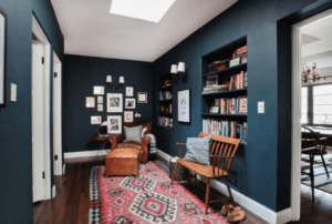
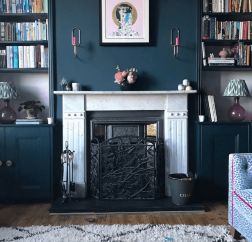
How to use Prussian blue on the walls
If you want to use this color on the walls, there are different ways of using it and, of course, combining it with other colors according to the room. The main purpose is that there is overall, coherent harmony in the room and a feeling of emotional health.
- You can cover all walls with this blue. It won’t hurt to envelop the entire room and let this color dominate. However, you can also alternate it with some white or light gray.
- Ornaments on the walls will stand out thanks to the dark background. In other words, it helps decorative elements stand out thanks to the moody atmosphere it creates.
- It’s important to contrast this color with the ceiling, which we recommend you paint white. This way, there’ll be a feeling of spaciousness from above and you won’t feel so closed in. Ultimately, it’s a matter of keeping some light areas of the room.
- With regard to the floor, you can use wood since Prussian blue looks great with dark brown. You can also use white or gray tiles to combine colors like a professional.
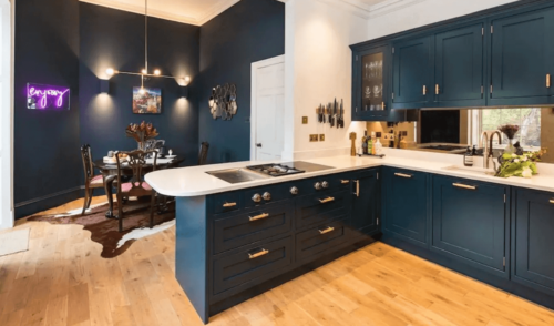
Can you find this color on furniture?
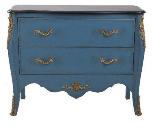
Prussian blue can work on any surface. No matter what part of the house it’s in or what type of furniture, it can look subtle and elegant.
In the case of furniture, you can use it on the coffee table in the living room, the dresser, a nightstand, or a closet. The size of the furniture doesn’t matter. What’s important is the other decoration in the room.
The furniture acquires a more noticeable, refined, and stylish look. In addition, it’s a pleasant color and wherever you use it, it’s sure to make a splash.
Prussian blue is a great way to decorate interiors.
Prussian blue on the couch
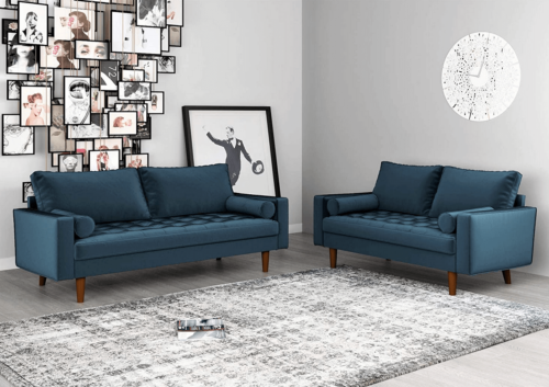
If you want the living room to feel rich and have a strong character, a Prussian blue sofa is a great choice. Using this color on the couch is a great way to make this the feature of the room.
This also can look great if it’s the same color as the walls. You can also place furniture like this in lighter environments by generating a subtle, relaxed contrast without losing a sense of comfort.
In short, Prussian blue is a new, trendy color and a decorative way of creating elegance, distinction, seriousness, and temperance. It’s a great way to give your house personality.
You can create a very serene look by using Prussian blue. This color can contribute in a unique way by providing depth, intensity, and vigor.
You might not be familiar with this color by name. However, you’ve probably seen it in museums, palaces, or other public buildings. It’s not as common in homes. Regardless, there is no doubt that it stands out strikingly and aesthetically.
For this reason, it’s best to understand some ways to apply it appropriately in interiors. You shouldn’t use it in all areas of your home, but instead, you can put it in specific areas of a room to add some prominence role.
Prussian blue – a sensational color
When describing this color, you should bear in mind that, from an aesthetic point of view, it creates numerous sensations. It can create a calm atmosphere thanks to its subdued character.
Another quality is that it calms the spirit. For this reason, people often use it for a specific purpose, such as meditation and reflection. For example, using it in a bedroom can help you fall asleep and reduce mental aggravation.
The intensity of the color is linked with temperance and peace. However, it doesn’t bring much brightness to a room so you’ll need to use other resources to generate light and avoid creating a gloomy environment.
A very interesting chromatic resource for serious, peaceful, and calm environments.
How to use Prussian blue on the walls
If you want to use this color on the walls, there are different ways of using it and, of course, combining it with other colors according to the room. The main purpose is that there is overall, coherent harmony in the room and a feeling of emotional health.
- You can cover all walls with this blue. It won’t hurt to envelop the entire room and let this color dominate. However, you can also alternate it with some white or light gray.
- Ornaments on the walls will stand out thanks to the dark background. In other words, it helps decorative elements stand out thanks to the moody atmosphere it creates.
- It’s important to contrast this color with the ceiling, which we recommend you paint white. This way, there’ll be a feeling of spaciousness from above and you won’t feel so closed in. Ultimately, it’s a matter of keeping some light areas of the room.
- With regard to the floor, you can use wood since Prussian blue looks great with dark brown. You can also use white or gray tiles to combine colors like a professional.
Can you find this color on furniture?
Prussian blue can work on any surface. No matter what part of the house it’s in or what type of furniture, it can look subtle and elegant.
In the case of furniture, you can use it on the coffee table in the living room, the dresser, a nightstand, or a closet. The size of the furniture doesn’t matter. What’s important is the other decoration in the room.
The furniture acquires a more noticeable, refined, and stylish look. In addition, it’s a pleasant color and wherever you use it, it’s sure to make a splash.
Prussian blue is a great way to decorate interiors.
Prussian blue on the couch
If you want the living room to feel rich and have a strong character, a Prussian blue sofa is a great choice. Using this color on the couch is a great way to make this the feature of the room.
This also can look great if it’s the same color as the walls. You can also place furniture like this in lighter environments by generating a subtle, relaxed contrast without losing a sense of comfort.
In short, Prussian blue is a new, trendy color and a decorative way of creating elegance, distinction, seriousness, and temperance. It’s a great way to give your house personality.
All cited sources were thoroughly reviewed by our team to ensure their quality, reliability, currency, and validity. The bibliography of this article was considered reliable and of academic or scientific accuracy.
- Gwynn, Kate; Sloan, Annie: El color en la decoración, Blume, 1999.


