Home Decor Projects Bursting with Color
When it comes to home decor projects, colorful palettes work especially well in spacious settings that have plenty of light. There’s always a way to pick out the right colors for any room in your home.
A good way to plan the colors for your home decor is choosing three or four that you like and work well together. Use them throughout your home but vary the amount of presence they have in each room.
Color combinations for home decor projects
Using bright, intense colors can balance out areas where gentler colors dominate. When you mix strong and mild colors, try to avoid creating too strong a chromatic tension because it can make a setting uncomfortable.
You can avoid it by choosing one main color and using the rest to contrast it, creating a harmonious setting. Or, you can also use less of a complementary color if you decide to use two opposing colors.
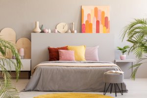
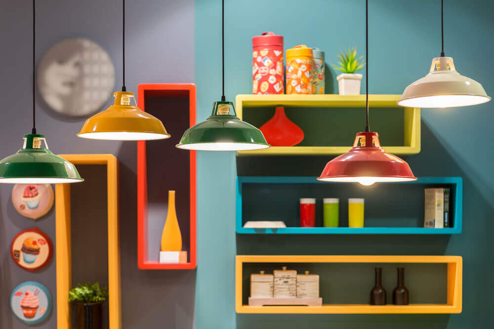
For example in a rustic decor setting, you can enhance the decor by contrasting reds with blues and ocher. It’ll create a bold yet harmonious ambiance.
You can also use that combination for a living room or even a well-lit bedroom. But we don’t recommend it for children’s rooms or a study. Transit areas, stairways, and special corners also create places to try bolder chromatic combinations.
Different colors that share a tone
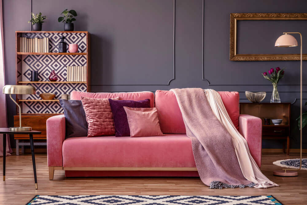
Just as monochrome settings yield balanced results, using different colors that share the same tone, depth or brightness can also create a harmonious setting.
Even if you use two complementary colors, they can work well together because a value can unify them. And they won’t create visual stress either.
What contrast can do for colorful home decor
As opposed to when you use colors separately, colors can look lighter or darker than they actually are when they’re next to another.
For example, dark gray can look even darker on a white background or it can seem lighter on top of an intense black. You need to especially consider these visual effects when arranging furniture or other objects against a black wall.
Creating separate spaces through colors
Color is extremely useful for separating spaces. For example, you can create separate spaces in one room by using two different color schemes that are connected to each other.
Try painting one area of a room with warm, gentle colors and the other as well with gentle but cool colors; they’ll work very well together. Or, only use warm colors but use darker ones in one area while using lighter tones in the other.
Paint a single wall in a deep color as leave the other three white. Or, use a light color to create a focal point, warmer setting or a special area within a room.
A dark-colored wall can work great to enhance a piece of furniture or set up a space to showcase decor accessories of a lighter color.
Decor projects bursting with color – bold combinations
Bathrooms
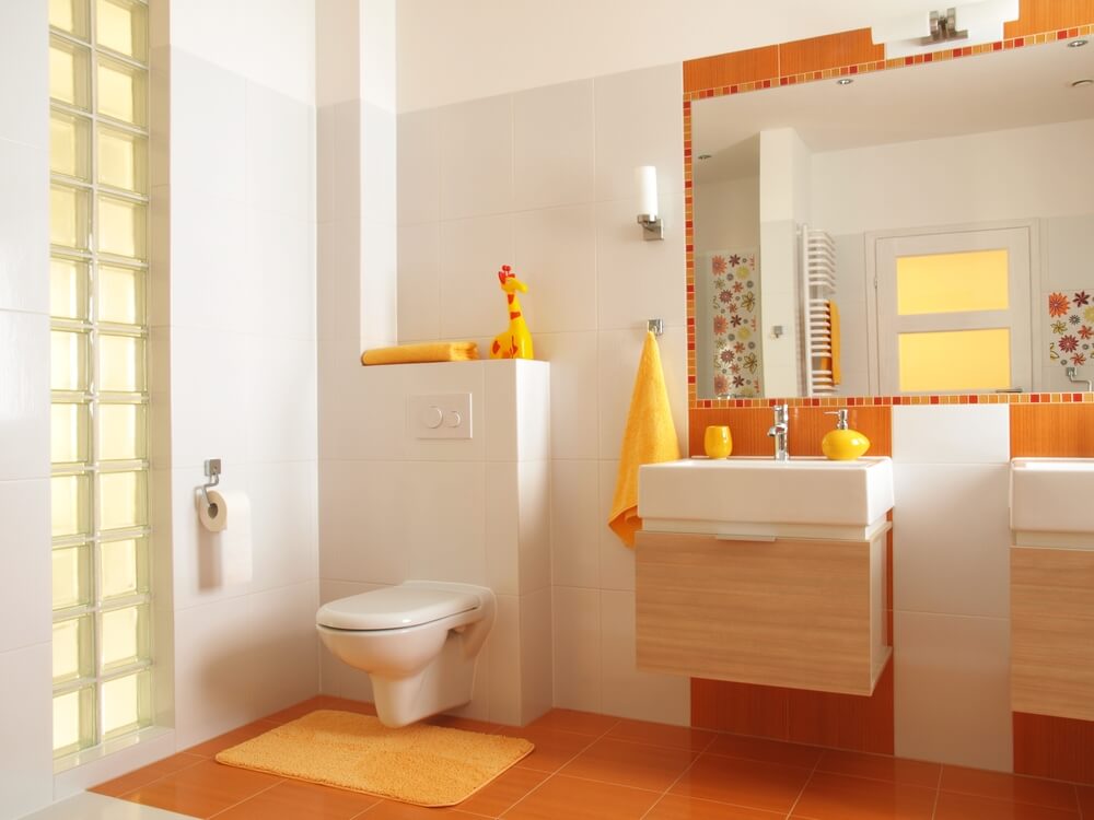
How many times have you limited yourself to thinking that cool colors only work in bathrooms? Well, that couldn’t be further from the truth. You can create a warmer bathroom by using orange as the main color.
Use orange tiles alongside its similar colors: yellow-orange and red-orange, in addition to a neutral white to add brightness.
You can also try a light wood for your bathroom and place orange decor accessories like jars or towels as well to create a lovely setting.
Decor projects full of color – your living room
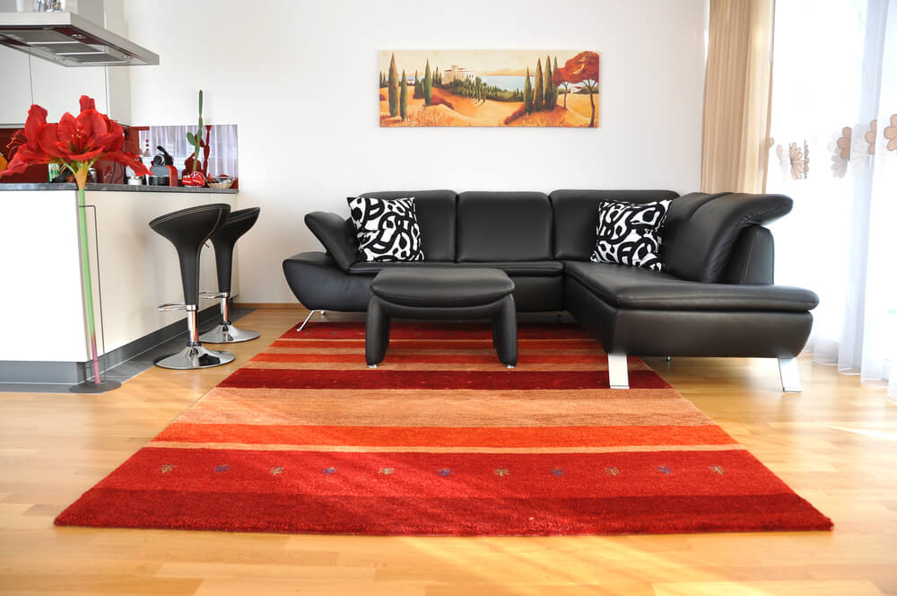
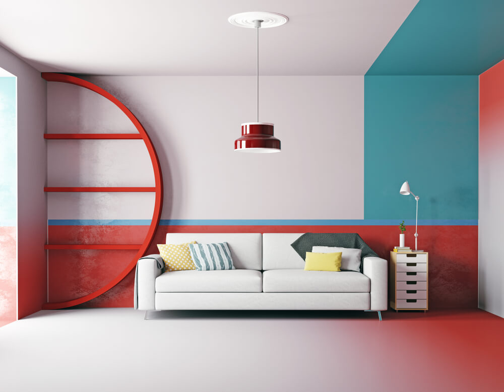
Try warm colors, such as orange, for your chairs and an orange-red lamp along with a dark red rug. Leave your walls white. If you add black and white chairs to the mix, you can create a very somber, elegant setting.
This idea doesn’t feature a main color. Instead, it uses four colors in equal parts without creating clashes between them.
Kitchen
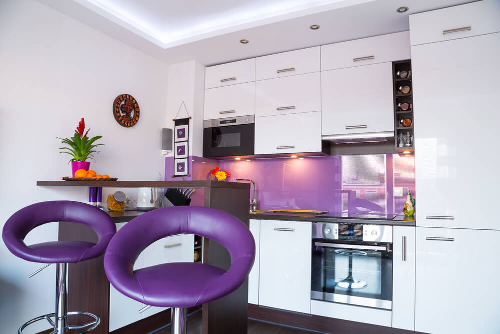
Whoever said that kitchens have to look bland? You can absolutely use a casual combination of colors for your kitchen: a warm color, yellow, a cold color, violet, and a neutral gray.
These three colors look amazing together with a dark wood cabinet. They give the setting a casual air, balancing out the seriousness of the dark wood. As you’ve read with us today, there are all kinds of winning color combinations for your home decor projects. Ready to give them a try?
When it comes to home decor projects, colorful palettes work especially well in spacious settings that have plenty of light. There’s always a way to pick out the right colors for any room in your home.
A good way to plan the colors for your home decor is choosing three or four that you like and work well together. Use them throughout your home but vary the amount of presence they have in each room.
Color combinations for home decor projects
Using bright, intense colors can balance out areas where gentler colors dominate. When you mix strong and mild colors, try to avoid creating too strong a chromatic tension because it can make a setting uncomfortable.
You can avoid it by choosing one main color and using the rest to contrast it, creating a harmonious setting. Or, you can also use less of a complementary color if you decide to use two opposing colors.
For example in a rustic decor setting, you can enhance the decor by contrasting reds with blues and ocher. It’ll create a bold yet harmonious ambiance.
You can also use that combination for a living room or even a well-lit bedroom. But we don’t recommend it for children’s rooms or a study. Transit areas, stairways, and special corners also create places to try bolder chromatic combinations.
Different colors that share a tone
Just as monochrome settings yield balanced results, using different colors that share the same tone, depth or brightness can also create a harmonious setting.
Even if you use two complementary colors, they can work well together because a value can unify them. And they won’t create visual stress either.
What contrast can do for colorful home decor
As opposed to when you use colors separately, colors can look lighter or darker than they actually are when they’re next to another.
For example, dark gray can look even darker on a white background or it can seem lighter on top of an intense black. You need to especially consider these visual effects when arranging furniture or other objects against a black wall.
Creating separate spaces through colors
Color is extremely useful for separating spaces. For example, you can create separate spaces in one room by using two different color schemes that are connected to each other.
Try painting one area of a room with warm, gentle colors and the other as well with gentle but cool colors; they’ll work very well together. Or, only use warm colors but use darker ones in one area while using lighter tones in the other.
Paint a single wall in a deep color as leave the other three white. Or, use a light color to create a focal point, warmer setting or a special area within a room.
A dark-colored wall can work great to enhance a piece of furniture or set up a space to showcase decor accessories of a lighter color.
Decor projects bursting with color – bold combinations
Bathrooms
How many times have you limited yourself to thinking that cool colors only work in bathrooms? Well, that couldn’t be further from the truth. You can create a warmer bathroom by using orange as the main color.
Use orange tiles alongside its similar colors: yellow-orange and red-orange, in addition to a neutral white to add brightness.
You can also try a light wood for your bathroom and place orange decor accessories like jars or towels as well to create a lovely setting.
Decor projects full of color – your living room
Try warm colors, such as orange, for your chairs and an orange-red lamp along with a dark red rug. Leave your walls white. If you add black and white chairs to the mix, you can create a very somber, elegant setting.
This idea doesn’t feature a main color. Instead, it uses four colors in equal parts without creating clashes between them.
Kitchen
Whoever said that kitchens have to look bland? You can absolutely use a casual combination of colors for your kitchen: a warm color, yellow, a cold color, violet, and a neutral gray.
These three colors look amazing together with a dark wood cabinet. They give the setting a casual air, balancing out the seriousness of the dark wood. As you’ve read with us today, there are all kinds of winning color combinations for your home decor projects. Ready to give them a try?


