Differences Between Minimalist and Contemporary Design

Everyone wants to be ahead of the latest fashion trends so, below, we’ll explain the differences between minimalist and contemporary design. Also, you’ll see how you can use each style in your home without turning it into a cliché.
Perhaps you’re beginning to doubt what direction to take your home decor in. Basically, it’s a complicated task to correctly define a style without it turning into an eclectic jumble that doesn’t really define you.
The most important thing is to be comfortable. You should pursue a single goal – well-being. To do this, you should consolidate the characteristics of the rooms so they’ll be sustainable and cozy.
Similarities between minimalist and contemporary design

Before identifying the differences between the two styles, it’s important to know what their similarities are, the nature of each one, and how they’re presented within a home.
Both fall within the group of modern and recent styles. That is, they’ve enjoyed years of development but don’t have centuries of history either. They’re the evolution of the shapes that’ve become popular in the 21st century.
They use technical, functional, and simple elements. Obviously, if you look a little more into the characteristics of each one, you’ll see some very precise differences, but in general, they’re very similar.
Two styles that, nowadays, are very common in city apartments.
The differences
If you were to consider what the differences between minimalist and contemporary design are, you’d come to different conclusions. You should do a comparative exercise to see that there are defined contrasts.
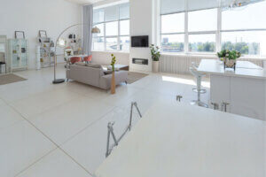
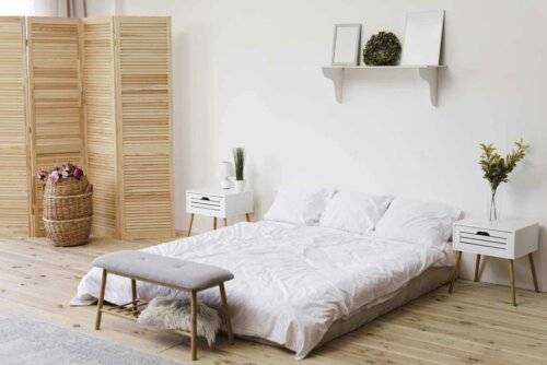
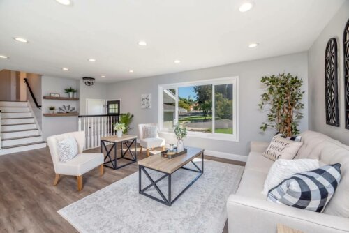
- Minimalism is reduced to the most basic and simple elements. Shapes are simplified to the max and it’s a matter of only using what’s really necessary. In the case of contemporary design, it uses more elements and more decor items to create a more generalized atmosphere.
- Openness is another difference. Minimalism tries to reach a degree of spatiality in a much stronger way, unlike contemporary where it doesn’t really matter if the rooms are full.
- When you’re looking at minimalism in homes, you’ll notice straight lines and geometric shapes are more prominent compared to the contemporary style that’s much more open to using more striking shapes and designs.
- The contemporary style uses more eye-catching and unique furniture. Perhaps it’s a bit showier since it’s not obsessed with simplifying shapes.
The lighting in minimalist and contemporary decor

The minimalist and contemporary styles use natural light in the same way – with large windows that take up most of the wall. The light coming from the outside enhances the interiors and promotes your well-being.
However, the biggest difference is in artificial lighting. People usually use indirect lighting in minimalist decor. That’s to say, lights that illuminate the whole space without focusing on specific spots, such as drop ceilings. In contemporary design, on the other hand, people usually use spotlights and lamps in specific spots.
Of course, it depends on the location of the house. If it doesn’t receive much natural light, you should use artificial lighting. Therefore, it’s important that in any of these situations you use warm lighting.
Size matters
This quality can go unnoticed within the minimalist style. Generally, there’s a tendency to arrange furniture lengthwise, but what does this mean? This decor style has wide dimensions in a horizontal format.
In the contemporary style, there’s room for different types, both narrow and wide formats. No matter what the design is. This is why this style has a casual and varied character.
In short, either one is a good choice for a modern house. Also, the interiors of both styles can be modified according to your requirements, convenience, and taste.
All cited sources were thoroughly reviewed by our team to ensure their quality, reliability, currency, and validity. The bibliography of this article was considered reliable and of academic or scientific accuracy.
- De Haro Lebrija, Fernando; Fuentes, Omar: Espacios con estilo, AM Editores, 2012.


