Cravings and Classical: The New Interior Decor Colors
The world of interior decor looks set to be full of new and exciting things in 2019, and the colors we’ll be seeing are no exception. The Pantone Color Institute has unveiled which colors will reign supreme this year, and they’re sure to delight any interior decorating fans. Among the eight distinct color palettes, there are two which we find particularly interesting: cravings and classical. These palettes feature colors which are at once completely different, and beautifully complementary.
The cravings and classical tones take their inspiration from foods and tastes which delight the senses. Out of all of these wonderful colors, Pantone has chosen coral as the color of the year in 2019.
Pantone is best-known as the creator of the Pantone color matching system, which is used as a reference point in the world of decoration, the arts, and many other creative fields. Their work has a huge impact on decorating, design and fashion trends. In this article, we’re going to take a look at what they have to offer us this year, focusing specifically on the cravings and classical pallets.
The Pantone Institute

Among the many different color standard groups that announce new color trends each season, Pantone has managed to make a name for itself as a design icon. They are the real authority in the world of color.
Industries such as graphic design, architecture, painting, fashion, cosmetics, and interior decoration recognize it as the world standard, and a reference point on all things colorful.
Their color guides have become an indispensable tool for designers, printers, brands and, of course, interior designers.
The man behind this huge international brand is Lawrence Herbert. Herbert is a chemist. In the sixties, he took over the company he was working for, renaming it Pantone.
Not long after, he created the “Pantone Matching System”, a standardized color reproduction system which allows printers and other brands to accurately reproduce colors and ensure more consistent results.
After that, Pantone’s color guides became a reference point in the world of cosmetics, followed later by many other industries.
Pantone’s color of the year 2019
Every year, Pantone reveals this year’s on-trend colors. Plus, since the year 2000, the company has chosen one color to be color of the year. By selecting a color of the year, they help guide the designs and trends for the year.
It might be used for nothing more than a few small details here in there, or it might be used as the dominant color in designs that season.
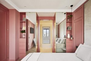
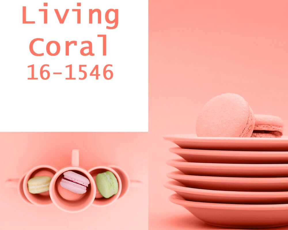
While the color of the year 2018 was ultraviolet, this year it’s coral, more specifically Pantone 16-1546 Living Coral.
Living coral is a soft but vibrant tone which will fill your ever-changing environment with warmth and comfort. It is a color which offers a greater sense of connection and intimacy, one which promotes socializing, energy and happiness.
Living coral symbolizes the importance of optimism and the search for happiness. It is the true epitome of fun. And that is why it has been chosen as 2019’s color of the year.
Cravings
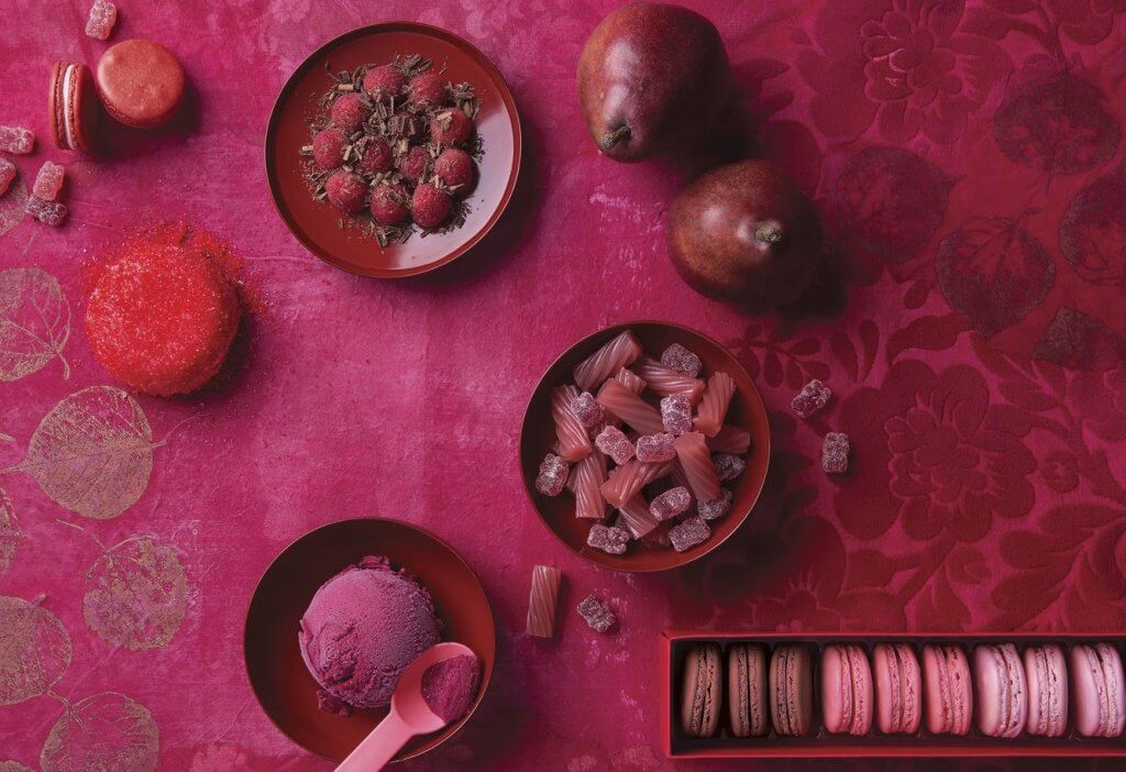
There are two particular palettes which stand out this year. One of those is cravings. The name chosen for this color palette couldn’t be more apt. It refers to what Pantone has dubbed our “food fetishes”.
In the cravings color palette, you will find strong tones with bags of character which aren’t afraid to take center stage in your decor. The more popular colors include hot reds, flaming orange, and a deep purple. This color palette aims to awaken the senses and attract the eye.
These colors are inspired by the idea of focus, attempting to capture the attention, so you won’t be able to take your eyes off of them. You could use one to create a feature wall or to decorate all four walls in a room. It would look particularly striking in entrance halls or bathrooms.
Classical tones
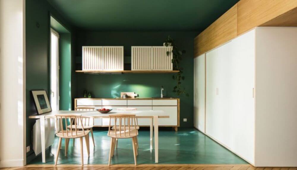
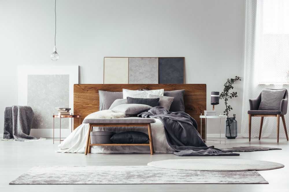
This color palette couldn’t be more enticing. It has been designed to balance out the cravings color palette with more neutral tones. These are elegant, soothing tones. Among them, you will find white, camel, teal, flannel gray, burgundy, and black. Their aim is to unite stimulating, timeless, and classic colors in a single color palette.
Cravings and classics: original and enticing
2019’s color palettes are original and innovative. From bedrooms to living rooms, we’re sure that we’ll be seeing some truly spectacular interior design ideas featuring these new colors. These bold colors awaken the senses and are sure to be the star of your decor. So, are you ready to try out the cravings and classical palettes in your home?
The world of interior decor looks set to be full of new and exciting things in 2019, and the colors we’ll be seeing are no exception. The Pantone Color Institute has unveiled which colors will reign supreme this year, and they’re sure to delight any interior decorating fans. Among the eight distinct color palettes, there are two which we find particularly interesting: cravings and classical. These palettes feature colors which are at once completely different, and beautifully complementary.
The cravings and classical tones take their inspiration from foods and tastes which delight the senses. Out of all of these wonderful colors, Pantone has chosen coral as the color of the year in 2019.
Pantone is best-known as the creator of the Pantone color matching system, which is used as a reference point in the world of decoration, the arts, and many other creative fields. Their work has a huge impact on decorating, design and fashion trends. In this article, we’re going to take a look at what they have to offer us this year, focusing specifically on the cravings and classical pallets.
The Pantone Institute
Among the many different color standard groups that announce new color trends each season, Pantone has managed to make a name for itself as a design icon. They are the real authority in the world of color.
Industries such as graphic design, architecture, painting, fashion, cosmetics, and interior decoration recognize it as the world standard, and a reference point on all things colorful.
Their color guides have become an indispensable tool for designers, printers, brands and, of course, interior designers.
The man behind this huge international brand is Lawrence Herbert. Herbert is a chemist. In the sixties, he took over the company he was working for, renaming it Pantone.
Not long after, he created the “Pantone Matching System”, a standardized color reproduction system which allows printers and other brands to accurately reproduce colors and ensure more consistent results.
After that, Pantone’s color guides became a reference point in the world of cosmetics, followed later by many other industries.
Pantone’s color of the year 2019
Every year, Pantone reveals this year’s on-trend colors. Plus, since the year 2000, the company has chosen one color to be color of the year. By selecting a color of the year, they help guide the designs and trends for the year.
It might be used for nothing more than a few small details here in there, or it might be used as the dominant color in designs that season.
While the color of the year 2018 was ultraviolet, this year it’s coral, more specifically Pantone 16-1546 Living Coral.
Living coral is a soft but vibrant tone which will fill your ever-changing environment with warmth and comfort. It is a color which offers a greater sense of connection and intimacy, one which promotes socializing, energy and happiness.
Living coral symbolizes the importance of optimism and the search for happiness. It is the true epitome of fun. And that is why it has been chosen as 2019’s color of the year.
Cravings
There are two particular palettes which stand out this year. One of those is cravings. The name chosen for this color palette couldn’t be more apt. It refers to what Pantone has dubbed our “food fetishes”.
In the cravings color palette, you will find strong tones with bags of character which aren’t afraid to take center stage in your decor. The more popular colors include hot reds, flaming orange, and a deep purple. This color palette aims to awaken the senses and attract the eye.
These colors are inspired by the idea of focus, attempting to capture the attention, so you won’t be able to take your eyes off of them. You could use one to create a feature wall or to decorate all four walls in a room. It would look particularly striking in entrance halls or bathrooms.
Classical tones
This color palette couldn’t be more enticing. It has been designed to balance out the cravings color palette with more neutral tones. These are elegant, soothing tones. Among them, you will find white, camel, teal, flannel gray, burgundy, and black. Their aim is to unite stimulating, timeless, and classic colors in a single color palette.
Cravings and classics: original and enticing
2019’s color palettes are original and innovative. From bedrooms to living rooms, we’re sure that we’ll be seeing some truly spectacular interior design ideas featuring these new colors. These bold colors awaken the senses and are sure to be the star of your decor. So, are you ready to try out the cravings and classical palettes in your home?


